Accordion
Expanders stacked in an accordion frame, opening and closing on a spring.
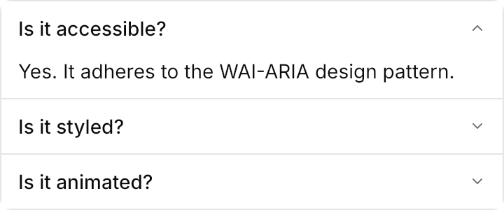
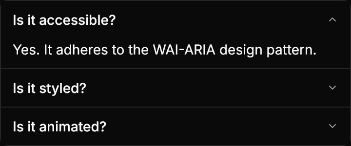
<Border Classes="accordion" Width="360" HorizontalAlignment="Left">
  <StackPanel Classes="accordion">
    <Expander Header="Is it accessible?" Content="Yes. It adheres to the WAI-ARIA design pattern." IsExpanded="True" />
    <Expander Header="Is it styled?" Content="Yes. It comes with default styles that match the other components." />
    <Expander Header="Is it animated?" Content="Yes. It opens and closes with a spring." />
  </StackPanel>
</Border>Usage
An Expander is one accordion item: a medium-weight title row with a 12px muted chevron (turned up while open, gone while disabled) over the content, on the accordion background. Stack the items in a StackPanel Classes="accordion", which gives every item but the last a 1px separator, inside a Border Classes="accordion" for the card around them. Opening and closing reveal the content at its natural height on UIKit.Spring.Control, clipped from the bottom; a toggle midway keeps the velocity. Items open independently, and the title row has no hover look and no focus ring. Sizes on the items: xsmall, small, large (medium is the default).
Examples
The four sizes.
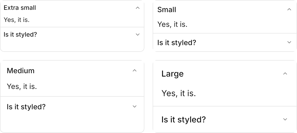
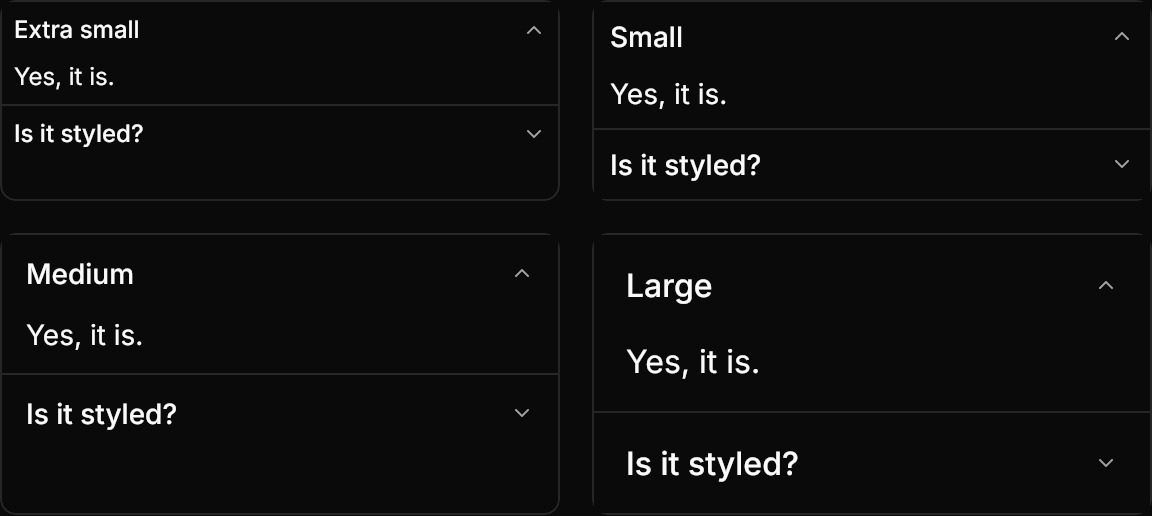
<WrapPanel ItemSpacing="16" LineSpacing="16">
  <Border Classes="accordion" Width="280">
    <StackPanel Classes="accordion">
      <Expander Classes="xsmall" Header="Extra small" Content="Yes, it is." IsExpanded="True" />
      <Expander Classes="xsmall" Header="Is it styled?" Content="Yes, by the theme." />
    </StackPanel>
  </Border>
  <Border Classes="accordion" Width="280">
    <StackPanel Classes="accordion">
      <Expander Classes="small" Header="Small" Content="Yes, it is." IsExpanded="True" />
      <Expander Classes="small" Header="Is it styled?" Content="Yes, by the theme." />
    </StackPanel>
  </Border>
  <Border Classes="accordion" Width="280">
    <StackPanel Classes="accordion">
      <Expander Header="Medium" Content="Yes, it is." IsExpanded="True" />
      <Expander Header="Is it styled?" Content="Yes, by the theme." />
    </StackPanel>
  </Border>
  <Border Classes="accordion" Width="280">
    <StackPanel Classes="accordion">
      <Expander Classes="large" Header="Large" Content="Yes, it is." IsExpanded="True" />
      <Expander Classes="large" Header="Is it styled?" Content="Yes, by the theme." />
    </StackPanel>
  </Border>
</WrapPanel>Without the Border the items keep their separators but have no frame; the last item is disabled.
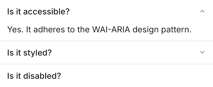
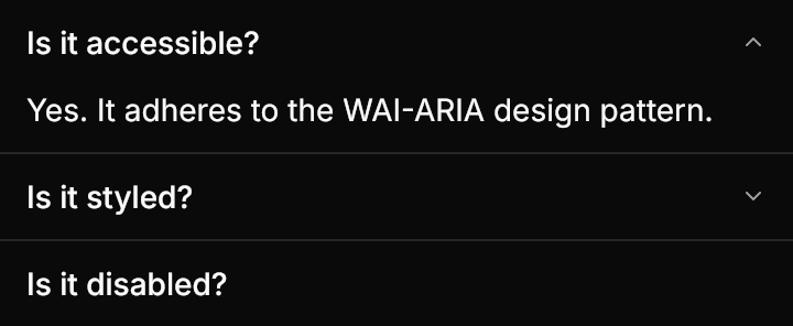
<StackPanel Classes="accordion" Width="360" HorizontalAlignment="Left">
  <Expander Header="Is it accessible?" Content="Yes. It adheres to the WAI-ARIA design pattern." IsExpanded="True" />
  <Expander Header="Is it styled?" Content="Yes. It comes with default styles that match the other components." />
  <Expander Header="Is it disabled?" Content="This item cannot be opened." IsEnabled="False" />
</StackPanel>A header is any content: here an icon and a label in a horizontal StackPanel.
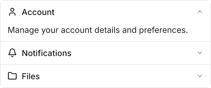
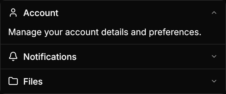
<Border Classes="accordion" Width="360" HorizontalAlignment="Left">
  <StackPanel Classes="accordion">
    <Expander Content="Manage your account details and preferences." IsExpanded="True">
      <Expander.Header>
        <StackPanel Orientation="Horizontal" Spacing="8">
          <PathIcon Data="{StaticResource UIKit.Icon.User}" Width="16" Height="16" />
          <TextBlock Text="Account" VerticalAlignment="Center" />
        </StackPanel>
      </Expander.Header>
    </Expander>
    <Expander Content="Choose which events send you a notification.">
      <Expander.Header>
        <StackPanel Orientation="Horizontal" Spacing="8">
          <PathIcon Data="{StaticResource UIKit.Icon.Bell}" Width="16" Height="16" />
          <TextBlock Text="Notifications" VerticalAlignment="Center" />
        </StackPanel>
      </Expander.Header>
    </Expander>
    <Expander Content="Browse the files in your workspace.">
      <Expander.Header>
        <StackPanel Orientation="Horizontal" Spacing="8">
          <PathIcon Data="{StaticResource UIKit.Icon.Folder}" Width="16" Height="16" />
          <TextBlock Text="Files" VerticalAlignment="Center" />
        </StackPanel>
      </Expander.Header>
    </Expander>
  </StackPanel>
</Border>Not covered
- Exclusive mode, which keeps only one item open at a time (an app can collapse the others itself).