Input Group
A text field with prefix and suffix addons inside one frame.


<TextBox Classes="group" PlaceholderText="Search..." Width="280" HorizontalAlignment="Left">
  <TextBox.InnerLeftContent>
    <PathIcon Data="{StaticResource UIKit.Icon.Search}" />
  </TextBox.InnerLeftContent>
</TextBox>Usage
TextBox Classes="group" is an input group: InnerLeftContent and InnerRightContent are the addons, inside the frame, 6px from the border and 8px from the text. Text addons are muted and medium-weight; a PathIcon or a Button works as well. A Button in the group gets the group's button look on its own: a compact ghost button tinted with muted on hover and press, square with icon-only. The frame's border and background move to their new color over 120ms.
A multi-line group is AcceptsReturn="True", as for the Textarea. An invalid group (Avalonia's :error, set through DataValidationErrors) shows the danger border and ring, even when unfocused or disabled; disabled, the whole group fades to half. Sizes: xsmall, small, large (medium is the default).
Examples
Text addons on both sides, and a read-only field with a suffix.


<StackPanel Spacing="12" Width="280" HorizontalAlignment="Left">
  <TextBox Classes="group" Text="example" InnerLeftContent="https://" InnerRightContent=".com" />
  <TextBox Classes="group" Text="Read only" InnerRightContent="Saving" IsReadOnly="True" />
</StackPanel>Buttons as the suffix: a text button, an icon-only one, and a multi-line group with a Send button.
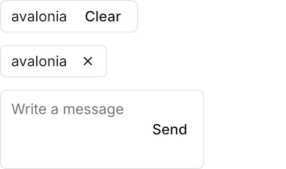
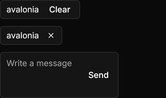
<StackPanel Spacing="12" Width="280" HorizontalAlignment="Left">
  <TextBox Classes="group" Text="avalonia">
    <TextBox.InnerRightContent>
      <Button Content="Clear" />
    </TextBox.InnerRightContent>
  </TextBox>
  <TextBox Classes="group" Text="avalonia">
    <TextBox.InnerRightContent>
      <Button Classes="icon-only">
        <PathIcon Data="{StaticResource UIKit.Icon.Close}" />
      </Button>
    </TextBox.InnerRightContent>
  </TextBox>
  <TextBox Classes="group" AcceptsReturn="True" MinLines="3" MaxLines="3" PlaceholderText="Write a message">
    <TextBox.InnerRightContent>
      <Button Content="Send" />
    </TextBox.InnerRightContent>
  </TextBox>
</StackPanel>An invalid group and a disabled one. The demo sets DataValidationErrors.Errors from a static helper that holds one validation message; an app gets its errors from its bindings' validation instead.


<StackPanel Spacing="12" Width="280" HorizontalAlignment="Left">
  <TextBox Classes="group" Text="not an email"
           DataValidationErrors.Errors="{x:Static demos:ValidationErrors.InvalidEmail}">
    <TextBox.InnerLeftContent>
      <PathIcon Data="{StaticResource UIKit.Icon.Search}" />
    </TextBox.InnerLeftContent>
  </TextBox>
  <TextBox Classes="group" PlaceholderText="Search..." IsEnabled="False">
    <TextBox.InnerLeftContent>
      <PathIcon Data="{StaticResource UIKit.Icon.Search}" />
    </TextBox.InnerLeftContent>
  </TextBox>
</StackPanel>Not covered
BlockStart/BlockEndaddons above and below the field.