Color Picker
Avalonia's ColorPicker as a swatch or an input field with a popover, from the AvaloniaUIKit.ColorPicker package.
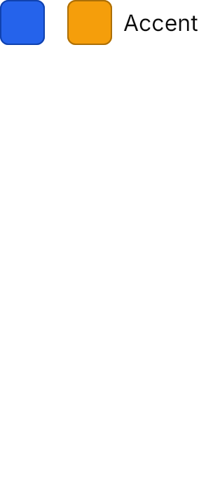

<Panel MinHeight="340">
  <StackPanel Orientation="Horizontal" Spacing="16" HorizontalAlignment="Left" VerticalAlignment="Top">
    <ColorPicker Color="#2563EB" />
    <ColorPicker Color="#F59E0B" Content="Accent" />
  </StackPanel>
</Panel>Usage
Avalonia's ColorPicker is a separate package, so its theme is too: add AvaloniaUIKit.ColorPicker and put NovaColorPickerTheme after NovaTheme in the application's styles.
<Application xmlns="https://github.com/avaloniaui"
             xmlns:uikit="clr-namespace:AvaloniaUIKit;assembly=AvaloniaUIKit"
             xmlns:uikitcolor="clr-namespace:AvaloniaUIKit;assembly=AvaloniaUIKit.ColorPicker">
  <Application.Styles>
    <uikit:NovaTheme />
    <uikitcolor:NovaColorPickerTheme />
  </Application.Styles>
</Application>
ColorPicker with a Color is a square swatch of the color with a border of the color darkened 30% and its hex as a tooltip; Content puts a label 8px after it. Classes="field" makes it an input frame with a small swatch, the hex and a caret, ringed while focused. Both open a 288px popover below with the palette (the control's Palette, Avalonia's FluentColorPalette by default) and the color's components on two segmented tabs, and the color with its editable hex under them.
| Class | Effect |
|---|---|
xsmall, small, large | A swatch of 16, 20 and 44px; medium, the default, is 32px |
field | An input field instead of the swatch |
Examples
The four swatch sizes.


<Panel MinHeight="350">
  <StackPanel Orientation="Horizontal" Spacing="16" HorizontalAlignment="Left" VerticalAlignment="Top">
    <ColorPicker Classes="xsmall" Color="#2563EB" VerticalAlignment="Center" />
    <ColorPicker Classes="small" Color="#2563EB" VerticalAlignment="Center" />
    <ColorPicker Color="#2563EB" VerticalAlignment="Center" />
    <ColorPicker Classes="large" Color="#2563EB" VerticalAlignment="Center" />
  </StackPanel>
</Panel>The field class in a column of 200px fields.
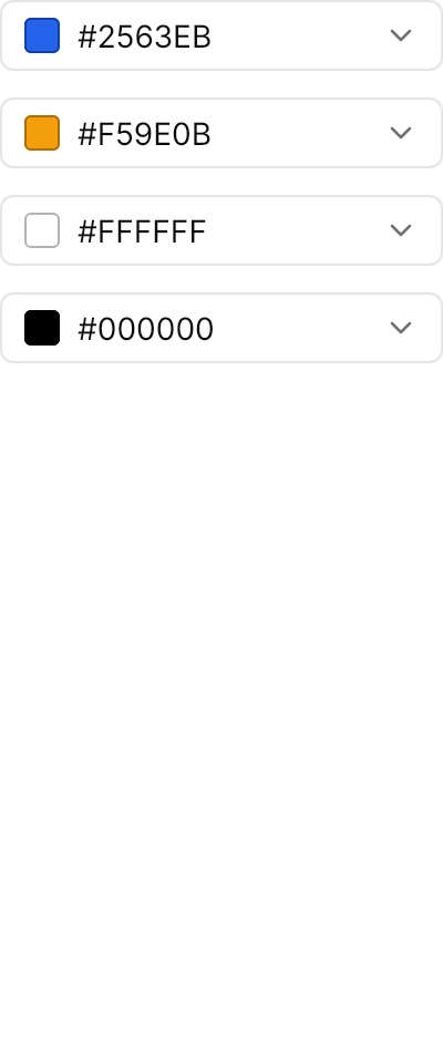
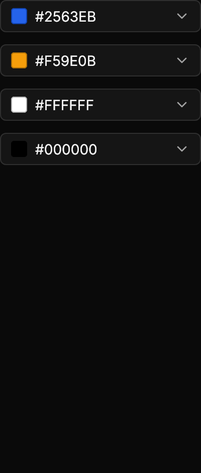
<Panel MinHeight="470">
  <StackPanel Spacing="12" Width="200" HorizontalAlignment="Left" VerticalAlignment="Top">
    <ColorPicker Classes="field" Color="#2563EB" />
    <ColorPicker Classes="field" Color="#F59E0B" />
    <ColorPicker Classes="field" Color="#FFFFFF" />
    <ColorPicker Classes="field" Color="#000000" />
  </StackPanel>
</Panel>Not covered
- A palette with a featured row, and HSL sliders; Avalonia's
FluentColorPaletteand RGB / HSV components are used instead. - A placeholder for no color:
Coloralways has a value.