Tooltip
A tooltip bubble, fading and sliding in above its trigger, as ToolTip.
ExampleInteractive
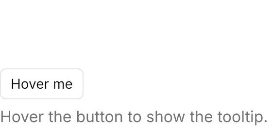
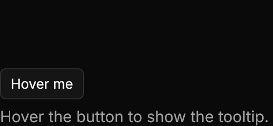
<Panel MinWidth="280" MinHeight="130">
  <StackPanel Spacing="8" HorizontalAlignment="Left" VerticalAlignment="Bottom">
    <Button Content="Hover me" ToolTip.Tip="Tooltip text" HorizontalAlignment="Left" />
    <TextBlock Text="Hover the button to show the tooltip." Foreground="{DynamicResource UIKit.MutedForeground}" />
  </StackPanel>
</Panel>Usage
The theme covers ToolTip in full: the popover background with a 1px border and a shadow, 2px by 8px of padding and 14px text, fading in and sliding up 4px over 150ms. Set ToolTip.Tip on any control.
The theme sets the timing and placement on every control: a tooltip shows after 500ms (ToolTip.ShowDelay), or at once within 300ms of another tooltip closing (ToolTip.BetweenShowDelay), and opens above its trigger, centered (ToolTip.Placement="Top"). Set ToolTip.Placement on a control to open its tooltip on another side.
Examples
ToolTip.Placement on each button: the default top, then bottom, left and right.


<Panel MinWidth="520" MinHeight="170">
  <StackPanel Orientation="Horizontal" Spacing="8" HorizontalAlignment="Center" VerticalAlignment="Center">
    <Button Classes="outline" Content="Top" ToolTip.Tip="Above the trigger" />
    <Button Classes="outline" Content="Bottom" ToolTip.Tip="Below the trigger" ToolTip.Placement="Bottom" />
    <Button Classes="outline" Content="Left" ToolTip.Tip="On the left" ToolTip.Placement="Left" />
    <Button Classes="outline" Content="Right" ToolTip.Tip="On the right" ToolTip.Placement="Right" />
  </StackPanel>
</Panel>A tooltip as the label of icon-only buttons.


<Panel MinWidth="240" MinHeight="96">
  <StackPanel Orientation="Horizontal" Spacing="4" HorizontalAlignment="Left" VerticalAlignment="Bottom">
    <Button Classes="icon-only ghost" ToolTip.Tip="Copy">
      <PathIcon Data="{StaticResource UIKit.Icon.Copy}" />
    </Button>
    <Button Classes="icon-only ghost" ToolTip.Tip="Search">
      <PathIcon Data="{StaticResource UIKit.Icon.Search}" />
    </Button>
    <Button Classes="icon-only ghost" ToolTip.Tip="Notifications">
      <PathIcon Data="{StaticResource UIKit.Icon.Bell}" />
    </Button>
    <Button Classes="icon-only ghost" ToolTip.Tip="Open in browser">
      <PathIcon Data="{StaticResource UIKit.Icon.ExternalLink}" />
    </Button>
  </StackPanel>
</Panel>Not covered
- Looking up a command's key binding to show in the tooltip.
- The grace period before closing.
- The slide between neighbouring tooltips.