Number Input
A numeric field with minus and plus buttons, as NumericUpDown.
ExampleInteractive
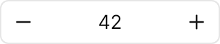

<NumericUpDown Value="42" Width="160" HorizontalAlignment="Left" />Usage
The theme covers NumericUpDown (and ButtonSpinner) in full: the input frame with the decrease button before the value, the text centred between the buttons, and the increase button after it. The buttons stay at the sides by contract: ButtonSpinnerLocation has no effect. Value, Minimum, Maximum, Increment and FormatString are Avalonia's own. The frame shows the ring while anything in it has focus; a disabled field fades as a whole to 50%. Sizes: xsmall (20px), small (24px), medium (32px, the default) and large (44px).
Examples
The four sizes.
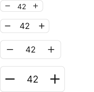
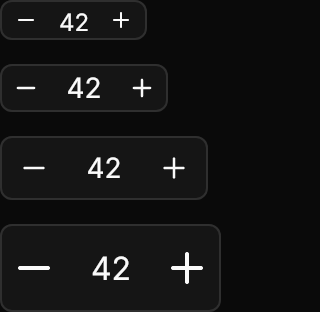
<StackPanel Spacing="12" Width="160" HorizontalAlignment="Left">
  <NumericUpDown Classes="xsmall" Value="42" />
  <NumericUpDown Classes="small" Value="42" />
  <NumericUpDown Value="42" />
  <NumericUpDown Classes="large" Value="42" />
</StackPanel>A range of 0 to 100 in steps of 10, a decimal field with Increment="0.5" and FormatString="0.0", and a disabled one.
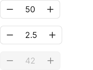
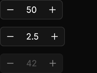
<StackPanel Spacing="12" Width="160" HorizontalAlignment="Left">
  <NumericUpDown Value="50" Minimum="0" Maximum="100" Increment="10" />
  <NumericUpDown Value="2.5" Minimum="0" Maximum="10" Increment="0.5" FormatString="0.0" />
  <NumericUpDown Value="42" IsEnabled="False" />
</StackPanel>Not covered
ButtonSpinnerLocation: the buttons stay at the [−] value [+] positions.- Normalising the value and computing the step dynamically.