GPUI Kit's look and motion, for Avalonia
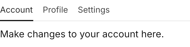
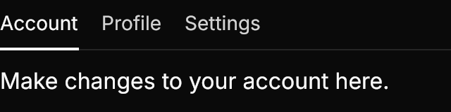
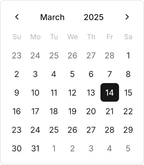
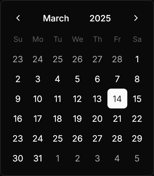
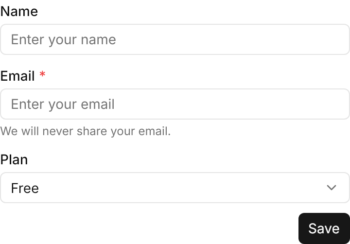
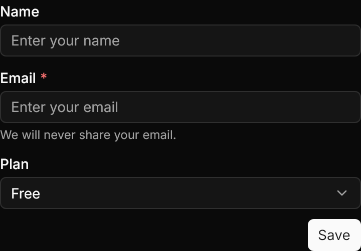
Avalonia themes and controls that reproduce the look and motion of GPUI Kit components. Every theme is verified pixel by pixel against GPUI Kit's own renders.


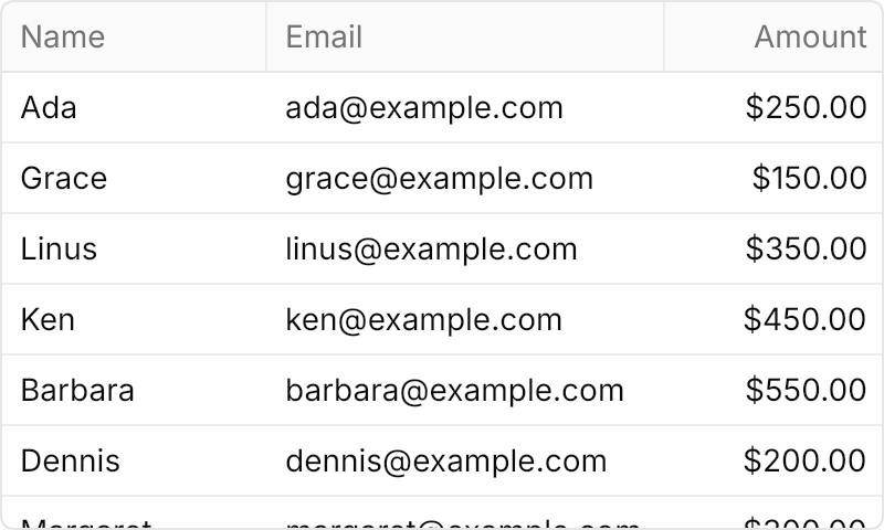
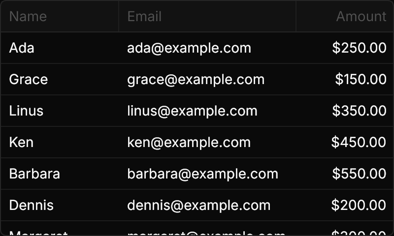




Verified pixel by pixel
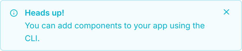
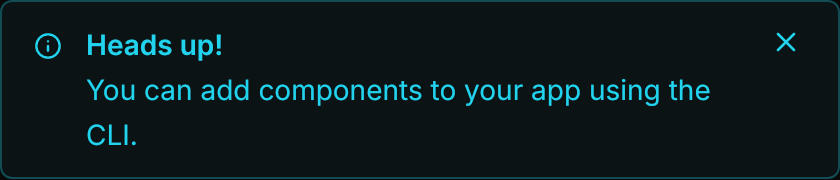
Every theme is compared with GPUI Kit's own renders: Light and Dark, each variant, size and state, and the motion frame by frame.
67 components
Themes for Avalonia's own controls, plus small new controls (Badge, Tag, Alert, Avatar, Stepper and more) for what Avalonia lacks.
NativeAOT ready
Compiled bindings, no reflection. A NativeAOT smoke test renders every control in both themes on each change.
Light and dark
Switch with RequestedThemeVariant. The color tokens are generated from GPUI Kit's Default Light and Default Dark themes.
One line to install
Add <uikit:GpuiTheme /> to App.axaml. It works on its own, or layered on top of FluentTheme for the controls it does not cover.
Your font, not ours
The theme uses the platform's UI font by default. Set Gpui.FontFamily to Inter for GPUI Kit's exact proportions.