Collapsible
A header that reveals its content at its natural height, on a spring.
ExampleInteractive
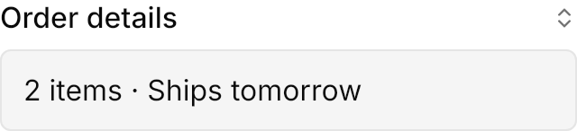

<!-- The class reveal animates the content's height; without it the content appears at once. -->
<Expander Theme="{StaticResource UIKitCollapsible}" Classes="reveal" IsExpanded="True" Width="320" HorizontalAlignment="Left">
  <Expander.Header>
    <DockPanel>
      <PathIcon DockPanel.Dock="Right" Data="{StaticResource UIKit.Icon.ChevronsUpDown}" Width="14" Height="14"
                Foreground="{DynamicResource UIKit.MutedForeground}" />
      <TextBlock Text="Order details" FontWeight="Medium" VerticalAlignment="Center" />
    </DockPanel>
  </Expander.Header>
  <Border Margin="0,8,0,0" Padding="12" CornerRadius="5.5" BorderThickness="1" BackgroundSizing="OuterBorderEdge"
          Background="{DynamicResource UIKit.Muted}" BorderBrush="{DynamicResource UIKit.Border}">
    <TextBlock Text="2 items · Ships tomorrow" />
  </Border>
</Expander>Usage
Give an Expander the named theme: Theme="{StaticResource UIKitCollapsible}". It has no chrome of its own: the header is the trigger and the content is whatever the app puts there. With the reveal class the content opens and closes at its natural height on UIKit.Spring.Control and reverses smoothly when toggled midway; without the class it appears and disappears at once. ExpandDirection="Up" puts the content before the trigger.
Examples
ExpandDirection="Up" reveals the content above the trigger.


<!-- ExpandDirection Up puts the content before the trigger. -->
<Expander Theme="{StaticResource UIKitCollapsible}" Classes="reveal" ExpandDirection="Up" IsExpanded="True" Width="320" HorizontalAlignment="Left">
  <Expander.Header>
    <DockPanel>
      <PathIcon DockPanel.Dock="Right" Data="{StaticResource UIKit.Icon.ChevronsUpDown}" Width="14" Height="14"
                Foreground="{DynamicResource UIKit.MutedForeground}" />
      <TextBlock Text="Show less" FontWeight="Medium" VerticalAlignment="Center" />
    </DockPanel>
  </Expander.Header>
  <Border Margin="0,0,0,8" Padding="12" CornerRadius="5.5" BorderThickness="1" BackgroundSizing="OuterBorderEdge"
          Background="{DynamicResource UIKit.Muted}" BorderBrush="{DynamicResource UIKit.Border}">
    <TextBlock Text="Revealed above the trigger." />
  </Border>
</Expander>Not covered
- Nothing: the control's look and motion are covered in full.