Textarea
A multi-line input in the Input's frame, as TextBox with AcceptsReturn.
ExampleInteractive


<TextBox AcceptsReturn="True" MinLines="3" MaxLines="3" PlaceholderText="Write a message"
Width="280" HorizontalAlignment="Left" />Usage
TextBox AcceptsReturn="True" is the textarea. It has no fixed height: give it rows with MinLines and MaxLines, or a Height. The theme wraps the text (TextWrapping="Wrap"), aligns it to the top and pads it inside the scrolling area rather than the frame, so the overlay scrollbar runs along the whole inner frame. The frame, the placeholder, the focus ring and the disabled look are the Input's. Sizes: xsmall, small, large (medium is the default).
Examples
MinLines="2" MaxLines="5": the field grows with its text from two to five lines, then scrolls.
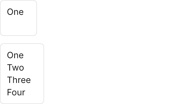

<StackPanel Spacing="12" Width="280" HorizontalAlignment="Left">
<TextBox AcceptsReturn="True" MinLines="2" MaxLines="5" Text="One" />
<TextBox AcceptsReturn="True" MinLines="2" MaxLines="5" Text="One Two Three Four" />
</StackPanel>The four sizes, each two lines tall.
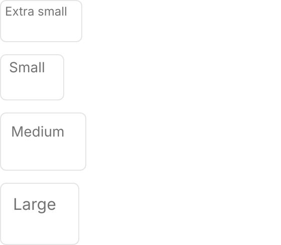
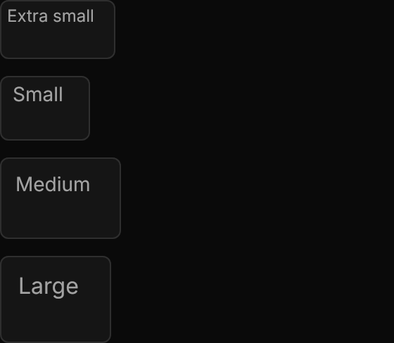
<StackPanel Spacing="12" Width="280" HorizontalAlignment="Left">
  <TextBox Classes="xsmall" AcceptsReturn="True" MinLines="2" MaxLines="2" PlaceholderText="Extra small" />
  <TextBox Classes="small" AcceptsReturn="True" MinLines="2" MaxLines="2" PlaceholderText="Small" />
  <TextBox AcceptsReturn="True" MinLines="2" MaxLines="2" PlaceholderText="Medium" />
  <TextBox Classes="large" AcceptsReturn="True" MinLines="2" MaxLines="2" PlaceholderText="Large" />
</StackPanel>Read-only and disabled textareas.


<StackPanel Spacing="12" Width="280" HorizontalAlignment="Left">
<TextBox AcceptsReturn="True" MinLines="3" MaxLines="3" Text="Read only notes" IsReadOnly="True" />
<TextBox AcceptsReturn="True" MinLines="3" MaxLines="3" Text="Disabled" IsEnabled="False" />
</StackPanel>Not covered
- The search UI.
- Inline tokens.