Data Table
A data table as Avalonia's TableView, or DataGrid with the AvaloniaUIKit.DataGrid package.
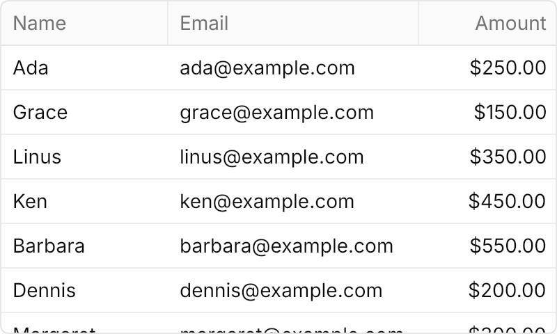
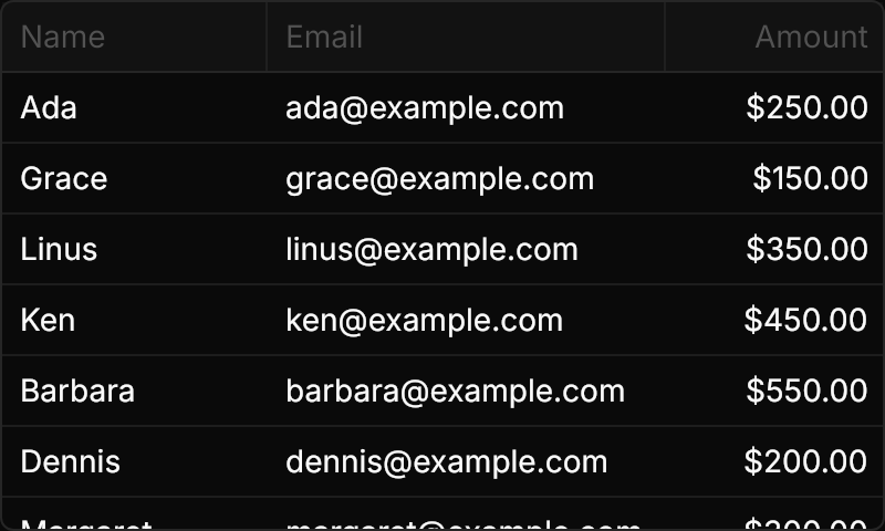
<TableView Width="400" Height="240" HorizontalAlignment="Left"
           ItemsSource="{x:Static local:Person.Samples}">
  <TableView.Columns>
    <TableViewColumn Header="Name" Binding="{Binding Name}" Width="120" />
    <TableViewColumn Header="Email" Binding="{Binding Email}" Width="180" />
    <TableViewColumn Header="Amount" Binding="{Binding Amount}" Width="100" HorizontalContentAlignment="Right" />
  </TableView.Columns>
</TableView>Usage
TableView has the data table look by default: a bordered box with the theme radius, a header band with a rule under it, rows of a fixed height with a rule under each, the hover and selection fills, resize handles on the header edges and overlay scrollbars. Columns are TableViewColumns with a Header and a Binding; give them pixel Widths, and HorizontalContentAlignment="Right" for numbers. The plain table is the same control with Theme="{StaticResource UIKitTable}": see Table.
| Class | Effect |
|---|---|
stripe | Every other row on the even color, and empty striped rows below the last one. |
borderless | No border and no fill around the rows. |
xsmall | 26px rows, 4×2 cell padding, 12px text. |
small | 30px rows, 6×3 cell padding. |
large | 40px rows, 12×8 cell padding, 16px text. |
The default is 32px rows with 8×4 padding and 14px text.
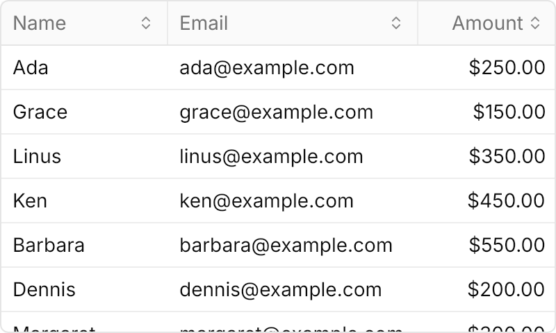
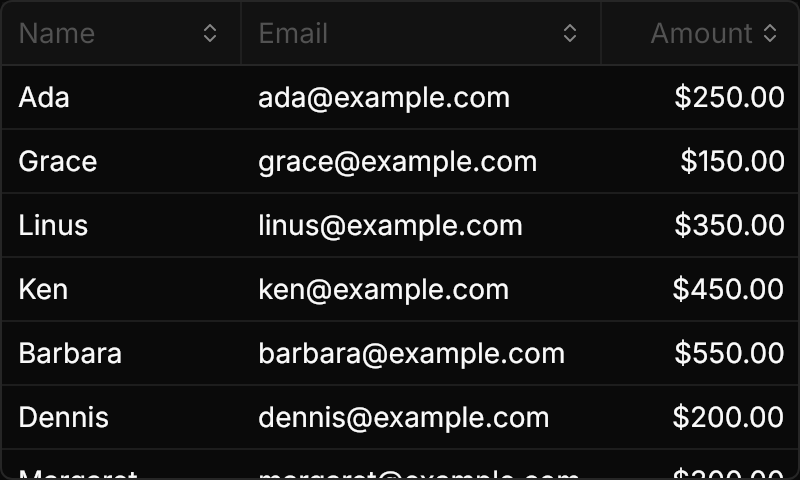
For DataGrid (the Avalonia.Controls.DataGrid package), add NovaDataGridTheme from the AvaloniaUIKit.DataGrid package to the application's styles after NovaTheme. The grid takes the same look, with what DataGrid has of its own: sort indicators in the headers, column resizing and reordering. Set IsReadOnly="True" for a table that only displays (a click edits a cell otherwise) and CanUserResizeColumns="True" (off by default); right-align a column with CellStyleClasses="text-right" and a right-aligned header. The stripe, borderless and size classes are the same.
Examples
Classes="stripe" fills every other row and continues the stripes below the last row.
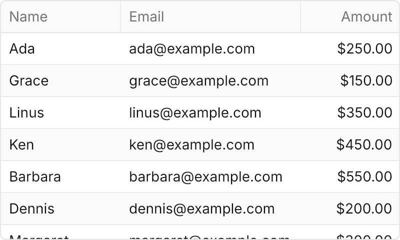
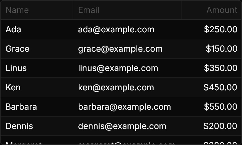
<TableView Classes="stripe" Width="400" Height="240" HorizontalAlignment="Left"
           ItemsSource="{x:Static local:Person.Samples}">
  <TableView.Columns>
    <TableViewColumn Header="Name" Binding="{Binding Name}" Width="120" />
    <TableViewColumn Header="Email" Binding="{Binding Email}" Width="180" />
    <TableViewColumn Header="Amount" Binding="{Binding Amount}" Width="100" HorizontalContentAlignment="Right" />
  </TableView.Columns>
</TableView>small and large change the row height, the cell padding and (for large) the text size.
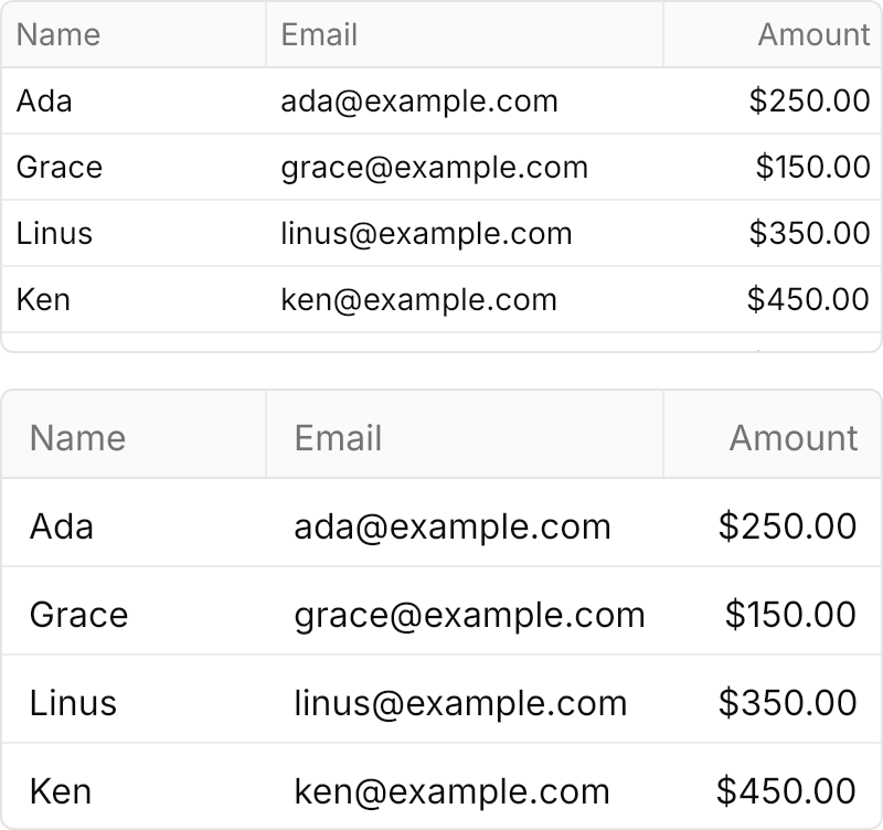
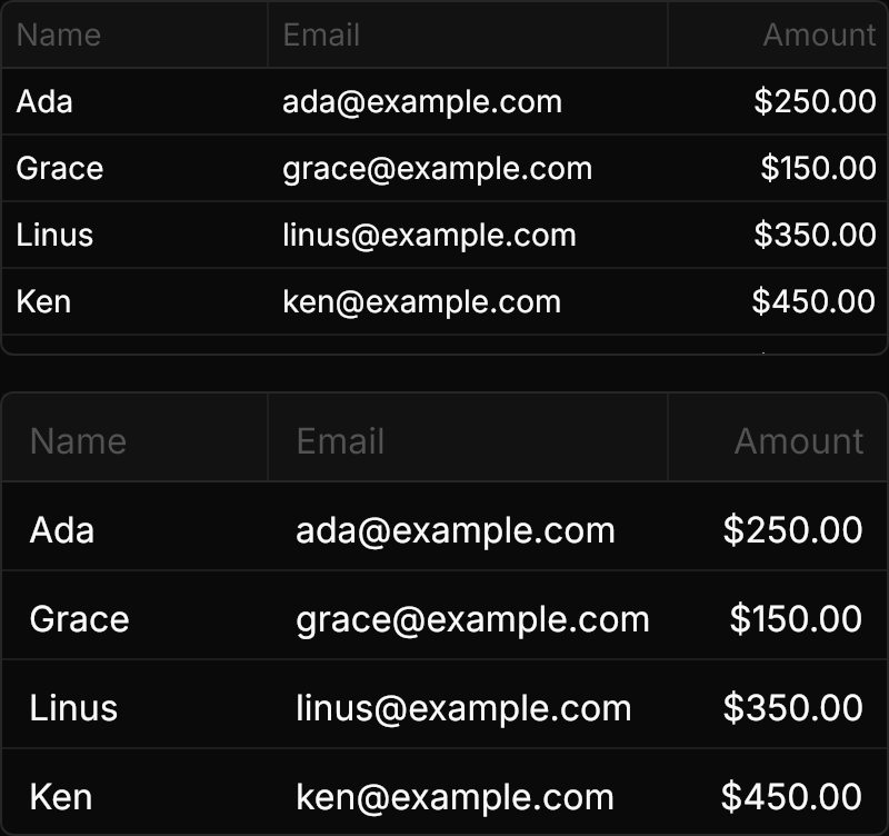
<StackPanel Spacing="16" HorizontalAlignment="Left">
  <TableView Classes="small" Width="400" Height="160" ItemsSource="{x:Static local:Person.Samples}">
    <TableView.Columns>
      <TableViewColumn Header="Name" Binding="{Binding Name}" Width="120" />
      <TableViewColumn Header="Email" Binding="{Binding Email}" Width="180" />
      <TableViewColumn Header="Amount" Binding="{Binding Amount}" Width="100" HorizontalContentAlignment="Right" />
    </TableView.Columns>
  </TableView>
  <TableView Classes="large" Width="400" Height="200" ItemsSource="{x:Static local:Person.Samples}">
    <TableView.Columns>
      <TableViewColumn Header="Name" Binding="{Binding Name}" Width="120" />
      <TableViewColumn Header="Email" Binding="{Binding Email}" Width="180" />
      <TableViewColumn Header="Amount" Binding="{Binding Amount}" Width="100" HorizontalContentAlignment="Right" />
    </TableView.Columns>
  </TableView>
</StackPanel>DataGrid with NovaDataGridTheme: read-only, sortable from the headers, resizable columns, and an amount column right-aligned with CellStyleClasses="text-right".
<DataGrid Width="400" Height="240" HorizontalAlignment="Left"
          ItemsSource="{x:Static local:Person.Samples}"
          IsReadOnly="True" CanUserSortColumns="True" CanUserResizeColumns="True" CanUserReorderColumns="False">
  <DataGrid.Columns>
    <DataGridTextColumn Header="Name" Binding="{Binding Name}" Width="120" />
    <DataGridTextColumn Header="Email" Binding="{Binding Email}" Width="180" />
    <DataGridTextColumn Header="Amount" Binding="{Binding Amount}" Width="100" CellStyleClasses="text-right">
      <DataGridTextColumn.Header>
        <TextBlock Text="Amount" HorizontalAlignment="Right" />
      </DataGridTextColumn.Header>
    </DataGridTextColumn>
  </DataGrid.Columns>
</DataGrid>Not covered
- Sorting, moving and pinning columns in
TableView(DataGrid has its own). - Cell range selection.
- Infinite loading.
- The frame around a right-clicked row (Avalonia selects the row on the right button).
- NativeAOT with
DataGrid, which is not trimmable itself.