Scrollable
Overlay scrollbars, as Avalonia's ScrollViewer.
ExampleInteractive
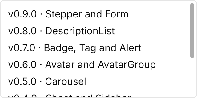
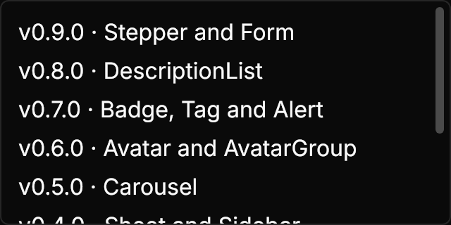
<!-- AllowAutoHide False keeps the scrollbar shown. -->
<Border BorderBrush="{DynamicResource UIKit.Border}" BorderThickness="1" CornerRadius="5.5" Width="320" Height="160" HorizontalAlignment="Left">
  <ScrollViewer AllowAutoHide="False">
    <StackPanel Spacing="8" Margin="12">
      <TextBlock Text="v0.9.0 · Stepper and Form" />
      <TextBlock Text="v0.8.0 · DescriptionList" />
      <TextBlock Text="v0.7.0 · Badge, Tag and Alert" />
      <TextBlock Text="v0.6.0 · Avatar and AvatarGroup" />
      <TextBlock Text="v0.5.0 · Carousel" />
      <TextBlock Text="v0.4.0 · Sheet and Sidebar" />
      <TextBlock Text="v0.3.0 · Table" />
      <TextBlock Text="v0.2.0 · Calendar" />
      <TextBlock Text="v0.1.0 · Initial release" />
    </StackPanel>
  </ScrollViewer>
</Border>Usage
The theme covers ScrollViewer, ScrollBar and Thumb in full, so every scrolling control gets these scrollbars. They overlay the content in a 16px strip; the thumb is 6px wide with rounded ends and, under the pointer or while dragged, takes the hover color at once and widens to 8px over 300ms. Two properties on the ScrollViewer pick one of three modes.
| Mode | AllowAutoHide | uikit:Scrollbars.ShowOnHover | Behaviour |
|---|---|---|---|
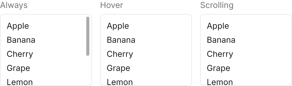
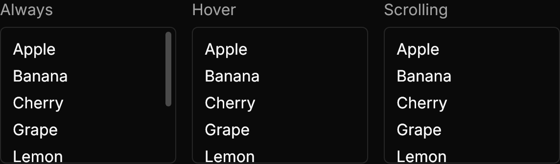
| Always | False | – | The scrollbar always shows. |
| Hover (the default) | True | True | Shows when the pointer enters the strip or the content scrolls, fading in over 300ms; hides 2s after the pointer leaves or the scrolling stops, fading and sliding out to its edge over 500ms. |
| Scrolling | True | False | Shows only after a scroll, and stays while the pointer moves over it. |
Pointed at straight on the thumb, a hidden bar slides in from its edge as it fades in.
Examples
The three modes side by side.
<StackPanel Orientation="Horizontal" Spacing="16" HorizontalAlignment="Left">
  <StackPanel Spacing="8">
    <TextBlock Text="Always" Foreground="{DynamicResource UIKit.MutedForeground}" />
    <Border BorderBrush="{DynamicResource UIKit.Border}" BorderThickness="1" CornerRadius="5.5" Width="180" Height="140">
      <ScrollViewer AllowAutoHide="False">
        <StackPanel Spacing="8" Margin="12">
          <TextBlock Text="Apple" />
          <TextBlock Text="Banana" />
          <TextBlock Text="Cherry" />
          <TextBlock Text="Grape" />
          <TextBlock Text="Lemon" />
          <TextBlock Text="Mango" />
          <TextBlock Text="Orange" />
          <TextBlock Text="Peach" />
        </StackPanel>
      </ScrollViewer>
    </Border>
  </StackPanel>
  <StackPanel Spacing="8">
    <TextBlock Text="Hover" Foreground="{DynamicResource UIKit.MutedForeground}" />
    <Border BorderBrush="{DynamicResource UIKit.Border}" BorderThickness="1" CornerRadius="5.5" Width="180" Height="140">
      <ScrollViewer AllowAutoHide="True">
        <StackPanel Spacing="8" Margin="12">
          <TextBlock Text="Apple" />
          <TextBlock Text="Banana" />
          <TextBlock Text="Cherry" />
          <TextBlock Text="Grape" />
          <TextBlock Text="Lemon" />
          <TextBlock Text="Mango" />
          <TextBlock Text="Orange" />
          <TextBlock Text="Peach" />
        </StackPanel>
      </ScrollViewer>
    </Border>
  </StackPanel>
  <StackPanel Spacing="8">
    <TextBlock Text="Scrolling" Foreground="{DynamicResource UIKit.MutedForeground}" />
    <Border BorderBrush="{DynamicResource UIKit.Border}" BorderThickness="1" CornerRadius="5.5" Width="180" Height="140">
      <ScrollViewer AllowAutoHide="True" uikit:Scrollbars.ShowOnHover="False">
        <StackPanel Spacing="8" Margin="12">
          <TextBlock Text="Apple" />
          <TextBlock Text="Banana" />
          <TextBlock Text="Cherry" />
          <TextBlock Text="Grape" />
          <TextBlock Text="Lemon" />
          <TextBlock Text="Mango" />
          <TextBlock Text="Orange" />
          <TextBlock Text="Peach" />
        </StackPanel>
      </ScrollViewer>
    </Border>
  </StackPanel>
</StackPanel>A horizontal scrollbar, with HorizontalScrollBarVisibility="Auto".


<Border BorderBrush="{DynamicResource UIKit.Border}" BorderThickness="1" CornerRadius="5.5" Width="400" Height="120" HorizontalAlignment="Left">
  <ScrollViewer HorizontalScrollBarVisibility="Auto" VerticalScrollBarVisibility="Disabled" AllowAutoHide="False">
    <StackPanel Orientation="Horizontal" Spacing="12" Margin="12">
      <Border Width="120" Height="64" CornerRadius="5.5" Background="{DynamicResource UIKit.Muted}" />
      <Border Width="120" Height="64" CornerRadius="5.5" Background="{DynamicResource UIKit.Muted}" />
      <Border Width="120" Height="64" CornerRadius="5.5" Background="{DynamicResource UIKit.Muted}" />
      <Border Width="120" Height="64" CornerRadius="5.5" Background="{DynamicResource UIKit.Muted}" />
      <Border Width="120" Height="64" CornerRadius="5.5" Background="{DynamicResource UIKit.Muted}" />
      <Border Width="120" Height="64" CornerRadius="5.5" Background="{DynamicResource UIKit.Muted}" />
    </StackPanel>
  </ScrollViewer>
</Border>Not covered
- Nothing: the control's look and motion are covered in full.