Radio
A radio button, with the dot fading in on a spring.
ExampleInteractive
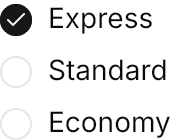
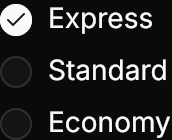
<StackPanel Spacing="8">
  <RadioButton Content="Express" GroupName="shipping" IsChecked="True" />
  <RadioButton Content="Standard" GroupName="shipping" />
  <RadioButton Content="Economy" GroupName="shipping" />
</StackPanel>Usage
The theme covers RadioButton in full: the circle with the label after it, the dot fading in on UIKit.Spring.Control. Buttons with the same GroupName select one of them; there is no separate RadioGroup type. Sizes: xsmall, small, large (medium is the default). As with the checkbox, a RadioButton without Content drops the label, and the focus ring shows on keyboard focus only.
Examples
The four sizes; each is in its own group here so that all four can be checked.


<WrapPanel ItemSpacing="16" LineSpacing="8">
  <RadioButton Classes="xsmall" Content="Extra small" GroupName="xsmall" IsChecked="True" />
  <RadioButton Classes="small" Content="Small" GroupName="small" IsChecked="True" />
  <RadioButton Content="Medium" GroupName="medium" IsChecked="True" />
  <RadioButton Classes="large" Content="Large" GroupName="large" IsChecked="True" />
</WrapPanel>IsEnabled="False" fades the circle, the dot and the label.
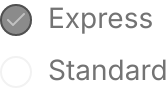
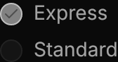
<StackPanel Spacing="8">
  <RadioButton Content="Express" GroupName="disabled" IsChecked="True" IsEnabled="False" />
  <RadioButton Content="Standard" GroupName="disabled" IsEnabled="False" />
</StackPanel>Not covered
- Nothing: the control's look and motion are covered in full.