Calendar
A month view in a bordered card, with month and year pickers.
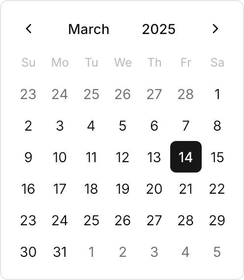
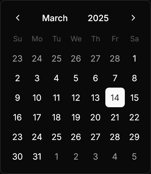
<Calendar SelectedDate="2025-03-14" DisplayDate="2025-03-14" HorizontalAlignment="Left" />Usage
The theme covers Calendar with its CalendarItem, CalendarDayButton and CalendarButton: a bordered card with 12px of padding, a header with the previous and next buttons and the month and year between them, the muted weekday titles, and the days. SelectedDate and DisplayDate are Avalonia's; FirstDayOfWeek starts the week on another day, and SelectionMode allows a range. Today is always marked in the accent; leave IsTodayHighlighted on.
Day states: days outside the month are muted, today is accent, a hovered day is UIKit.SecondaryHover, the selected day is primary, and a blackout date is muted at half strength without a hover. DisplayMode="Year" shows the months grid in three columns of full month names, with the selected month in primary; Avalonia's header acts as one button.
| Class | Cells | Width |
|---|---|---|
small | 28px | 220px |
| (medium) | 32px | 248px |
large | 40px | 304px |
Examples
The small and large calendars.
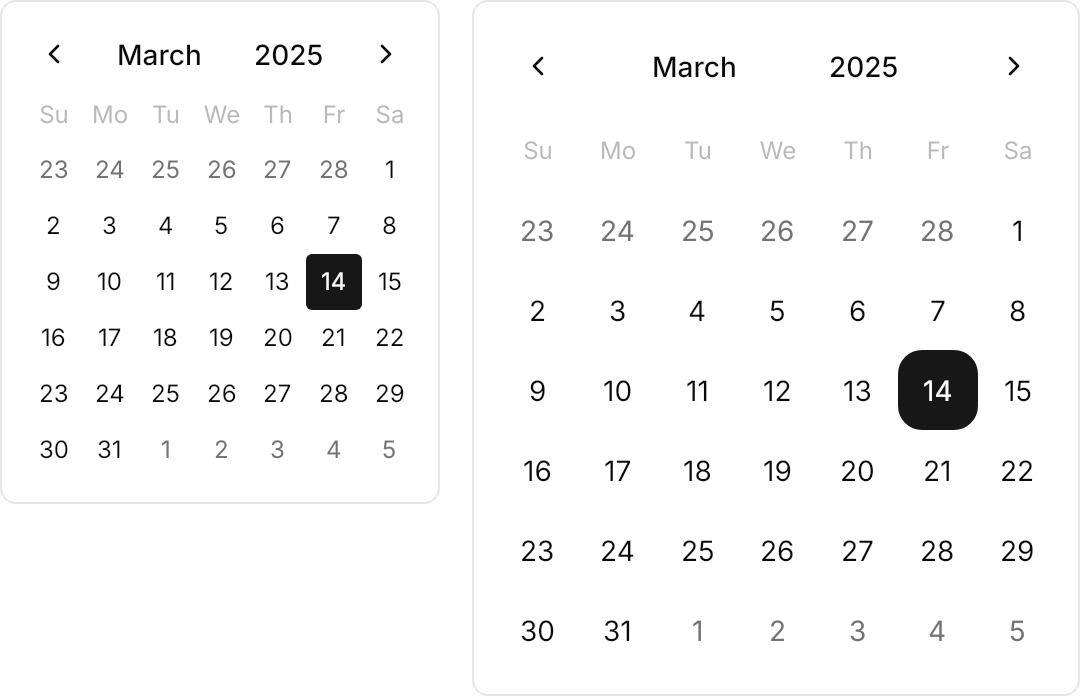
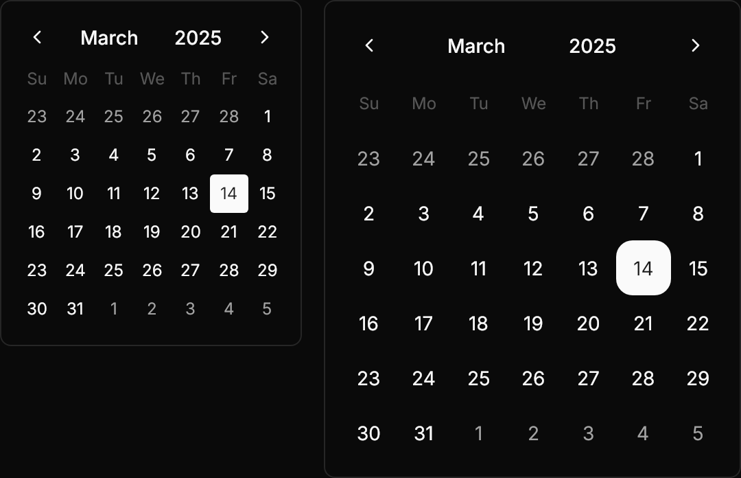
<WrapPanel ItemSpacing="16" LineSpacing="16">
  <Calendar Classes="small" SelectedDate="2025-03-14" DisplayDate="2025-03-14" VerticalAlignment="Top" />
  <Calendar Classes="large" SelectedDate="2025-03-14" DisplayDate="2025-03-14" VerticalAlignment="Top" />
</WrapPanel>The months grid, as DisplayMode="Year" shows it.
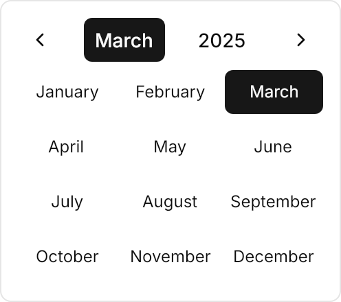
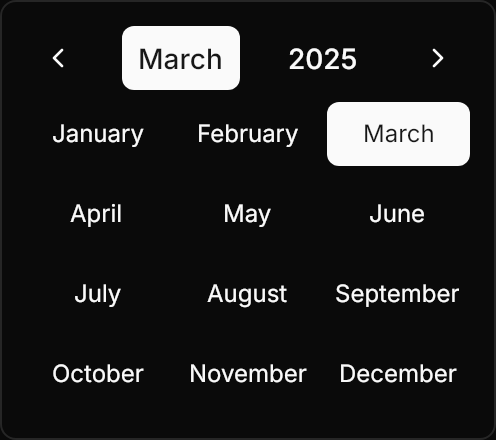
<Calendar DisplayMode="Year" SelectedDate="2025-03-14" DisplayDate="2025-03-14" HorizontalAlignment="Left" />FirstDayOfWeek="Monday" reorders the weekday titles and the grid.
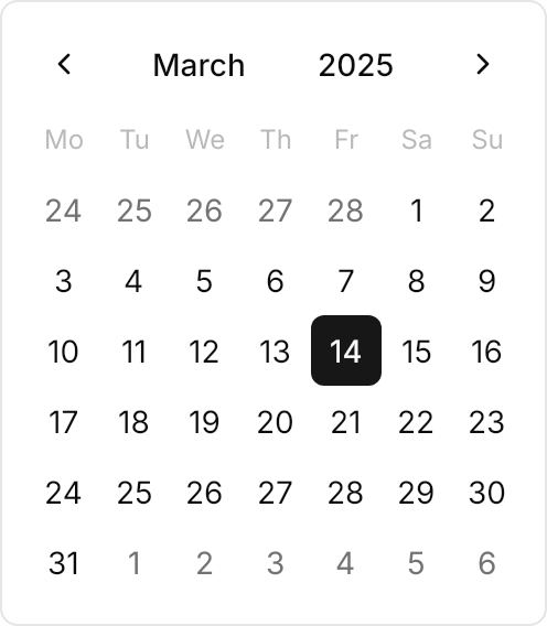
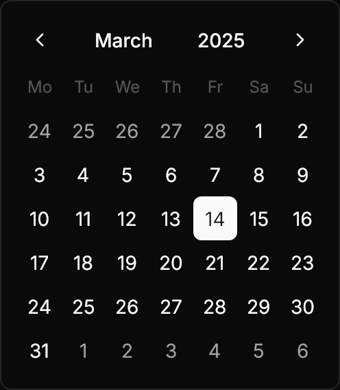
<Calendar FirstDayOfWeek="Monday" SelectedDate="2025-03-14" DisplayDate="2025-03-14" HorizontalAlignment="Left" />Not covered
- Showing several months side by side.
- The 20-year grid: Avalonia's decade view shows 12 years.
- 4 to 6 week rows per month: Avalonia always shows 6.