Marker
A muted status line with an icon or a spinner, and optional separators.
ExampleInteractive


<StackPanel Spacing="16" Width="420" HorizontalAlignment="Left">
  <uikit:Marker Content="Conversation archived">
    <uikit:Marker.Icon>
      <PathIcon Data="{StaticResource UIKit.Icon.Info}" />
    </uikit:Marker.Icon>
  </uikit:Marker>
  <uikit:Marker Classes="separator" Content="Today" />
  <uikit:Marker Classes="border" Content="Earlier messages" />
</StackPanel>Usage
uikit:Marker is a muted row of 14px text for a conversation or a timeline: an Icon in a 16px box, then the content, 8px apart. HorizontalContentAlignment places the row: Left (the default), Center or Right. While IsLoading, and there is no icon, a small spinner leads instead.
| Class | Meaning |
|---|---|
separator | 1px lines in the border color fill the rest of the row, on both sides of the content when centered or on one side when aligned to an end. |
border | A bottom border, with 8px under the row. |
shimmer | While loading, a text content shimmers instead of the spinner (other content pulses). |
Examples
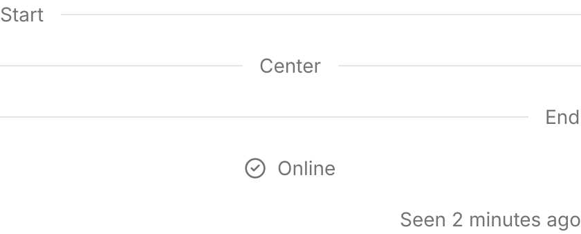
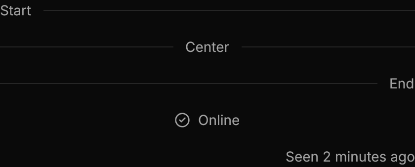
HorizontalContentAlignment places the content and its separators at the start, center or end; without separators the row itself moves.
<StackPanel Spacing="16" Width="420" HorizontalAlignment="Left">
  <uikit:Marker Classes="separator" Content="Start" HorizontalContentAlignment="Left" />
  <uikit:Marker Classes="separator" Content="Center" />
  <uikit:Marker Classes="separator" Content="End" HorizontalContentAlignment="Right" />
  <uikit:Marker Content="Online" HorizontalContentAlignment="Center">
    <uikit:Marker.Icon>
      <PathIcon Data="{StaticResource UIKit.Icon.CircleCheck}" />
    </uikit:Marker.Icon>
  </uikit:Marker>
  <uikit:Marker Content="Seen 2 minutes ago" HorizontalContentAlignment="Right" />
</StackPanel>IsLoading leads with a spinner, or shimmers the text with shimmer; separators stay.


<StackPanel Spacing="16" Width="320" HorizontalAlignment="Left">
  <uikit:Marker Content="Thinking" IsLoading="True" />
  <uikit:Marker Classes="shimmer" Content="Thinking" IsLoading="True" />
  <uikit:Marker Classes="separator" Content="Loading older messages" IsLoading="True" />
</StackPanel>Not covered
- Changing the separator's style.