Status Bar
A thin bar of muted regions along the bottom of a window.
ExampleInteractive


<uikit:StatusBar Width="420" HorizontalAlignment="Left" Content="Ready">
  <uikit:StatusBar.Left>
    <StackPanel Orientation="Horizontal" Spacing="8">
      <TextBlock Text="main" />
      <TextBlock Text="0 errors" />
    </StackPanel>
  </uikit:StatusBar.Left>
  <uikit:StatusBar.Right>
    <StackPanel Orientation="Horizontal" Spacing="8">
      <TextBlock Text="Ln 1, Col 1" />
      <TextBlock Text="UTF-8" />
    </StackPanel>
  </uikit:StatusBar.Right>
</uikit:StatusBar>Usage
uikit:StatusBar draws a 1px top border and three regions in muted 12px text, 8px apart: Left pinned to the start, Right pinned to the end, and the Content filling the middle. The content is centered when both ends are set, at the end when only Left is, and at the start otherwise. Each region holds one element and clips what does not fit; put several in a horizontal StackPanel with Spacing="8", so they keep the 8px gap.
Examples
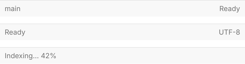
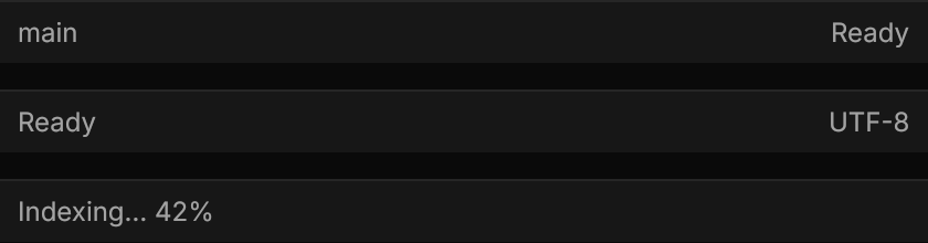
A bar with Left and content, one with content and Right, and one with content alone: with Left set the content moves to the end, otherwise it stays at the start.
<StackPanel Spacing="12" HorizontalAlignment="Left">
  <uikit:StatusBar Width="420" Left="main" Content="Ready" />
  <uikit:StatusBar Width="420" Content="Ready" Right="UTF-8" />
  <uikit:StatusBar Width="420" Content="Indexing… 42%" />
</StackPanel>Not covered
- Nothing: the control covers the component.