Menu
Popup menus and a menu bar: Menu, ContextMenu and MenuFlyout.
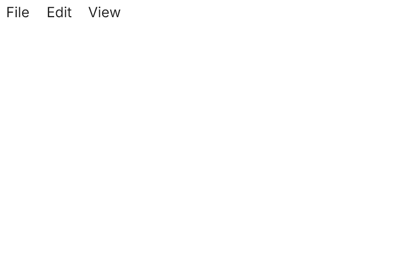

<Panel MinWidth="400" MinHeight="260">
  <Menu VerticalAlignment="Top">
    <MenuItem Header="File">
      <MenuItem Header="New File" InputGesture="Ctrl+N" />
      <MenuItem Header="Open Recent">
        <MenuItem Header="Avalonia UIKit" />
        <MenuItem Header="Sample App" />
      </MenuItem>
      <Separator />
      <MenuItem Header="Save" InputGesture="Ctrl+S" />
      <MenuItem Header="Save As…" IsEnabled="False" />
      <Separator />
      <MenuItem Header="Quit" />
    </MenuItem>
    <MenuItem Header="Edit">
      <MenuItem Header="Undo" InputGesture="Ctrl+Z" />
      <MenuItem Header="Redo" InputGesture="Ctrl+Shift+Z" />
      <Separator />
      <MenuItem Header="Word Wrap" ToggleType="CheckBox" IsChecked="True" />
    </MenuItem>
    <MenuItem Header="View">
      <MenuItem Header="Zoom In" />
      <MenuItem Header="Zoom Out" />
    </MenuItem>
  </Menu>
</Panel>Usage
The theme covers Menu, MenuItem, ContextMenu and MenuFlyoutPresenter in full: the popover surface with its hairline ring and shadow, 26px items 2px apart, an icon column when any item has an Icon or a check, ToggleType="CheckBox" and "Radio" items, submenus with a chevron, Separators, and InputGesture shown as a shortcut. Menu is a menu bar drawn in the window: its top-level items are small ghost buttons, shown selected while open.
Two settings are left to the app. Submenus open as soon as they are hovered: set DefaultMenuInteractionHandler.MenuShowDelay to zero at startup, as Avalonia waits otherwise:
Avalonia.Controls.Platform.DefaultMenuInteractionHandler.MenuShowDelay = TimeSpan.Zero;And open a MenuFlyout with Placement="BottomEdgeAlignedLeft" (BottomEdgeAlignedRight for a split button): the presenter keeps a 4px gap from the trigger. A ContextMenu opens at the pointer. Avalonia selects the first item when a menu opens or takes focus; the theme gives that selection the hover look.
Examples
A ContextMenu on a control: an icon, a shortcut, a check item, a separator, a disabled item and a submenu.
<Panel MinWidth="420" MinHeight="260">
  <Border Width="200" Height="64" BorderThickness="1" CornerRadius="6" Background="Transparent"
          BorderBrush="{DynamicResource UIKit.Border}" HorizontalAlignment="Left" VerticalAlignment="Top">
    <Border.ContextMenu>
      <ContextMenu>
        <MenuItem Header="Copy" InputGesture="Ctrl+C">
          <MenuItem.Icon>
            <PathIcon Data="{StaticResource UIKit.Icon.Copy}" />
          </MenuItem.Icon>
        </MenuItem>
        <MenuItem Header="Paste" InputGesture="Ctrl+V" />
        <MenuItem Header="Word Wrap" ToggleType="CheckBox" IsChecked="True" />
        <Separator />
        <MenuItem Header="Rename" IsEnabled="False" />
        <MenuItem Header="Share">
          <MenuItem Header="Copy Link" />
          <MenuItem Header="Email" />
        </MenuItem>
      </ContextMenu>
    </Border.ContextMenu>
    <TextBlock Text="Right-click here" HorizontalAlignment="Center" VerticalAlignment="Center" />
  </Border>
</Panel>A dropdown menu: a Button with a MenuFlyout, placed below its left edge.


<Panel MinWidth="360" MinHeight="260">
  <Button Classes="outline" HorizontalAlignment="Left" VerticalAlignment="Top">
    <StackPanel Orientation="Horizontal" Spacing="8">
      <TextBlock Text="Open" />
      <PathIcon Classes="small" Data="{StaticResource UIKit.Icon.ChevronDown}" />
    </StackPanel>
    <Button.Flyout>
      <MenuFlyout Placement="BottomEdgeAlignedLeft">
        <MenuItem Header="New File" />
        <MenuItem Header="Refresh" InputGesture="F5" />
        <MenuItem Header="Word Wrap" ToggleType="CheckBox" IsChecked="True" />
        <Separator />
        <MenuItem Header="Rename" IsEnabled="False" />
        <MenuItem Header="Edit">
          <MenuItem Header="Copy" />
          <MenuItem Header="Paste" />
        </MenuItem>
      </MenuFlyout>
    </Button.Flyout>
  </Button>
</Panel>Not covered
- Link items (open the link from a
Clickhandler).