Popover
The popover surface, with an arrow or without any surface, as Avalonia's Flyout.


<Panel MinWidth="320" MinHeight="200">
  <Button Classes="outline" Content="Open popover" HorizontalAlignment="Left" VerticalAlignment="Top">
    <Button.Flyout>
      <Flyout Placement="BottomEdgeAlignedLeft" PlacementConstraintAdjustment="SlideX, SlideY" FlyoutPresenterClasses="arrow">
        <StackPanel Spacing="4" Width="240">
          <TextBlock Text="Dimensions" FontWeight="SemiBold" />
          <TextBlock Text="Set the dimensions for the layer." Foreground="{DynamicResource UIKit.MutedForeground}" TextWrapping="Wrap" />
        </StackPanel>
      </Flyout>
    </Button.Flyout>
  </Button>
</Panel>Usage
The theme covers Flyout and FlyoutPresenter: the popover background on the theme radius, a 1px ring and a shadow, about 12px of padding, and a 4px gap from the trigger on whichever side the flyout opens. A popover slides to stay on screen rather than flipping to the other side, so give every flyout PlacementConstraintAdjustment="SlideX, SlideY". The theme adds the gap, so a HorizontalOffset or VerticalOffset moves the flyout further than it. The popover opens in place, without an animation.
FlyoutPresenterClasses picks the look: arrow adds a 6px arrow toward the trigger (the gap grows by its depth), and plain draws no surface and no padding, only the content.
Examples
The eight placements; each slides to stay on screen instead of flipping.
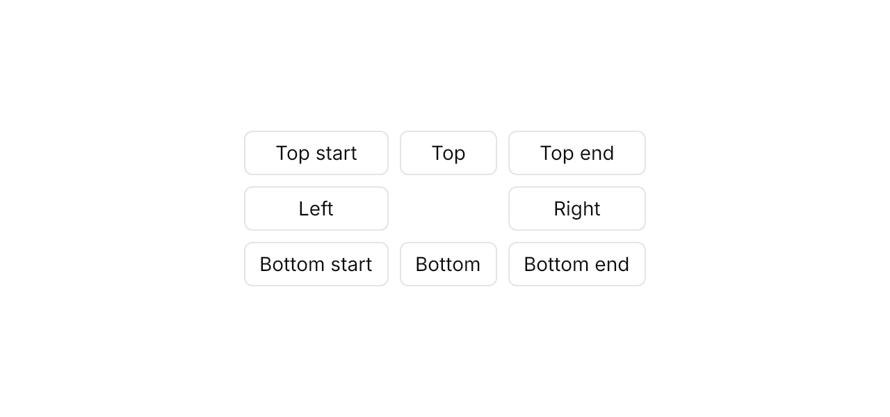
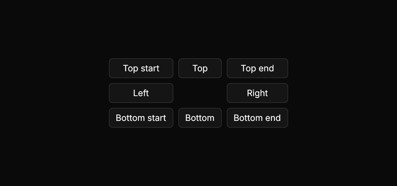
<Panel MinWidth="640" MinHeight="300">
  <Grid ColumnDefinitions="Auto,Auto,Auto" RowDefinitions="Auto,Auto,Auto" ColumnSpacing="8" RowSpacing="8"
        HorizontalAlignment="Center" VerticalAlignment="Center">
    <Button Classes="outline" Content="Top start" HorizontalAlignment="Stretch">
      <Button.Flyout>
        <Flyout Placement="TopEdgeAlignedLeft" PlacementConstraintAdjustment="SlideX, SlideY" Content="Popover content" />
      </Button.Flyout>
    </Button>
    <Button Grid.Column="1" Classes="outline" Content="Top" HorizontalAlignment="Stretch">
      <Button.Flyout>
        <Flyout Placement="Top" PlacementConstraintAdjustment="SlideX, SlideY" Content="Popover content" />
      </Button.Flyout>
    </Button>
    <Button Grid.Column="2" Classes="outline" Content="Top end" HorizontalAlignment="Stretch">
      <Button.Flyout>
        <Flyout Placement="TopEdgeAlignedRight" PlacementConstraintAdjustment="SlideX, SlideY" Content="Popover content" />
      </Button.Flyout>
    </Button>
    <Button Grid.Row="1" Classes="outline" Content="Left" HorizontalAlignment="Stretch">
      <Button.Flyout>
        <Flyout Placement="Left" PlacementConstraintAdjustment="SlideX, SlideY" Content="Popover content" />
      </Button.Flyout>
    </Button>
    <Button Grid.Row="1" Grid.Column="2" Classes="outline" Content="Right" HorizontalAlignment="Stretch">
      <Button.Flyout>
        <Flyout Placement="Right" PlacementConstraintAdjustment="SlideX, SlideY" Content="Popover content" />
      </Button.Flyout>
    </Button>
    <Button Grid.Row="2" Classes="outline" Content="Bottom start" HorizontalAlignment="Stretch">
      <Button.Flyout>
        <Flyout Placement="BottomEdgeAlignedLeft" PlacementConstraintAdjustment="SlideX, SlideY" Content="Popover content" />
      </Button.Flyout>
    </Button>
    <Button Grid.Row="2" Grid.Column="1" Classes="outline" Content="Bottom" HorizontalAlignment="Stretch">
      <Button.Flyout>
        <Flyout Placement="Bottom" PlacementConstraintAdjustment="SlideX, SlideY" Content="Popover content" />
      </Button.Flyout>
    </Button>
    <Button Grid.Row="2" Grid.Column="2" Classes="outline" Content="Bottom end" HorizontalAlignment="Stretch">
      <Button.Flyout>
        <Flyout Placement="BottomEdgeAlignedRight" PlacementConstraintAdjustment="SlideX, SlideY" Content="Popover content" />
      </Button.Flyout>
    </Button>
  </Grid>
</Panel>plain draws the content alone; here an Alert brings its own surface.

<Panel MinWidth="360" MinHeight="180">
  <Button Classes="outline" Content="Open plain popover" HorizontalAlignment="Left" VerticalAlignment="Top">
    <Button.Flyout>
      <Flyout Placement="BottomEdgeAlignedLeft" PlacementConstraintAdjustment="SlideX, SlideY" FlyoutPresenterClasses="plain">
        <uikit:Alert Classes="info" Title="No surface" Content="A plain popover draws only its content." Width="300" />
      </Flyout>
    </Button.Flyout>
  </Button>
</Panel>Not covered
- The closing animation; a closed popup cannot be drawn in Avalonia.