Alert
A message with a title and an icon in the info, success, warning and error colors.
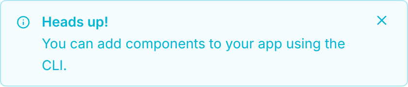
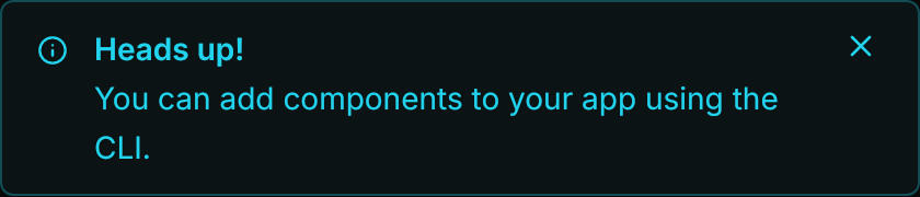
<uikit:Alert Classes="info" Title="Heads up!" Content="You can add components to your app using the CLI."
IsClosable="True" CloseRequested="OnClose" Width="420" HorizontalAlignment="Left" />Usage
uikit:Alert shows its content as the message, with an optional Title above it and an Icon before the text (a Geometry; the info icon when unset). The variant is a class; without one the alert is the foreground on the background. The variant color is the text and the icon, at 4% the fill and at 30% the border. IsClosable="True" adds a close button at the top right; it only raises CloseRequested, and hiding the alert is up to the app. In the demo above, the handler sets IsVisible to false.
| Group | Classes |
|---|---|
| Variant | info, success, warning, error |
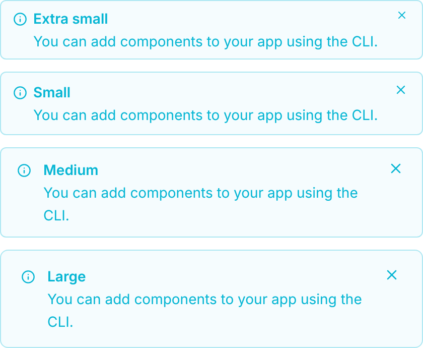
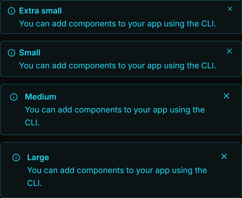
| Size | xsmall, small, large (medium is the default) |
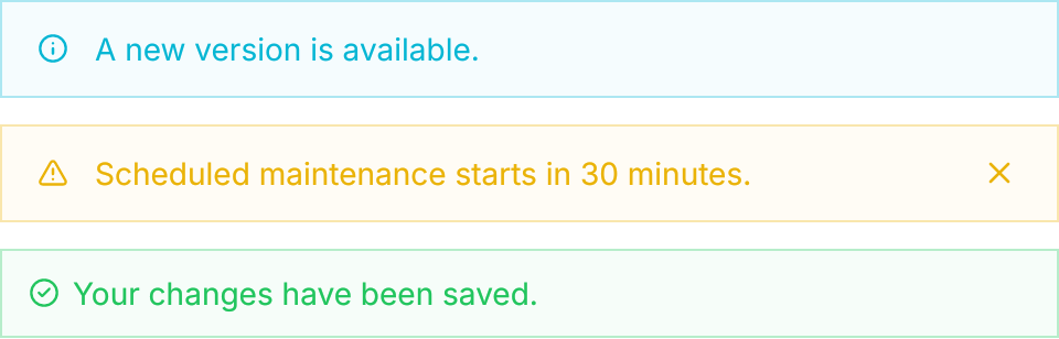
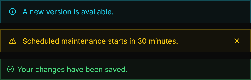
| Layout | banner: full width, no corners and no title, the row centered |
Examples
The default and the four variants, each with its icon.
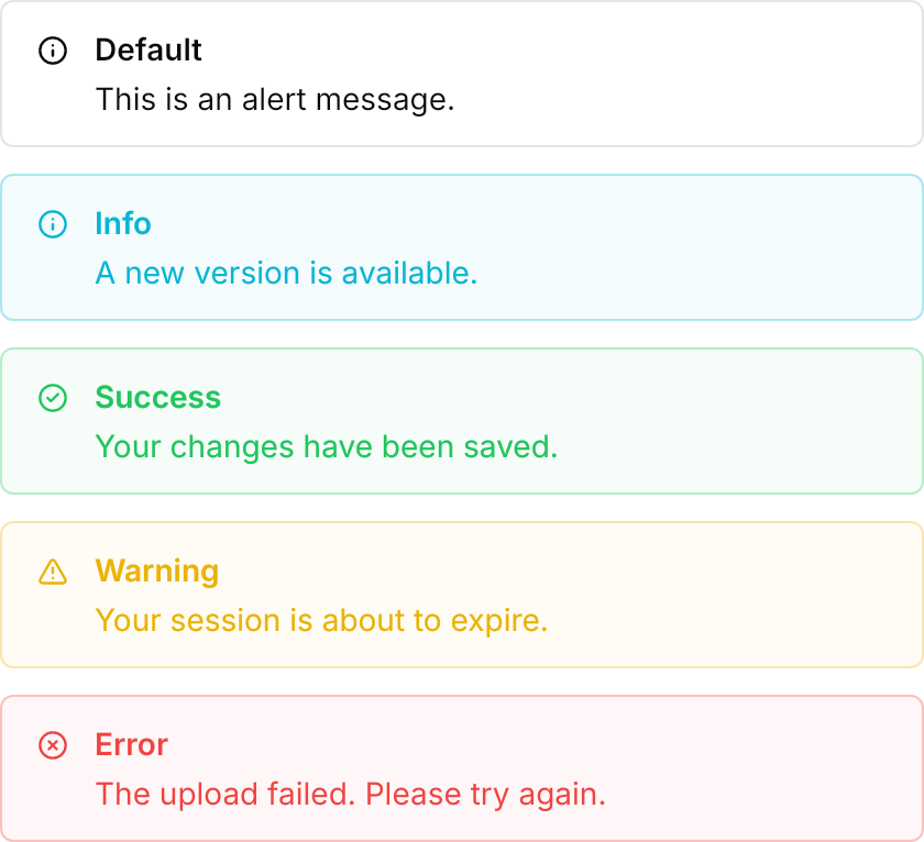
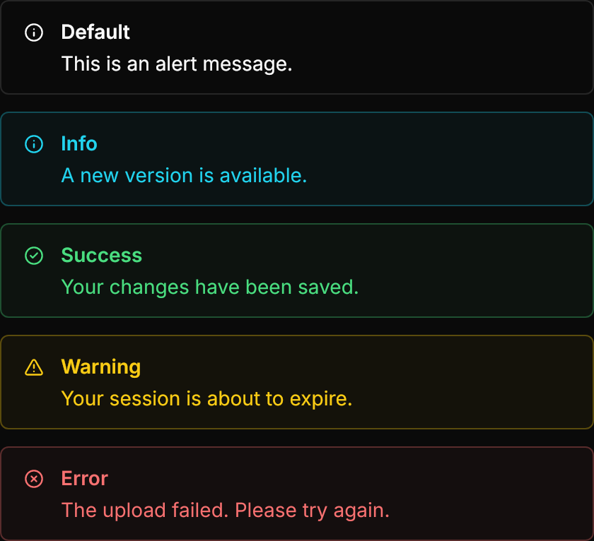
<StackPanel Spacing="12" Width="420" HorizontalAlignment="Left">
  <uikit:Alert Title="Default" Content="This is an alert message." />
  <uikit:Alert Classes="info" Title="Info" Content="A new version is available." />
  <uikit:Alert Classes="success" Title="Success" Content="Your changes have been saved." Icon="{StaticResource UIKit.Icon.CircleCheck}" />
  <uikit:Alert Classes="warning" Title="Warning" Content="Your session is about to expire." Icon="{StaticResource UIKit.Icon.TriangleAlert}" />
  <uikit:Alert Classes="error" Title="Error" Content="The upload failed. Please try again." Icon="{StaticResource UIKit.Icon.CircleX}" />
</StackPanel>The four sizes, from 12 by 6 to 20 by 14 of padding; large takes the larger radius.
<StackPanel Spacing="12" Width="420" HorizontalAlignment="Left">
  <uikit:Alert Classes="info xsmall" Title="Extra small" Content="You can add components to your app using the CLI." IsClosable="True" />
  <uikit:Alert Classes="info small" Title="Small" Content="You can add components to your app using the CLI." IsClosable="True" />
  <uikit:Alert Classes="info" Title="Medium" Content="You can add components to your app using the CLI." IsClosable="True" />
  <uikit:Alert Classes="info large" Title="Large" Content="You can add components to your app using the CLI." IsClosable="True" />
</StackPanel>banner drops the corners and the title and centers the row; it combines with a variant, a size and IsClosable.
<StackPanel Spacing="12" Width="480" HorizontalAlignment="Left">
  <uikit:Alert Classes="info banner" Content="A new version is available." />
  <uikit:Alert Classes="warning banner" Content="Scheduled maintenance starts in 30 minutes." Icon="{StaticResource UIKit.Icon.TriangleAlert}" IsClosable="True" />
  <uikit:Alert Classes="success banner small" Content="Your changes have been saved." Icon="{StaticResource UIKit.Icon.CircleCheck}" />
</StackPanel>Not covered
- Markdown in the message.