Pagination
Previous, numbered pages and Next, as a PipsPager.
ExampleInteractive


<PipsPager NumberOfPages="5" SelectedPageIndex="2" />Usage
PipsPager with numbered pages: set NumberOfPages and SelectedPageIndex. Previous and Next are ghost compact buttons with a chevron and a label (the resources UIKit.Pagination.Previous and UIKit.Pagination.Next), and the pages are compact buttons, the current one outline. The end buttons stay visible and disabled at the first and the last page. Sizes: xsmall, small, large (medium without one); compact keeps the chevrons alone, as square icon buttons. Set the classes in XAML, before the template applies: PipsPager sizes its page list from the first page it realizes. Past MaxVisiblePips the pages scroll.
Examples
The four sizes.
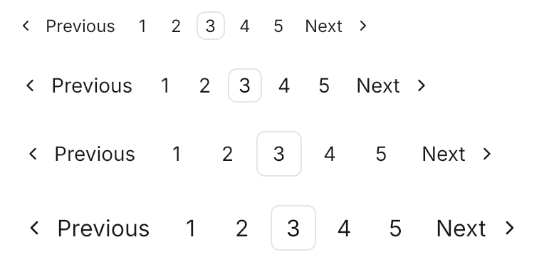
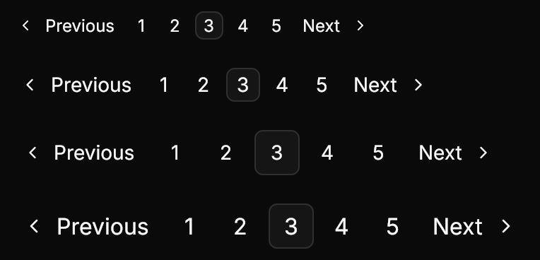
<StackPanel Spacing="4" HorizontalAlignment="Left">
  <PipsPager Classes="xsmall" NumberOfPages="5" SelectedPageIndex="2" />
  <PipsPager Classes="small" NumberOfPages="5" SelectedPageIndex="2" />
  <PipsPager NumberOfPages="5" SelectedPageIndex="2" />
  <PipsPager Classes="large" NumberOfPages="5" SelectedPageIndex="2" />
</StackPanel>compact with small, at the default size, and disabled.


<StackPanel Spacing="4" HorizontalAlignment="Left">
  <PipsPager Classes="compact small" NumberOfPages="5" SelectedPageIndex="2" />
  <PipsPager Classes="compact" NumberOfPages="5" SelectedPageIndex="2" />
  <PipsPager Classes="compact" NumberOfPages="5" SelectedPageIndex="2" IsEnabled="False" />
</StackPanel>Not covered
- Collapsing long page lists into an ellipsis menu; PipsPager scrolls its pages instead.