Switch
An on-off switch, with the thumb sliding on a spring.
ExampleInteractive
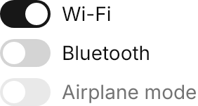
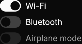
<StackPanel Spacing="8">
  <ToggleSwitch Content="Wi-Fi" IsChecked="True" />
  <ToggleSwitch Content="Bluetooth" />
  <ToggleSwitch Content="Airplane mode" IsEnabled="False" />
</StackPanel>Usage
The theme covers ToggleSwitch in full. The track is 28×16 for xsmall and small (they differ in the label's text size), 36×20 at medium (the default) and 44×24 for large; IsChecked colors it. The thumb travels on the UIKit.Spring.Move spring, keeping its velocity when the switch is toggled back mid-flight, and follows the pointer at once while dragged.
Content is the label after the track; Classes="label-left" puts it before. Unlike a button, a pointer press focuses a switch, so its ring shows on :focus.
Examples
The four sizes.


<WrapPanel ItemSpacing="16" LineSpacing="8">
  <ToggleSwitch Classes="xsmall" Content="Extra small" IsChecked="True" />
  <ToggleSwitch Classes="small" Content="Small" IsChecked="True" />
  <ToggleSwitch Content="Medium" IsChecked="True" />
  <ToggleSwitch Classes="large" Content="Large" IsChecked="True" />
</WrapPanel>label-left for a settings row where the label leads.
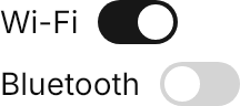
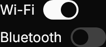
<StackPanel Spacing="8">
  <ToggleSwitch Classes="label-left" Content="Wi-Fi" IsChecked="True" />
  <ToggleSwitch Classes="label-left" Content="Bluetooth" />
</StackPanel>Not covered
- Custom track colors.