Time Field
Hour and minute segments in an input frame, as TimePicker.


<Panel MinHeight="350">
  <TimePicker SelectedTime="09:30" ClockIdentifier="24HourClock" HorizontalAlignment="Left" VerticalAlignment="Top" />
</Panel>Usage
The theme covers the closed TimePicker as a time field: an input-styled frame sized to its content, with the hour, minute and (with UseSeconds="True") second as two-digit segments with tabular figures between colons. ClockIdentifier="24HourClock" or "12HourClock" picks the clock; the 12-hour clock adds the period after a 4px gap. SelectedTime is the value. Sizes: xsmall, small, large (medium is the default).
Focused, the border turns to the ring with the focus band and the hour segment shows the selection; this is a look only, as TimePicker has no segments to edit. An invalid field (:error through DataValidationErrors) turns the border to the danger color; a disabled one fills with the disabled background, mutes its text and fades to half. A click opens Avalonia's TimePickerPresenter on the popover surface, where the value is picked.
Examples
The four sizes.
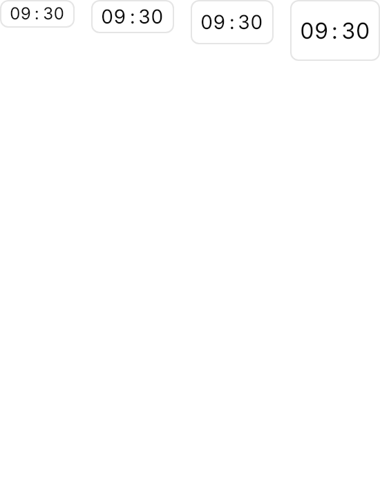
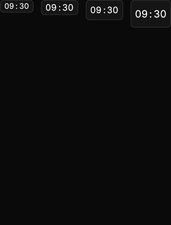
<Panel MinHeight="360">
  <WrapPanel ItemSpacing="12" LineSpacing="12" VerticalAlignment="Top">
    <TimePicker Classes="xsmall" SelectedTime="09:30" ClockIdentifier="24HourClock" />
    <TimePicker Classes="small" SelectedTime="09:30" ClockIdentifier="24HourClock" />
    <TimePicker SelectedTime="09:30" ClockIdentifier="24HourClock" />
    <TimePicker Classes="large" SelectedTime="09:30" ClockIdentifier="24HourClock" />
  </WrapPanel>
</Panel>24-hour and 12-hour clocks, with and without seconds.
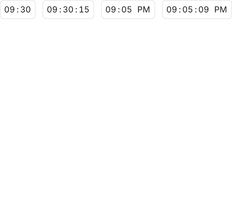
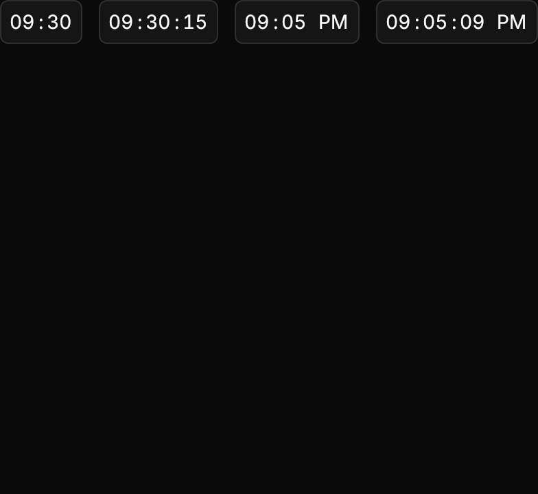
<Panel MinHeight="360">
  <WrapPanel ItemSpacing="12" LineSpacing="12" VerticalAlignment="Top">
    <TimePicker SelectedTime="09:30" ClockIdentifier="24HourClock" />
    <TimePicker SelectedTime="09:30:15" ClockIdentifier="24HourClock" UseSeconds="True" />
    <TimePicker SelectedTime="21:05" ClockIdentifier="12HourClock" />
    <TimePicker SelectedTime="21:05:09" ClockIdentifier="12HourClock" UseSeconds="True" />
  </WrapPanel>
</Panel>A disabled field and an invalid one. The demo sets DataValidationErrors.Errors from a static helper that holds one validation message; an app gets its errors from its bindings' validation instead.
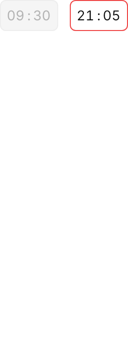
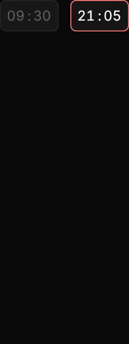
<Panel MinHeight="350">
  <WrapPanel ItemSpacing="12" LineSpacing="12" VerticalAlignment="Top">
    <TimePicker SelectedTime="09:30" ClockIdentifier="24HourClock" IsEnabled="False" />
    <TimePicker SelectedTime="21:05" ClockIdentifier="24HourClock"
                DataValidationErrors.Errors="{x:Static demos:ValidationErrors.OutsideBusinessHours}" />
  </WrapPanel>
</Panel>Not covered
- Editing the segments directly in the field: focus only marks the hour.
- The opened picker, which is Avalonia's
TimePickerPresenter.