Input
An input frame with a focus ring and a placeholder, as Avalonia's TextBox.


<StackPanel Spacing="12" Width="240" HorizontalAlignment="Left">
  <TextBox PlaceholderText="Enter your name..." />
  <TextBox Text="Hello world" />
</StackPanel>Usage
The theme covers TextBox (MaskedTextBox shares it): the frame with the input background and a 1px input border that turns to ring, with the ring band, while the field or anything in it has focus; the muted PlaceholderText; no hover look. The selection shows only while the field is focused.
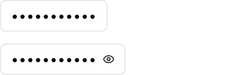
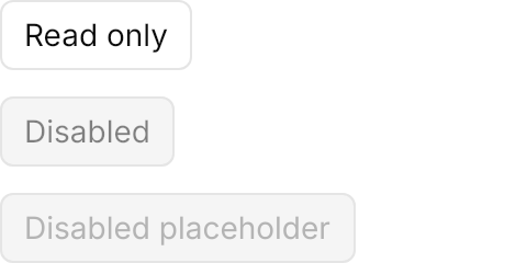
InnerLeftContent and InnerRightContent are the prefix and suffix, a size's gap from the text; for addons inside one bordered frame see Input Group. A password is masked with PasswordChar="•", and Classes="revealPasswordButton" adds a mask toggle, an eye button that shows the text while checked. A disabled field fills with the disabled background and draws its text, placeholder and inner content at half strength; a read-only field has no look of its own.
| Class | Effect |
|---|---|
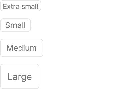
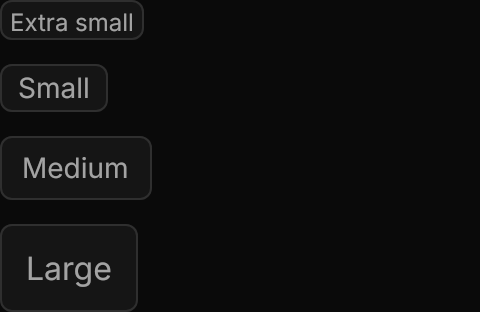
xsmall, small, large | Height 20, 24 and 44; medium, the default, is 32 |
revealPasswordButton | The eye button that reveals a masked password |
Examples
The four sizes.
<StackPanel Spacing="12" Width="240" HorizontalAlignment="Left">
  <TextBox Classes="xsmall" PlaceholderText="Extra small" />
  <TextBox Classes="small" PlaceholderText="Small" />
  <TextBox PlaceholderText="Medium" />
  <TextBox Classes="large" PlaceholderText="Large" />
</StackPanel>A small search icon as InnerLeftContent, and an xsmall ghost icon button as InnerRightContent.


<StackPanel Spacing="12" Width="240" HorizontalAlignment="Left">
  <TextBox PlaceholderText="Search">
    <TextBox.InnerLeftContent>
      <PathIcon Classes="small" Data="{StaticResource UIKit.Icon.Search}" />
    </TextBox.InnerLeftContent>
  </TextBox>
  <TextBox Text="Hello world">
    <TextBox.InnerRightContent>
      <Button Classes="ghost xsmall icon-only">
        <PathIcon Data="{StaticResource UIKit.Icon.Info}" />
      </Button>
    </TextBox.InnerRightContent>
  </TextBox>
</StackPanel>A masked password, with and without the reveal button.

<StackPanel Spacing="12" Width="240" HorizontalAlignment="Left">
  <TextBox PasswordChar="•" Text="password123" />
  <TextBox Classes="revealPasswordButton" PasswordChar="•" Text="password123" />
</StackPanel>Read-only and disabled fields.
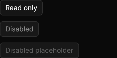
<StackPanel Spacing="12" Width="240" HorizontalAlignment="Left">
  <TextBox Text="Read only" IsReadOnly="True" />
  <TextBox Text="Disabled" IsEnabled="False" />
  <TextBox PlaceholderText="Disabled placeholder" IsEnabled="False" />
</StackPanel>Not covered
- Validation and masking built into the field (use
MaskedTextBoxor your own validation). - Clearing with Esc.
- Inline tokens.