GPUI Kit's notification cards, sliding in and fading out, as Avalonia's WindowNotificationManager.


<Panel MinWidth="480" MinHeight="240">
  <Button Classes="outline" Content="Show notification" HorizontalAlignment="Left" VerticalAlignment="Top" Click="OnShow" />
</Panel>Usage
Use Avalonia's WindowNotificationManager; the theme covers the NotificationCard it shows. Create the manager once for the top level and call Show. In the demo above, the button's Click handler does exactly that, with MaxItems = 3.
_manager ??= new WindowNotificationManager(TopLevel.GetTopLevel(this)) { MaxItems = 10 };
_manager.Show(new Notification("Saved", "Your changes have been saved.", NotificationType.Success),
    NotificationType.Success, expiration: TimeSpan.FromSeconds(5.4));
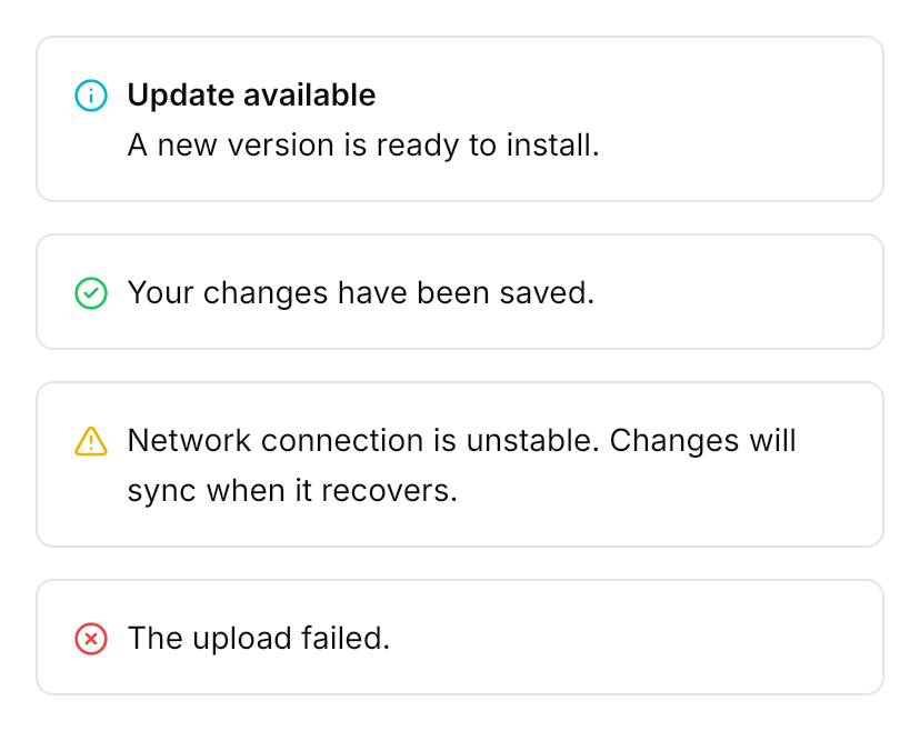
A card is 382px wide on the popover background with a 1px border and GPUI Kit's toast shadow: the type's icon at the top left, the title in semibold and the message on 22.5px lines, and a ghost close button that shows while the card is hovered. The manager's Position places the pile as GPUI Kit does: 50px from the top (under a 34px title bar) or 16px from the bottom, 16px from the side, the newest nearest the edge, 14px apart. A card slides 96px in from its edge and fades in over 400ms, and fades out over 200ms when it closes. For GPUI Kit's limits pass MaxItems = 10 and an expiration of 5.4 seconds. GPUI Kit's untyped notification, without an icon, is the class plain: Show(..., classes: ["plain"]).
Examples
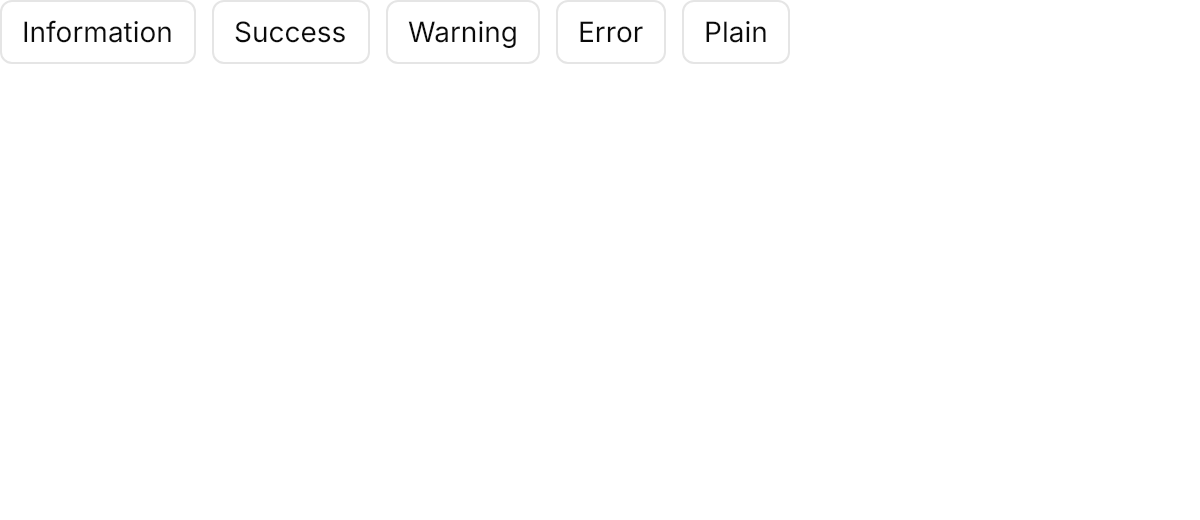
The four types and the plain card; each button's Click handler creates the manager for the top level once and calls Show with the type from its Tag.
<Panel MinWidth="600" MinHeight="260">
  <WrapPanel ItemSpacing="8" LineSpacing="8" HorizontalAlignment="Left" VerticalAlignment="Top">
    <Button Classes="outline" Content="Information" Tag="information" Click="OnShow" />
    <Button Classes="outline" Content="Success" Tag="success" Click="OnShow" />
    <Button Classes="outline" Content="Warning" Tag="warning" Click="OnShow" />
    <Button Classes="outline" Content="Error" Tag="error" Click="OnShow" />
    <Button Classes="outline" Content="Plain" Tag="plain" Click="OnShow" />
  </WrapPanel>
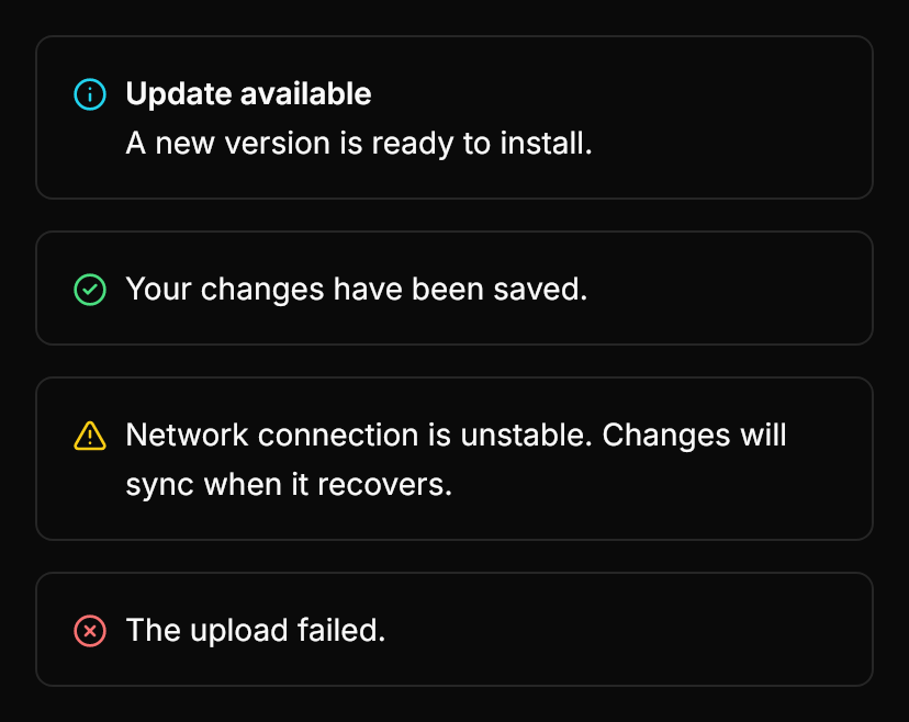
</Panel>A mock of the card's look, drawn with the theme's tokens so that it can sit on the page; real cards come from WindowNotificationManager and slide in.
<!--
  The look of a notification card, drawn from the theme's tokens: a 382px
  popover surface with the type's icon at the top left, the title in
  semibold and the message on 22.5px lines. A real NotificationCard is shown
  by WindowNotificationManager and slides in (see the Demo).
-->
<StackPanel Spacing="14" Margin="16" HorizontalAlignment="Left">
  <Border Width="382" CornerRadius="7.5" BorderThickness="1" BackgroundSizing="OuterBorderEdge"
          Background="{DynamicResource Gpui.Popover}" BorderBrush="{DynamicResource Gpui.Border}"
          BoxShadow="0 10 24.2487 -3 #1A000000, 0 4 8.6603 -4 #1A000000">
    <Panel>
      <PathIcon Data="{StaticResource Gpui.Icon.Info}" Foreground="{DynamicResource Gpui.Info}" Width="16" Height="16"
                Margin="16,18,0,0" HorizontalAlignment="Left" VerticalAlignment="Top" />
      <StackPanel Margin="40,14,16,14">
        <TextBlock Text="Update available" FontSize="14" FontWeight="SemiBold" LineHeight="22.5" />
        <TextBlock Text="A new version is ready to install." FontSize="14" LineHeight="22.5" TextWrapping="Wrap" />
      </StackPanel>
    </Panel>
  </Border>
  <Border Width="382" CornerRadius="7.5" BorderThickness="1" BackgroundSizing="OuterBorderEdge"
          Background="{DynamicResource Gpui.Popover}" BorderBrush="{DynamicResource Gpui.Border}"
          BoxShadow="0 10 24.2487 -3 #1A000000, 0 4 8.6603 -4 #1A000000">
    <Panel>
      <PathIcon Data="{StaticResource Gpui.Icon.CircleCheck}" Foreground="{DynamicResource Gpui.Success}" Width="16" Height="16"
                Margin="16,18,0,0" HorizontalAlignment="Left" VerticalAlignment="Top" />
      <TextBlock Text="Your changes have been saved." Margin="40,14,16,14" FontSize="14" LineHeight="22.5" TextWrapping="Wrap" />
    </Panel>
  </Border>
  <Border Width="382" CornerRadius="7.5" BorderThickness="1" BackgroundSizing="OuterBorderEdge"
          Background="{DynamicResource Gpui.Popover}" BorderBrush="{DynamicResource Gpui.Border}"
          BoxShadow="0 10 24.2487 -3 #1A000000, 0 4 8.6603 -4 #1A000000">
    <Panel>
      <PathIcon Data="{StaticResource Gpui.Icon.TriangleAlert}" Foreground="{DynamicResource Gpui.Warning}" Width="16" Height="16"
                Margin="16,18,0,0" HorizontalAlignment="Left" VerticalAlignment="Top" />
      <TextBlock Text="Network connection is unstable. Changes will sync when it recovers." Margin="40,14,16,14"
                 FontSize="14" LineHeight="22.5" TextWrapping="Wrap" />
    </Panel>
  </Border>
  <Border Width="382" CornerRadius="7.5" BorderThickness="1" BackgroundSizing="OuterBorderEdge"
          Background="{DynamicResource Gpui.Popover}" BorderBrush="{DynamicResource Gpui.Border}"
          BoxShadow="0 10 24.2487 -3 #1A000000, 0 4 8.6603 -4 #1A000000">
    <Panel>
      <PathIcon Data="{StaticResource Gpui.Icon.CircleX}" Foreground="{DynamicResource Gpui.Danger}" Width="16" Height="16"
                Margin="16,18,0,0" HorizontalAlignment="Left" VerticalAlignment="Top" />
      <TextBlock Text="The upload failed." Margin="40,14,16,14" FontSize="14" LineHeight="22.5" TextWrapping="Wrap" />
    </Panel>
  </Border>
</StackPanel>Not covered
- Placing each notification individually.
- Deduplicating notifications.
- Expanding and re-stacking the pile.