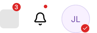
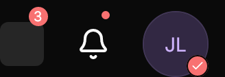
<StackPanel Orientation="Horizontal" Spacing="24" Margin="0,8,12,0" HorizontalAlignment="Left">
  <gpui:Badge Count="3">
    <Border Width="32" Height="32" CornerRadius="6" Background="{DynamicResource Gpui.Secondary}" />
  </gpui:Badge>
  <gpui:Badge IsDot="True">
    <PathIcon Classes="large" Data="{StaticResource Gpui.Icon.Bell}" />
  </gpui:Badge>
  <gpui:Badge Icon="{StaticResource Gpui.Icon.Check}">
    <gpui:Avatar UserName="Jason Lee" />
  </gpui:Badge>
</StackPanel>Usage
gpui:Badge wraps its content and draws over its top right corner, taking no room of its own: the Count on a pill at least 14px wide, a 6px dot with IsDot="True", or an Icon in a ringed circle at the bottom right. A count of 0 shows nothing; past Maximum (99 by default) it reads "99+". An icon takes precedence over the dot, which takes precedence over the count. The color is BadgeBackground, the theme's red by default (not Background, which belongs to the content). The sizes small, the default medium and large move the count and resize the icon's circle.
Examples
Counts of 3, 12 and 100 (shown as 99+), and 12 with Maximum="9".


<StackPanel Orientation="Horizontal" Spacing="24" Margin="0,8,12,0" HorizontalAlignment="Left">
  <gpui:Badge Count="3">
    <Border Width="32" Height="32" CornerRadius="6" Background="{DynamicResource Gpui.Secondary}" />
  </gpui:Badge>
  <gpui:Badge Count="12">
    <Border Width="32" Height="32" CornerRadius="6" Background="{DynamicResource Gpui.Secondary}" />
  </gpui:Badge>
  <gpui:Badge Count="100">
    <Border Width="32" Height="32" CornerRadius="6" Background="{DynamicResource Gpui.Secondary}" />
  </gpui:Badge>
  <gpui:Badge Count="12" Maximum="9">
    <Border Width="32" Height="32" CornerRadius="6" Background="{DynamicResource Gpui.Secondary}" />
  </gpui:Badge>
</StackPanel>small and large on the badge, with a count and with a dot; the dot stays 6px.


<StackPanel Orientation="Horizontal" Spacing="24" Margin="0,8,12,0" HorizontalAlignment="Left">
  <gpui:Badge Classes="small" Count="3" VerticalAlignment="Bottom">
    <Border Width="24" Height="24" CornerRadius="6" Background="{DynamicResource Gpui.Secondary}" />
  </gpui:Badge>
  <gpui:Badge Count="3" VerticalAlignment="Bottom">
    <Border Width="32" Height="32" CornerRadius="6" Background="{DynamicResource Gpui.Secondary}" />
  </gpui:Badge>
  <gpui:Badge Classes="large" Count="3" VerticalAlignment="Bottom">
    <Border Width="48" Height="48" CornerRadius="6" Background="{DynamicResource Gpui.Secondary}" />
  </gpui:Badge>
  <gpui:Badge Classes="small" IsDot="True" VerticalAlignment="Bottom">
    <Border Width="24" Height="24" CornerRadius="6" Background="{DynamicResource Gpui.Secondary}" />
  </gpui:Badge>
  <gpui:Badge Classes="large" IsDot="True" VerticalAlignment="Bottom">
    <Border Width="48" Height="48" CornerRadius="6" Background="{DynamicResource Gpui.Secondary}" />
  </gpui:Badge>
</StackPanel>BadgeBackground takes any brush, such as the theme's palette colors.


<StackPanel Orientation="Horizontal" Spacing="24" Margin="0,8,12,0" HorizontalAlignment="Left">
  <gpui:Badge Count="5" BadgeBackground="{DynamicResource Gpui.Blue}">
    <Border Width="32" Height="32" CornerRadius="6" Background="{DynamicResource Gpui.Secondary}" />
  </gpui:Badge>
  <gpui:Badge Count="5" BadgeBackground="{DynamicResource Gpui.Green}">
    <Border Width="32" Height="32" CornerRadius="6" Background="{DynamicResource Gpui.Secondary}" />
  </gpui:Badge>
  <gpui:Badge Count="5" BadgeBackground="{DynamicResource Gpui.Yellow}">
    <Border Width="32" Height="32" CornerRadius="6" Background="{DynamicResource Gpui.Secondary}" />
  </gpui:Badge>
  <gpui:Badge IsDot="True" BadgeBackground="{DynamicResource Gpui.Green}">
    <PathIcon Classes="large" Data="{StaticResource Gpui.Icon.Bell}" />
  </gpui:Badge>
</StackPanel>Not covered
- Nothing: the control covers the component.