A numeric field with GPUI Kit's minus and plus buttons, as NumericUpDown.
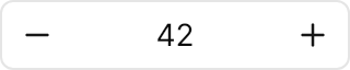

<NumericUpDown Value="42" Width="160" HorizontalAlignment="Left" />Usage
The theme covers NumericUpDown (and ButtonSpinner) in full: the input frame with the decrease button before the value, the text centred between the buttons, and the increase button after it, as GPUI Kit lays it out. The buttons stay at the sides by contract: ButtonSpinnerLocation has no effect. Value, Minimum, Maximum, Increment and FormatString are Avalonia's own. The frame shows the ring while anything in it has focus; a disabled field fades as a whole to 50%. Sizes: xsmall (20px), small (24px), medium (32px, the default) and large (44px).
Examples
The four sizes.
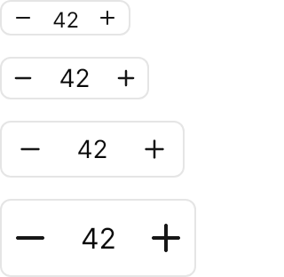
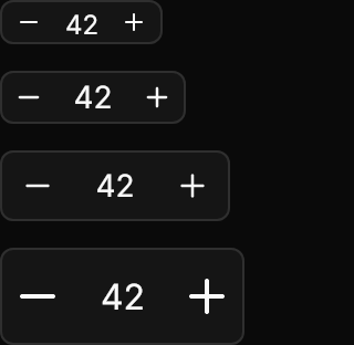
<StackPanel Spacing="12" Width="160" HorizontalAlignment="Left">
  <NumericUpDown Classes="xsmall" Value="42" />
  <NumericUpDown Classes="small" Value="42" />
  <NumericUpDown Value="42" />
  <NumericUpDown Classes="large" Value="42" />
</StackPanel>A range of 0 to 100 in steps of 10, a decimal field with Increment="0.5" and FormatString="0.0", and a disabled one.
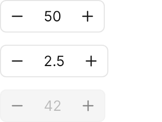
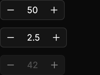
<StackPanel Spacing="12" Width="160" HorizontalAlignment="Left">
  <NumericUpDown Value="50" Minimum="0" Maximum="100" Increment="10" />
  <NumericUpDown Value="2.5" Minimum="0" Maximum="10" Increment="0.5" FormatString="0.0" />
  <NumericUpDown Value="42" IsEnabled="False" />
</StackPanel>Not covered
ButtonSpinnerLocation: the buttons stay at GPUI Kit's [−] value [+] positions.- GPUI Kit's own normalisation and dynamic step computation.