Avalonia's ColorPicker in GPUI Kit's input frame and popover, from the AvaloniaUIKit.ColorPicker package.
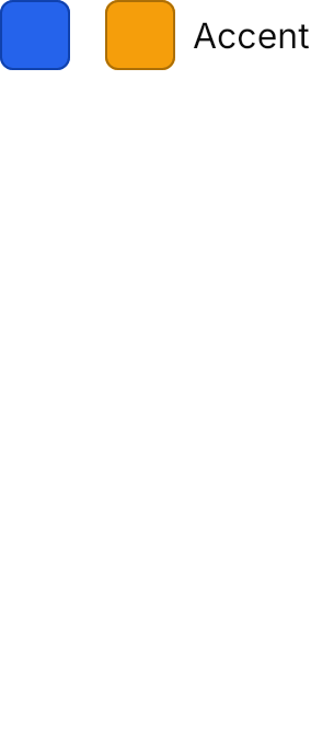

<Panel MinHeight="340">
  <StackPanel Orientation="Horizontal" Spacing="16" HorizontalAlignment="Left" VerticalAlignment="Top">
    <ColorPicker Color="#2563EB" />
    <ColorPicker Color="#F59E0B" Content="Accent" />
  </StackPanel>
</Panel>Usage
Avalonia's ColorPicker is a separate package, so its theme is too: add AvaloniaUIKit.ColorPicker and put GpuiColorPickerTheme after GpuiTheme in the application's styles.
<Application xmlns="https://github.com/avaloniaui"
             xmlns:uikit="clr-namespace:AvaloniaUIKit;assembly=AvaloniaUIKit"
             xmlns:uikitcolor="clr-namespace:AvaloniaUIKit;assembly=AvaloniaUIKit.ColorPicker">
  <Application.Styles>
    <uikit:GpuiTheme />
    <uikitcolor:GpuiColorPickerTheme />
  </Application.Styles>
</Application>
ColorPicker with a Color is GPUI Kit's ColorPicker: a square swatch of the color with a border of the color darkened 30% and its hex as a tooltip; Content puts a label 8px after it. Classes="field" is GPUI Kit's ColorSelect: an input frame with a small swatch, the hex and a caret, ringed while focused. Both open a 288px popover below with the palette (the control's Palette, Avalonia's FluentColorPalette by default) and the color's components on two segmented tabs, and the color with its editable hex under them.
Examples
The four swatch sizes.


<Panel MinHeight="350">
  <StackPanel Orientation="Horizontal" Spacing="16" HorizontalAlignment="Left" VerticalAlignment="Top">
    <ColorPicker Classes="xsmall" Color="#2563EB" VerticalAlignment="Center" />
    <ColorPicker Classes="small" Color="#2563EB" VerticalAlignment="Center" />
    <ColorPicker Color="#2563EB" VerticalAlignment="Center" />
    <ColorPicker Classes="large" Color="#2563EB" VerticalAlignment="Center" />
  </StackPanel>
</Panel>The field class, GPUI Kit's ColorSelect, in a column of 200px fields.
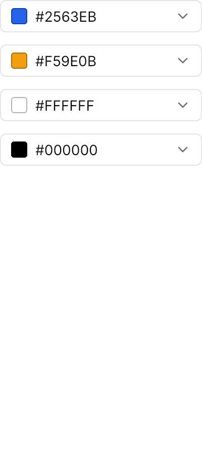
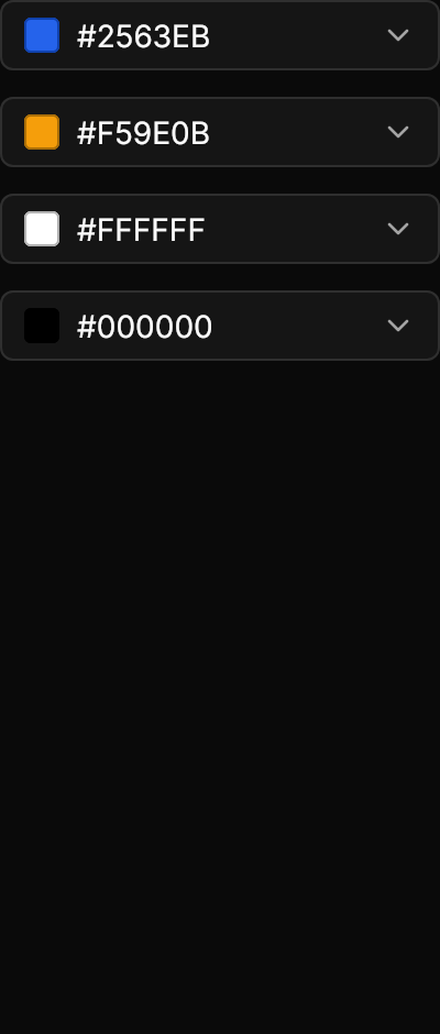
<Panel MinHeight="470">
  <StackPanel Spacing="12" Width="200" HorizontalAlignment="Left" VerticalAlignment="Top">
    <ColorPicker Classes="field" Color="#2563EB" />
    <ColorPicker Classes="field" Color="#F59E0B" />
    <ColorPicker Classes="field" Color="#FFFFFF" />
    <ColorPicker Classes="field" Color="#000000" />
  </StackPanel>
</Panel>Not covered
- GPUI Kit's own palette, featured row and HSL sliders; Avalonia's
FluentColorPaletteand RGB / HSV components are used instead. - A placeholder for no color:
Coloralways has a value.