GPUI Kit's tab bar in its default, outline, pill, segmented and underline looks, as TabStrip and TabControl.
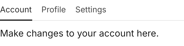
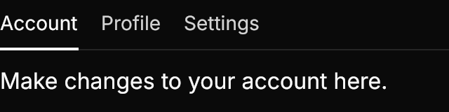
<TabControl Classes="underline" Width="320" HorizontalAlignment="Left">
  <TabItem Header="Account">
    <TextBlock Text="Make changes to your account here." Margin="0,12" />
  </TabItem>
  <TabItem Header="Profile">
    <TextBlock Text="Edit your public profile." Margin="0,12" />
  </TabItem>
  <TabItem Header="Settings">
    <TextBlock Text="Change your preferences." Margin="0,12" />
  </TabItem>
</TabControl>Usage
The theme covers TabStrip and TabStripItem (a bar on its own) and the strip of TabControl and TabItem (tabs with their content). The look is a class on the strip or control: GPUI Kit's default tab without one, or outline, pill, segmented or underline. Pill, segmented and underline show the selection with an indicator that springs to the selected tab on GPUI Kit's spring and reverses midway when the selection changes again; a pill's label fades in as the indicator slides. Sizes: xsmall, small, large (medium without one). Put icon-only on an item whose content is an icon. GPUI's tabs take no focus; here a tab shows a ring on keyboard focus only.
Examples
The five looks; the last underline tab is disabled.
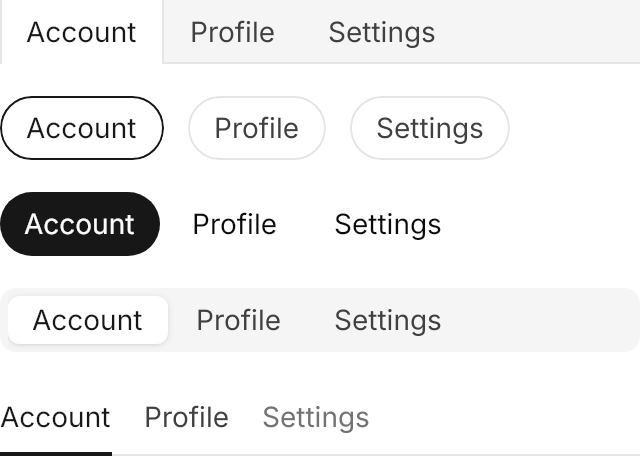
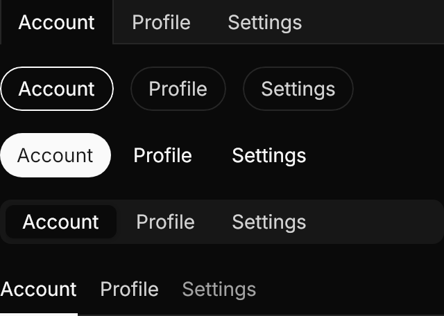
<StackPanel Spacing="16" HorizontalAlignment="Left">
  <TabStrip Width="320" SelectedIndex="0">
    <TabStripItem Content="Account" />
    <TabStripItem Content="Profile" />
    <TabStripItem Content="Settings" />
  </TabStrip>
  <TabStrip Classes="outline" Width="320" SelectedIndex="0">
    <TabStripItem Content="Account" />
    <TabStripItem Content="Profile" />
    <TabStripItem Content="Settings" />
  </TabStrip>
  <TabStrip Classes="pill" Width="320" SelectedIndex="0">
    <TabStripItem Content="Account" />
    <TabStripItem Content="Profile" />
    <TabStripItem Content="Settings" />
  </TabStrip>
  <TabStrip Classes="segmented" Width="320" SelectedIndex="0">
    <TabStripItem Content="Account" />
    <TabStripItem Content="Profile" />
    <TabStripItem Content="Settings" />
  </TabStrip>
  <TabStrip Classes="underline" Width="320" SelectedIndex="0">
    <TabStripItem Content="Account" />
    <TabStripItem Content="Profile" />
    <TabStripItem Content="Settings" IsEnabled="False" />
  </TabStrip>
</StackPanel>The four sizes of a pill strip.
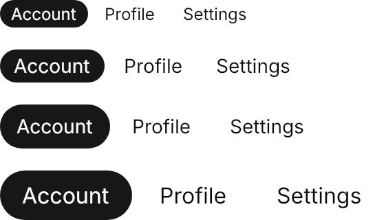
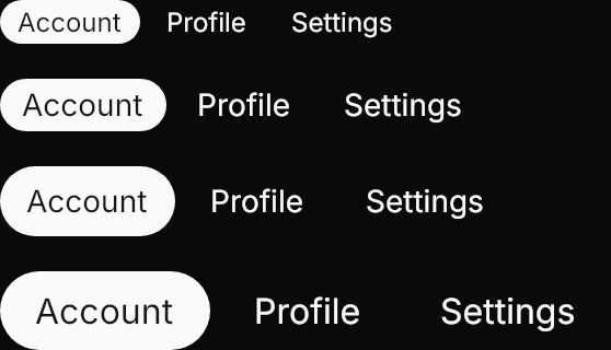
<StackPanel Spacing="16" HorizontalAlignment="Left">
  <TabStrip Classes="pill xsmall" SelectedIndex="0">
    <TabStripItem Content="Account" />
    <TabStripItem Content="Profile" />
    <TabStripItem Content="Settings" />
  </TabStrip>
  <TabStrip Classes="pill small" SelectedIndex="0">
    <TabStripItem Content="Account" />
    <TabStripItem Content="Profile" />
    <TabStripItem Content="Settings" />
  </TabStrip>
  <TabStrip Classes="pill" SelectedIndex="0">
    <TabStripItem Content="Account" />
    <TabStripItem Content="Profile" />
    <TabStripItem Content="Settings" />
  </TabStrip>
  <TabStrip Classes="pill large" SelectedIndex="0">
    <TabStripItem Content="Account" />
    <TabStripItem Content="Profile" />
    <TabStripItem Content="Settings" />
  </TabStrip>
</StackPanel>icon-only items in a pill and in a segmented strip.
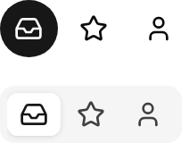

<StackPanel Spacing="16" HorizontalAlignment="Left">
  <TabStrip Classes="pill" SelectedIndex="0">
    <TabStripItem Classes="icon-only">
      <PathIcon Data="{StaticResource Gpui.Icon.Inbox}" />
    </TabStripItem>
    <TabStripItem Classes="icon-only">
      <PathIcon Data="{StaticResource Gpui.Icon.Star}" />
    </TabStripItem>
    <TabStripItem Classes="icon-only">
      <PathIcon Data="{StaticResource Gpui.Icon.User}" />
    </TabStripItem>
  </TabStrip>
  <TabStrip Classes="segmented" SelectedIndex="0">
    <TabStripItem Classes="icon-only">
      <PathIcon Data="{StaticResource Gpui.Icon.Inbox}" />
    </TabStripItem>
    <TabStripItem Classes="icon-only">
      <PathIcon Data="{StaticResource Gpui.Icon.Star}" />
    </TabStripItem>
    <TabStripItem Classes="icon-only">
      <PathIcon Data="{StaticResource Gpui.Icon.User}" />
    </TabStripItem>
  </TabStrip>
</StackPanel>Not covered
- Closing tabs with a button.
- Reordering tabs by drag and drop.