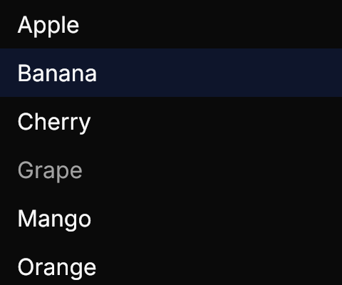
GPUI Kit's list rows: hover, selection and the overlay scrollbar, as ListBox.
Partial
Interactive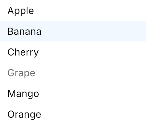
<ListBox Width="240" Height="200" HorizontalAlignment="Left" SelectedIndex="1">
  <ListBoxItem Content="Apple" />
  <ListBoxItem Content="Banana" />
  <ListBoxItem Content="Cherry" />
  <ListBoxItem Content="Grape" IsEnabled="False" />
  <ListBoxItem Content="Mango" />
  <ListBoxItem Content="Orange" />
  <ListBoxItem Content="Peach" />
  <ListBoxItem Content="Strawberry" />
</ListBox>Usage
The theme covers ListBox and ListBoxItem: 34px rows of 16px text with 12×4 padding, square and full width, with no chrome of the list's own. A hovered row takes GPUI Kit's list hover color, the selected row its active color (hovering adds nothing), and a disabled item shows muted text; the scrollbar overlays the rows, from the ScrollViewer theme. Put a row's content in the ItemTemplate. The items panel stays virtualizing, so a long list is the same control: see Virtual List.
Examples
An empty list shows GPUI Kit's 48px Inbox icon, centered; there is nothing to add for it.
Interactive

<ListBox Width="240" Height="120" HorizontalAlignment="Left" />Not covered
- The built-in search field.
- Loading more items on scroll.
- Reordering by drag and drop.