Components
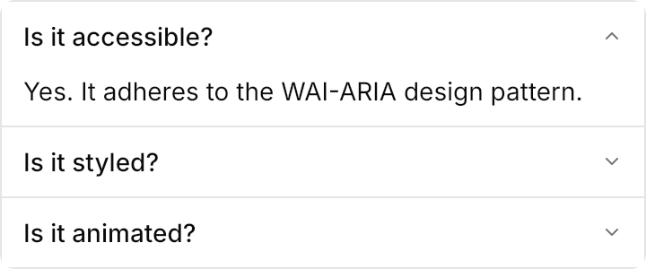
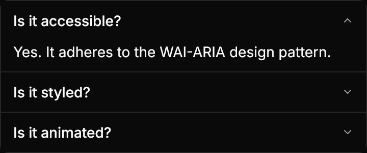
- Accordion
- Alert
- Avatar
- Badge
- Breadcrumb
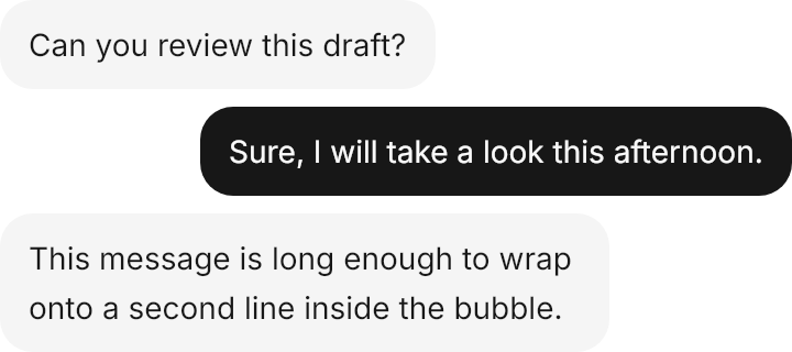
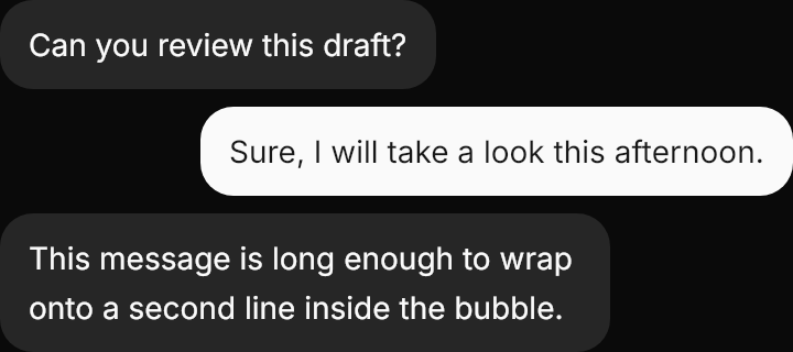
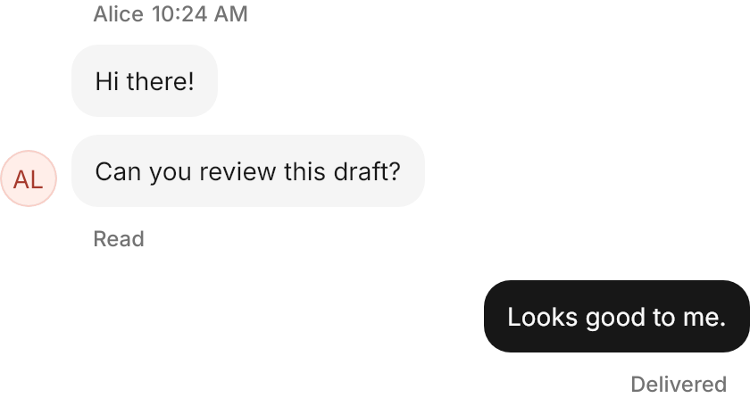
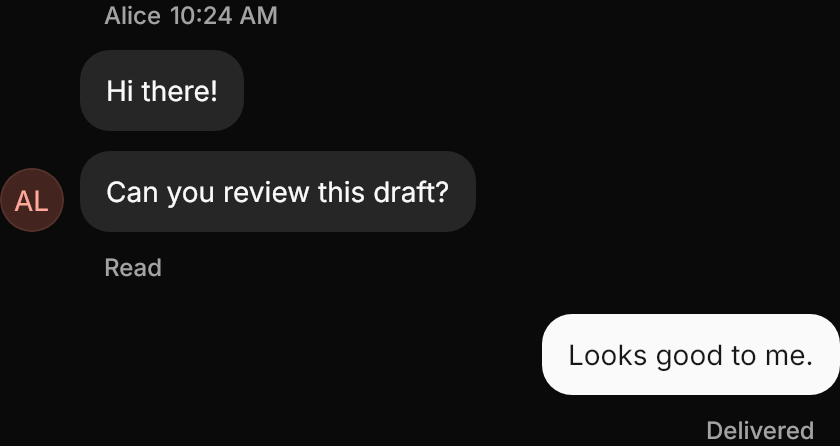
- Bubble
- Button
- Button Group
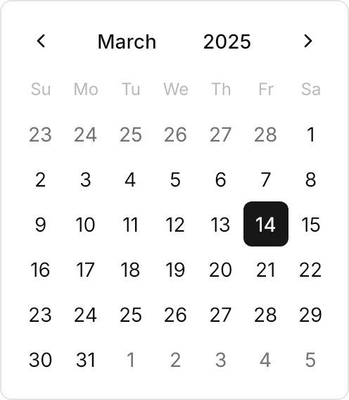
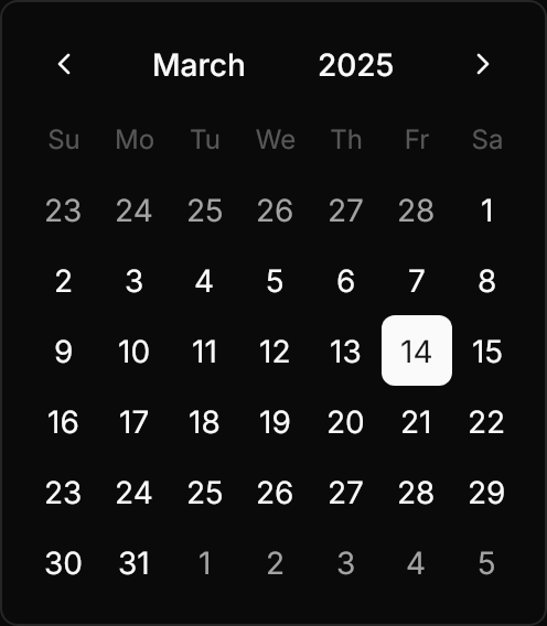
- Calendar
- Carousel
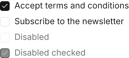
- Checkbox
- Clipboard
- Collapsible
- Color Picker
- Combobox
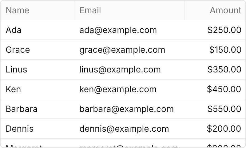
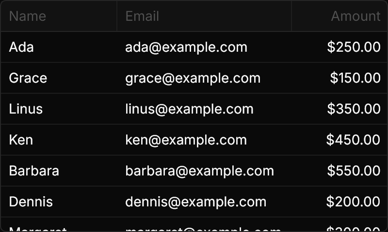
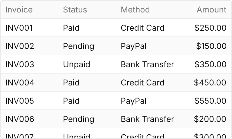
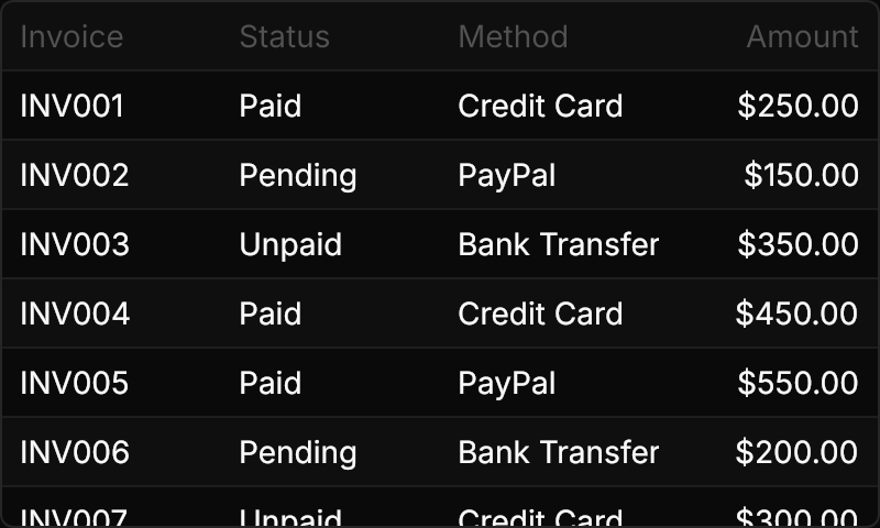
- Data Table
- Date Picker
- Description List
- Dropdown Button
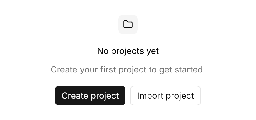
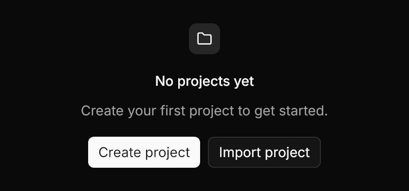
- Empty
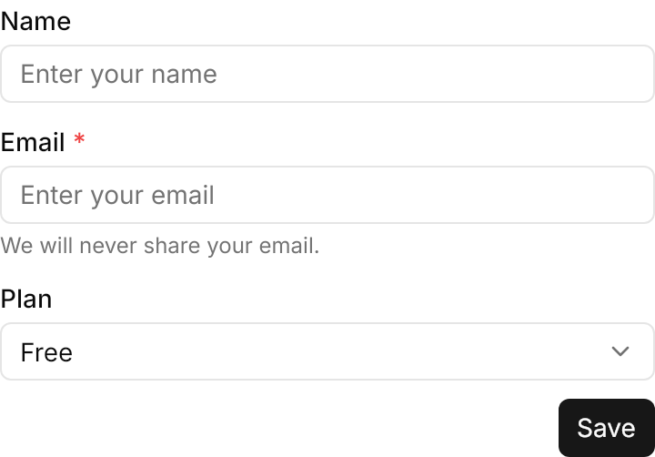
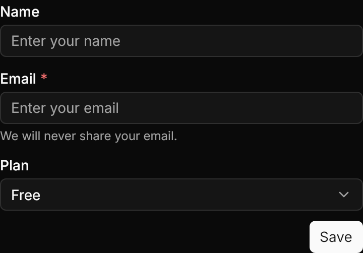
- Form
- Group Box
- Hover Card
- Icon
- Image
- Input
- Input Group
- Kbd
- Label
- Link
- List
- Marker
- Menu
- Message
- Notification
- Number Input
- Pagination
- Popover
- Progress
- Progress Circle
- Radio
- Rating
- Resizable
- Scrollable
- Select
- Separator
- Sheet
- Shimmer
- Sidebar
- Skeleton
- Slider
- Spinner
- Status Bar
- Stepper
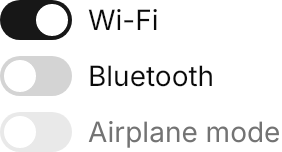
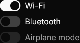
- Switch
- Table
- Tabs
- Tag
- Textarea
- Time Field
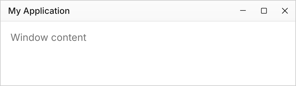
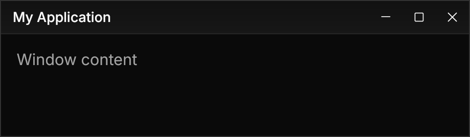
- Title Bar
- Toggle
- Toggle Group
- Toolbar
- Tooltip
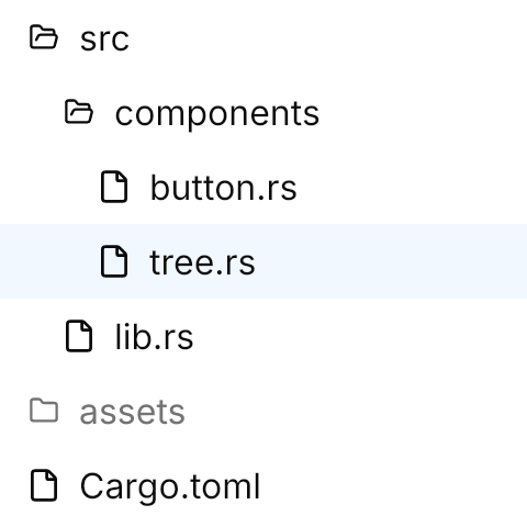
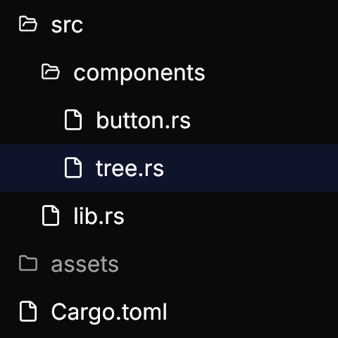
- Tree
- Virtual List
Every GPUI Kit component the library ports: themes for Avalonia's own controls, and new controls for the small components Avalonia lacks.