Interactive

<StackPanel Spacing="12" Width="320" HorizontalAlignment="Left">
  <StackPanel Spacing="4">
    <TextBlock Text="GPUI Kit" FontWeight="Medium" />
    <TextBlock Text="An open-source UI component library." Foreground="{DynamicResource Gpui.MutedForeground}" />
  </StackPanel>
  <Separator />
  <StackPanel Orientation="Horizontal" Spacing="12" Height="20">
    <TextBlock Text="Blog" VerticalAlignment="Center" />
    <Separator Classes="vertical" />
    <TextBlock Text="Docs" VerticalAlignment="Center" />
    <Separator Classes="vertical" />
    <TextBlock Text="Source" VerticalAlignment="Center" />
  </StackPanel>
</StackPanel>Usage
The theme covers Separator in full: a 1px line in the border color, centered on a box of no thickness, so it straddles the boundary between its neighbours without taking space, as GPUI Kit's does. A vertical separator stretches to its row's height (the demos give the StackPanel one). Classes: vertical, dashed (a 4px dash with a 2px gap); they combine.
Examples
Solid and dashed, horizontal and vertical.
Interactive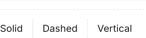

<StackPanel Spacing="16" Width="240" HorizontalAlignment="Left">
  <Separator />
  <Separator Classes="dashed" />
  <StackPanel Orientation="Horizontal" Spacing="16" Height="32">
    <TextBlock Text="Solid" VerticalAlignment="Center" />
    <Separator Classes="vertical" />
    <TextBlock Text="Dashed" VerticalAlignment="Center" />
    <Separator Classes="vertical dashed" />
    <TextBlock Text="Vertical" VerticalAlignment="Center" />
  </StackPanel>
</StackPanel>Not covered
- A label in the middle of the line.