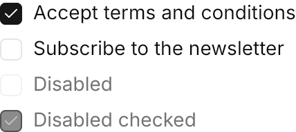
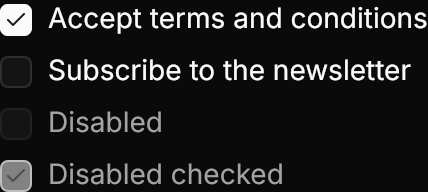
<StackPanel Spacing="8">
  <CheckBox Content="Accept terms and conditions" IsChecked="True" />
  <CheckBox Content="Subscribe to the newsletter" />
  <CheckBox Content="Disabled" IsEnabled="False" />
  <CheckBox Content="Disabled checked" IsChecked="True" IsEnabled="False" />
</StackPanel>Usage
The theme covers CheckBox in full. The box is 16px with the label 8px after it; the check mark fades in on Gpui.Spring.Control and reverses midway when the box is toggled back. Sizes: xsmall, small, large (medium is the default).
IsThreeState="True" with IsChecked="{x:Null}" gives the indeterminate state, drawn as a minus mark. A CheckBox without Content drops the label and its gap: the theme adds the bare class to the indicator on its own. The focus ring wraps the whole row and shows on keyboard focus only, as GPUI Kit does not focus a checkbox on a pointer press.
Examples
The four sizes scale the box, the mark and the label.


<WrapPanel ItemSpacing="16" LineSpacing="8">
  <CheckBox Classes="xsmall" Content="Extra small" IsChecked="True" />
  <CheckBox Classes="small" Content="Small" IsChecked="True" />
  <CheckBox Content="Medium" IsChecked="True" />
  <CheckBox Classes="large" Content="Large" IsChecked="True" />
</WrapPanel>A three-state "Select all" box above the items it stands for. The states are static here; an app keeps them in sync through its bindings.
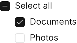
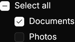
<StackPanel Spacing="8">
  <CheckBox Content="Select all" IsThreeState="True" IsChecked="{x:Null}" />
  <StackPanel Spacing="8" Margin="24,0,0,0">
    <CheckBox Content="Documents" IsChecked="True" />
    <CheckBox Content="Photos" />
  </StackPanel>
</StackPanel>Label-less boxes for a table or list row; no class is needed.


<WrapPanel ItemSpacing="12" LineSpacing="8">
  <CheckBox IsChecked="True" />
  <CheckBox />
  <CheckBox Classes="small" IsChecked="True" />
  <CheckBox Classes="small" />
  <CheckBox IsChecked="True" IsEnabled="False" />
  <CheckBox IsEnabled="False" />
</WrapPanel>Not covered
- Nothing: the control's look and motion are covered in full.