

<Slider Value="40" Minimum="0" Maximum="100" Width="240" Margin="12,8" HorizontalAlignment="Left" />Usage
The theme covers Slider with its Track, Thumb and TickBars: a 6px pill filled up to the value in a 24px band, and a 16px thumb centred on the value that overhangs the ends by half its width, so leave a margin around the control. A 3px ring springs around the thumb while it or the slider is hovered or pressed, and fades when released.
Orientation="Vertical" makes it 24px wide and 120px tall by default, filling from the bottom; Classes="reverse" fills from the thumb to the end instead. Disabled, the thumb is not drawn and the fill keeps its length. There is one size, as in GPUI. Ticks (TickPlacement, TickFrequency) are Avalonia's own, drawn as muted 1px lines at the band's edges.
Examples
Vertical sliders at the minimum, a value and the maximum.
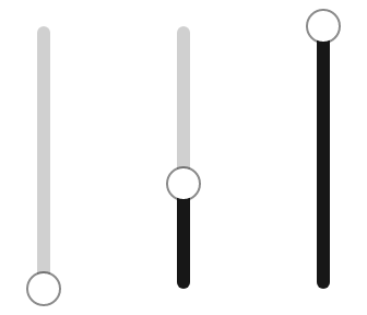
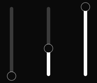
<StackPanel Orientation="Horizontal" Spacing="24" HorizontalAlignment="Left">
  <Slider Orientation="Vertical" Value="0" Height="120" Margin="8,12" />
  <Slider Orientation="Vertical" Value="40" Height="120" Margin="8,12" />
  <Slider Orientation="Vertical" Value="100" Height="120" Margin="8,12" />
</StackPanel>A normal and a reverse slider at the same value.
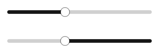

<StackPanel Spacing="8" Width="264" HorizontalAlignment="Left">
  <Slider Value="40" Margin="12,8" />
  <Slider Classes="reverse" Value="40" Margin="12,8" />
</StackPanel>Disabled sliders keep their fill but draw no thumb.
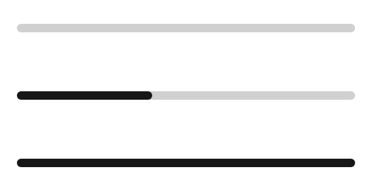

<StackPanel Spacing="8" Width="264" HorizontalAlignment="Left">
  <Slider Value="0" Margin="12,8" IsEnabled="False" />
  <Slider Value="40" Margin="12,8" IsEnabled="False" />
  <Slider Value="100" Margin="12,8" IsEnabled="False" />
</StackPanel>Not covered
- A range slider with two thumbs.
- The active color while pressing the track (GPUI's thumb moves first, so it is not drawn either).