Interactive

<StackPanel Orientation="Horizontal" Spacing="12" HorizontalAlignment="Left">
  <ProgressBar Theme="{StaticResource GpuiProgressCircle}" Value="0" />
  <ProgressBar Theme="{StaticResource GpuiProgressCircle}" Value="25" />
  <ProgressBar Theme="{StaticResource GpuiProgressCircle}" Value="50" />
  <ProgressBar Theme="{StaticResource GpuiProgressCircle}" Value="75" />
  <ProgressBar Theme="{StaticResource GpuiProgressCircle}" Value="100" />
</StackPanel>Usage
ProgressBar Theme="{StaticResource GpuiProgressCircle}" draws a ring in the progress color at 20% and, over it, the value's arc clockwise from 12 o'clock with flat ends. The stroke is 15% of the width, at most 5px, so any Width and Height work. A change of Value sweeps the arc over 180ms; IsIndeterminate="True" repeats GPUI Kit's one-second cycle, in which the arc grows and shrinks around the ring. Sizes: xsmall (8px), small (12px), large (20px); medium (16px) needs no class.
Examples
The four sizes and an 80px ring, whose stroke stops at 5px.
Interactive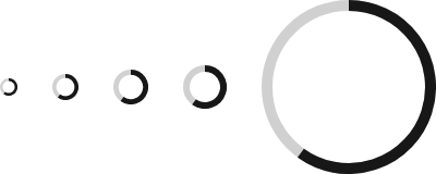

<StackPanel Orientation="Horizontal" Spacing="16" HorizontalAlignment="Left">
  <ProgressBar Theme="{StaticResource GpuiProgressCircle}" Classes="xsmall" Value="60" VerticalAlignment="Center" />
  <ProgressBar Theme="{StaticResource GpuiProgressCircle}" Classes="small" Value="60" VerticalAlignment="Center" />
  <ProgressBar Theme="{StaticResource GpuiProgressCircle}" Value="60" VerticalAlignment="Center" />
  <ProgressBar Theme="{StaticResource GpuiProgressCircle}" Classes="large" Value="60" VerticalAlignment="Center" />
  <!-- Any size works: the stroke is 15% of the width, at most 5px. -->
  <ProgressBar Theme="{StaticResource GpuiProgressCircle}" Width="80" Height="80" Value="60" VerticalAlignment="Center" />
</StackPanel>The indeterminate arc at medium, large and 40px.
Interactive

<StackPanel Orientation="Horizontal" Spacing="16" HorizontalAlignment="Left">
  <ProgressBar Theme="{StaticResource GpuiProgressCircle}" IsIndeterminate="True" VerticalAlignment="Center" />
  <ProgressBar Theme="{StaticResource GpuiProgressCircle}" Classes="large" IsIndeterminate="True" VerticalAlignment="Center" />
  <ProgressBar Theme="{StaticResource GpuiProgressCircle}" Width="40" Height="40" IsIndeterminate="True" VerticalAlignment="Center" />
</StackPanel>Not covered
- Custom colors.
- Content in the center of the ring (overlay it in a
Grid).