

<Panel MinHeight="280">
  <ComboBox Width="200" PlaceholderText="Select a fruit" HorizontalAlignment="Left" VerticalAlignment="Top">
    <ComboBoxItem Content="Apple" />
    <ComboBoxItem Content="Banana" />
    <ComboBoxItem Content="Cherry" />
    <ComboBoxItem Content="Grape" />
    <ComboBoxItem Content="Orange" />
  </ComboBox>
</Panel>Usage
The theme covers ComboBox and ComboBoxItem. The trigger is the input frame with the selected item (or the muted PlaceholderText) and a muted chevron; it shows the ring while focused or open, and stays focused after a mouse selection, as GPUI refocuses it. Disabled, the frame fades to half; IsEnabled="False" on a ComboBoxItem mutes that row. An invalid select (:error through DataValidationErrors) turns the border to the danger color.
The popup opens 6px below the trigger (above it when it flips), as wide as the trigger and at most 320px tall: GPUI's popover surface with 4px of padding around rounded rows. The row under the keyboard cursor shows the accent, a hovered row the accent at 70%, and the selected row has a check mark. On every open the popup slides 8px down and fades in over 150ms, and while it is open the trigger shows the item under the cursor, as GPUI's does. Sizes: xsmall, small, large (medium is the default).
Examples
The four sizes.
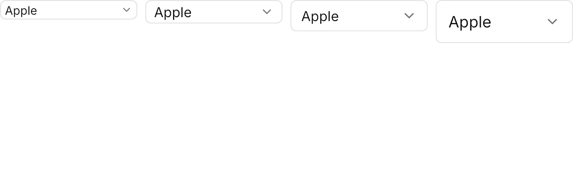
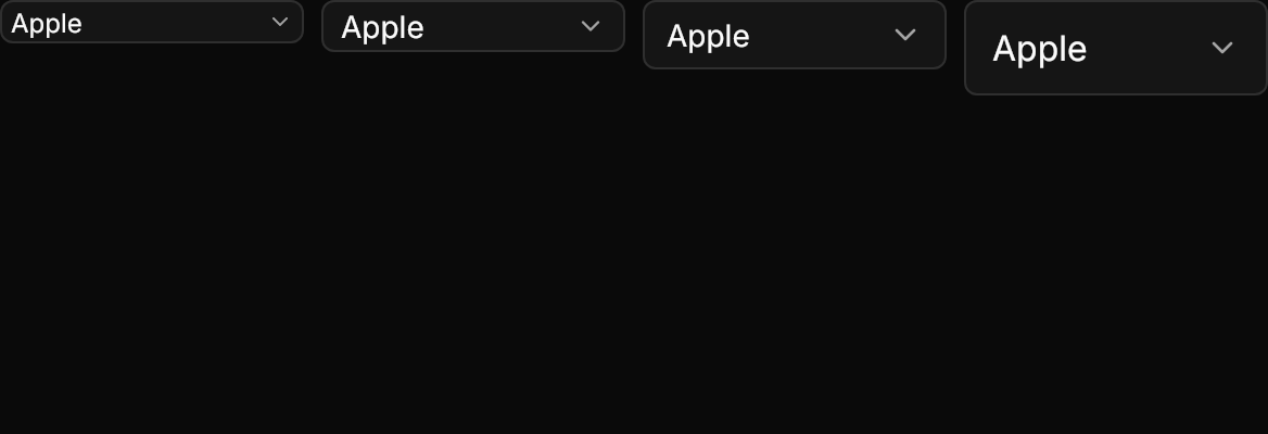
<Panel MinHeight="200">
  <WrapPanel ItemSpacing="8" LineSpacing="8" VerticalAlignment="Top">
    <ComboBox Classes="xsmall" Width="140" SelectedIndex="0">
      <ComboBoxItem Content="Apple" />
      <ComboBoxItem Content="Banana" />
      <ComboBoxItem Content="Cherry" />
    </ComboBox>
    <ComboBox Classes="small" Width="140" SelectedIndex="0">
      <ComboBoxItem Content="Apple" />
      <ComboBoxItem Content="Banana" />
      <ComboBoxItem Content="Cherry" />
    </ComboBox>
    <ComboBox Width="140" SelectedIndex="0">
      <ComboBoxItem Content="Apple" />
      <ComboBoxItem Content="Banana" />
      <ComboBoxItem Content="Cherry" />
    </ComboBox>
    <ComboBox Classes="large" Width="140" SelectedIndex="0">
      <ComboBoxItem Content="Apple" />
      <ComboBoxItem Content="Banana" />
      <ComboBoxItem Content="Cherry" />
    </ComboBox>
  </WrapPanel>
</Panel>A disabled item in the list, a disabled select with a value, and a disabled one showing its placeholder.
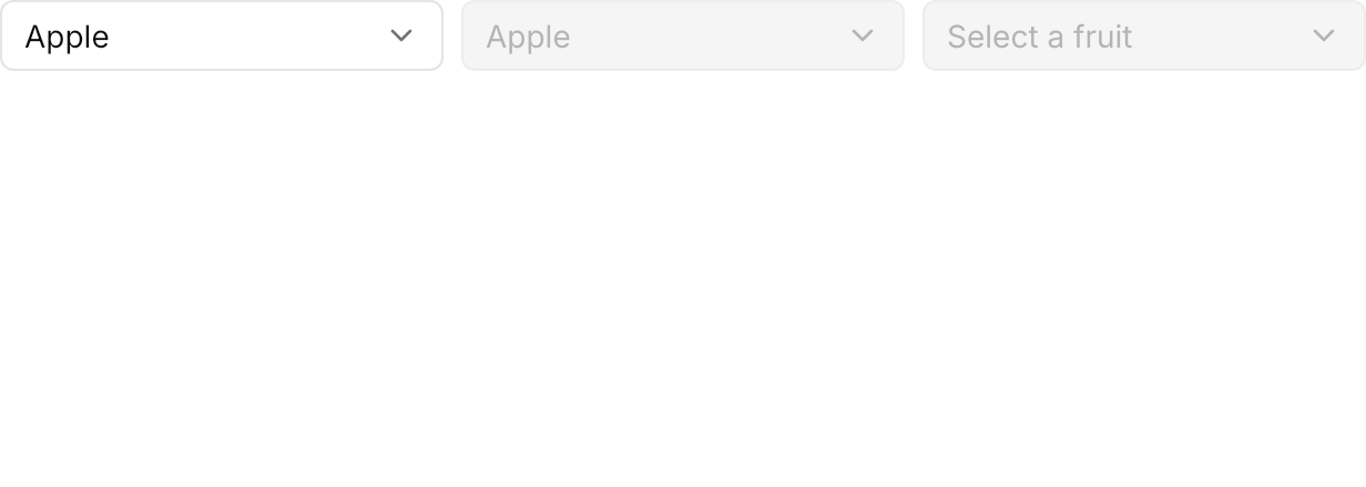
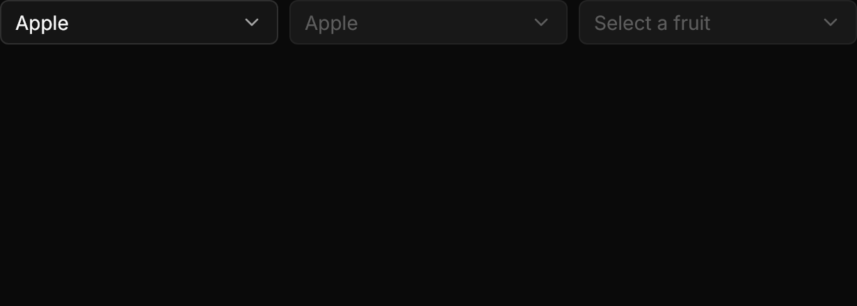
<Panel MinHeight="220">
  <WrapPanel ItemSpacing="8" LineSpacing="8" VerticalAlignment="Top">
    <ComboBox Width="200" SelectedIndex="0">
      <ComboBoxItem Content="Apple" />
      <ComboBoxItem Content="Banana" />
      <ComboBoxItem Content="Cherry" IsEnabled="False" />
      <ComboBoxItem Content="Grape" />
    </ComboBox>
    <ComboBox Width="200" SelectedIndex="0" IsEnabled="False">
      <ComboBoxItem Content="Apple" />
      <ComboBoxItem Content="Banana" />
    </ComboBox>
    <ComboBox Width="200" PlaceholderText="Select a fruit" IsEnabled="False">
      <ComboBoxItem Content="Apple" />
      <ComboBoxItem Content="Banana" />
    </ComboBox>
  </WrapPanel>
</Panel>Not covered
- A search field inside the popup (see Combobox).
- Grouped items.
- A clear button.