GPUI Kit's combobox: a select that filters as you type, as ComboBox or AutoCompleteBox.


<Panel MinHeight="280">
  <ComboBox Classes="combobox" Width="200" SelectedIndex="0" HorizontalAlignment="Left" VerticalAlignment="Top">
    <ComboBoxItem Content="Apple" />
    <ComboBoxItem Content="Banana" />
    <ComboBoxItem Content="Cherry" />
    <ComboBoxItem Content="Grape" />
    <ComboBoxItem Content="Orange" />
  </ComboBox>
</Panel>Usage
GPUI Kit's Combobox pairs a trigger with a search field in its popup; Avalonia splits that between two controls. To pick from a list, use ComboBox Classes="combobox": the themed Select, except that the trigger is titled with the committed item only (a plain ComboBox shows the item under the cursor while open). To filter as you type, use AutoCompleteBox: its text field is the input frame and its suggestions open in GPUI's dropdown popup, 6px below and as wide as the field, with the selected suggestion in the accent. ItemsSource and FilterMode are the control's own; FilterMode="Contains" matches anywhere in an item. Sizes on both: xsmall, small, large (medium is the default).
Examples
An AutoCompleteBox filtering a list of fruit names. The demo takes its ItemsSource from a static helper that holds a list of strings; bind your own collection instead.


<Panel MinHeight="280">
  <AutoCompleteBox Width="200" PlaceholderText="Type a fruit" FilterMode="Contains"
                   ItemsSource="{x:Static demos:Fruits.All}"
                   HorizontalAlignment="Left" VerticalAlignment="Top" />
</Panel>A small and a medium combobox, and a disabled one.
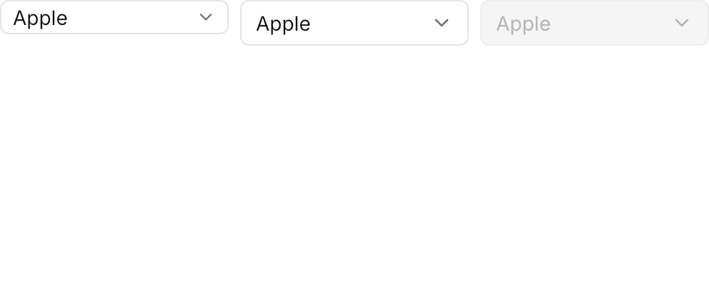

<Panel MinHeight="200">
  <WrapPanel ItemSpacing="8" LineSpacing="8" VerticalAlignment="Top">
    <ComboBox Classes="combobox small" Width="160" SelectedIndex="0">
      <ComboBoxItem Content="Apple" />
      <ComboBoxItem Content="Banana" />
      <ComboBoxItem Content="Cherry" />
    </ComboBox>
    <ComboBox Classes="combobox" Width="160" SelectedIndex="0">
      <ComboBoxItem Content="Apple" />
      <ComboBoxItem Content="Banana" />
      <ComboBoxItem Content="Cherry" />
    </ComboBox>
    <ComboBox Classes="combobox" Width="160" SelectedIndex="0" IsEnabled="False">
      <ComboBoxItem Content="Apple" />
      <ComboBoxItem Content="Banana" />
    </ComboBox>
  </WrapPanel>
</Panel>Not covered
- Multiple selection with chips.
- A custom search function:
AutoCompleteBox's own filtering is used. - GPUI's trigger plus a separate search field inside the popup.