Interactive

<ProgressBar Theme="{StaticResource GpuiSpinner}" />Usage
ProgressBar Theme="{StaticResource GpuiSpinner}" draws GPUI Kit's loader icon turning once every 0.8 seconds, with an ease-in-out on each turn. The theme sets IsIndeterminate itself, and the icon takes Foreground, the text color by default. Sizes: xsmall (12px), small (14px), large (24px); medium (16px) needs no class.
Examples
The four sizes.
Interactive

<StackPanel Orientation="Horizontal" Spacing="16" HorizontalAlignment="Left">
  <ProgressBar Theme="{StaticResource GpuiSpinner}" Classes="xsmall" VerticalAlignment="Center" />
  <ProgressBar Theme="{StaticResource GpuiSpinner}" Classes="small" VerticalAlignment="Center" />
  <ProgressBar Theme="{StaticResource GpuiSpinner}" VerticalAlignment="Center" />
  <ProgressBar Theme="{StaticResource GpuiSpinner}" Classes="large" VerticalAlignment="Center" />
</StackPanel>A spinner beside text, one in the muted color, and one inside a disabled button in the button's foreground.
Interactive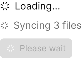
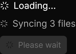
<StackPanel Spacing="12" HorizontalAlignment="Left">
  <StackPanel Orientation="Horizontal" Spacing="8">
    <ProgressBar Theme="{StaticResource GpuiSpinner}" VerticalAlignment="Center" />
    <TextBlock Text="Loading…" VerticalAlignment="Center" />
  </StackPanel>
  <StackPanel Orientation="Horizontal" Spacing="8">
    <ProgressBar Theme="{StaticResource GpuiSpinner}" Classes="small" Foreground="{DynamicResource Gpui.MutedForeground}" VerticalAlignment="Center" />
    <TextBlock Text="Syncing 3 files" Foreground="{DynamicResource Gpui.MutedForeground}" VerticalAlignment="Center" />
  </StackPanel>
  <Button Classes="primary" IsEnabled="False" HorizontalAlignment="Left">
    <StackPanel Orientation="Horizontal" Spacing="8">
      <ProgressBar Theme="{StaticResource GpuiSpinner}" Classes="small" Foreground="{DynamicResource Gpui.PrimaryForeground}" VerticalAlignment="Center" />
      <TextBlock Text="Please wait" VerticalAlignment="Center" />
    </StackPanel>
  </Button>
</StackPanel>Not covered
- Changing the icon, the speed or the easing.