GPUI Kit's form grid, with labelled fields, required marks and descriptions.
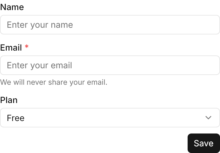
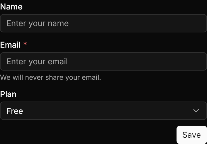
<gpui:Form Width="360" HorizontalAlignment="Left">
  <gpui:FormField Label="Name">
    <TextBox PlaceholderText="Enter your name" />
  </gpui:FormField>
  <gpui:FormField Label="Email" IsRequired="True" Description="We will never share your email.">
    <TextBox PlaceholderText="Enter your email" />
  </gpui:FormField>
  <gpui:FormField Label="Plan">
    <ComboBox SelectedIndex="0" HorizontalAlignment="Stretch">
      <ComboBoxItem Content="Free" />
      <ComboBoxItem Content="Pro" />
    </ComboBox>
  </gpui:FormField>
  <gpui:Form.Footer>
    <Button Classes="primary" Content="Save" />
  </gpui:Form.Footer>
</gpui:Form>Usage
gpui:Form is an ItemsControl of gpui:FormFields laid out in a grid of Columns, placed in order; a field that does not fit the rest of a row starts the next. A field's content is the input, stretched to the field's width; its Label is medium-weight text with a danger * after it when IsRequired, and Description is muted help text under the input, whose row is there even when empty. Footer is content under the fields, aligned to the end of the row. Validation stays with the inputs (DataValidationErrors); the form holds no values.
The size classes on the form set its gaps: rows 8px apart (small 6, large 12) and the label 2px from the input (4 at large). The inputs keep their own size classes.
Examples
LabelOrientation="Horizontal" puts the labels beside the inputs, 140px wide by default; LabelWidth narrows or widens them.
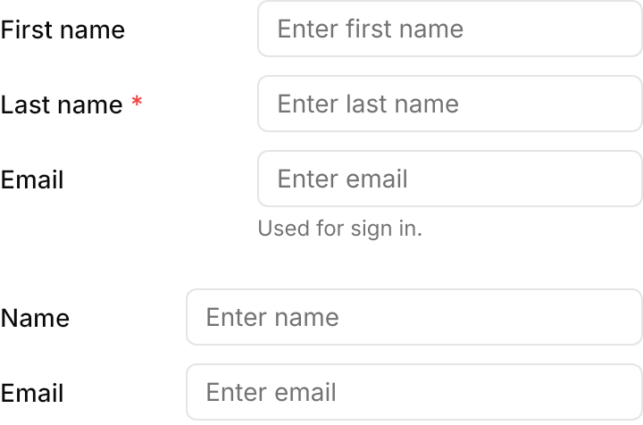
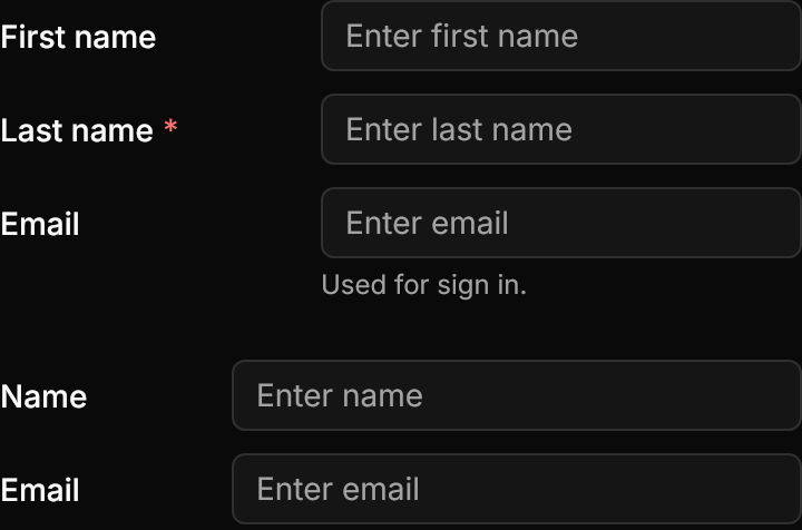
<StackPanel Spacing="24" Width="360" HorizontalAlignment="Left">
  <gpui:Form LabelOrientation="Horizontal">
    <gpui:FormField Label="First name">
      <TextBox PlaceholderText="Enter first name" />
    </gpui:FormField>
    <gpui:FormField Label="Last name" IsRequired="True">
      <TextBox PlaceholderText="Enter last name" />
    </gpui:FormField>
    <gpui:FormField Label="Email" Description="Used for sign in.">
      <TextBox PlaceholderText="Enter email" />
    </gpui:FormField>
  </gpui:Form>
  <gpui:Form LabelOrientation="Horizontal" LabelWidth="100">
    <gpui:FormField Label="Name">
      <TextBox PlaceholderText="Enter name" />
    </gpui:FormField>
    <gpui:FormField Label="Email">
      <TextBox PlaceholderText="Enter email" />
    </gpui:FormField>
  </gpui:Form>
</StackPanel>Columns="2", with the address field spanning both through ColumnSpan="2".
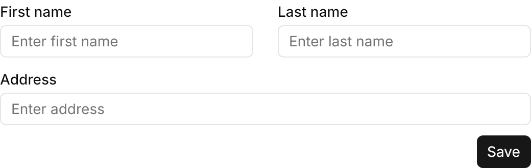
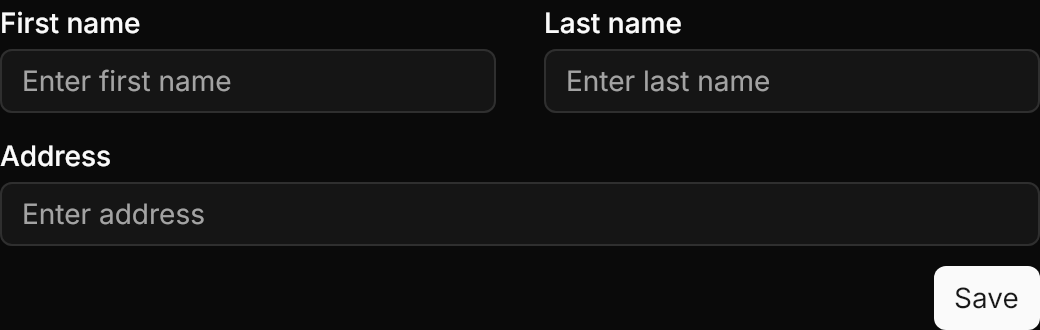
<gpui:Form Columns="2" Width="520" HorizontalAlignment="Left">
  <gpui:FormField Label="First name">
    <TextBox PlaceholderText="Enter first name" />
  </gpui:FormField>
  <gpui:FormField Label="Last name">
    <TextBox PlaceholderText="Enter last name" />
  </gpui:FormField>
  <gpui:FormField Label="Address" ColumnSpan="2">
    <TextBox PlaceholderText="Enter address" />
  </gpui:FormField>
  <gpui:Form.Footer>
    <Button Classes="primary" Content="Save" />
  </gpui:Form.Footer>
</gpui:Form>small and large forms, with matching size classes on their inputs and footer buttons.
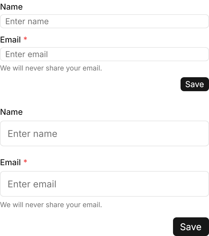
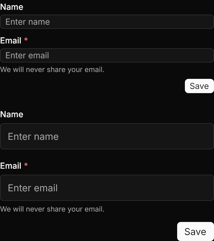
<StackPanel Spacing="24" Width="360" HorizontalAlignment="Left">
  <gpui:Form Classes="small">
    <gpui:FormField Label="Name">
      <TextBox Classes="small" PlaceholderText="Enter name" />
    </gpui:FormField>
    <gpui:FormField Label="Email" IsRequired="True" Description="We will never share your email.">
      <TextBox Classes="small" PlaceholderText="Enter email" />
    </gpui:FormField>
    <gpui:Form.Footer>
      <Button Classes="primary small" Content="Save" />
    </gpui:Form.Footer>
  </gpui:Form>
  <gpui:Form Classes="large">
    <gpui:FormField Label="Name">
      <TextBox Classes="large" PlaceholderText="Enter name" />
    </gpui:FormField>
    <gpui:FormField Label="Email" IsRequired="True" Description="We will never share your email.">
      <TextBox Classes="large" PlaceholderText="Enter email" />
    </gpui:FormField>
    <gpui:Form.Footer>
      <Button Classes="primary large" Content="Save" />
    </gpui:Form.Footer>
  </gpui:Form>
</StackPanel>Not covered
- Placing a field at an explicit column (
col_start/col_end). - Changing the label's text size.