A titled group in GPUI Kit's normal, fill and outline looks, as Avalonia's GroupBox.
Full
Interactive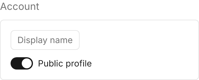

<GroupBox Classes="outline" Header="Account" Width="320" HorizontalAlignment="Left">
  <StackPanel Spacing="12">
    <TextBox PlaceholderText="Display name" />
    <ToggleSwitch Content="Public profile" IsChecked="True" />
  </StackPanel>
</GroupBox>Usage
The theme covers GroupBox in full. Header is the muted title, and the content follows 16px below it (12px for fill and outline). Without a class the group sits on the page background; fill paints the group box color and outline a 1px border, and both pad the content by 16px. Without a Header, only the surface remains.
Examples
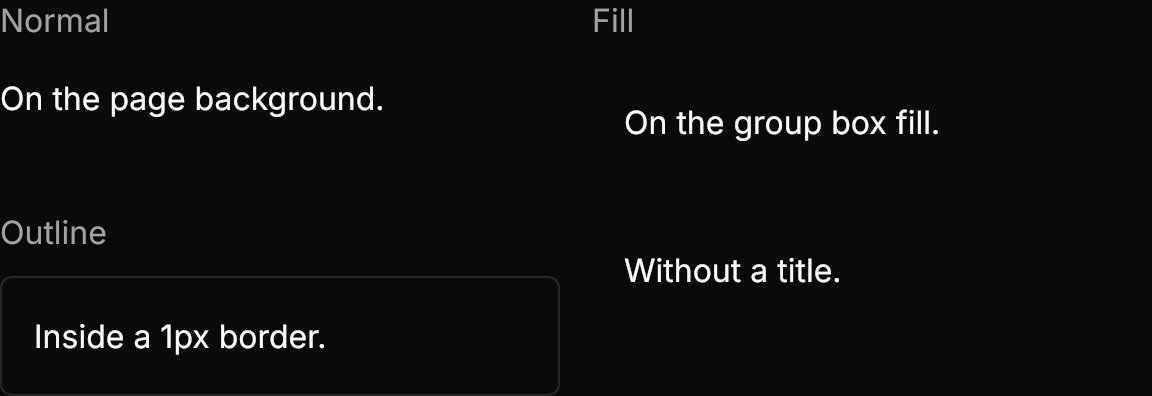
Normal, fill and outline, and a fill group without a title.
Interactive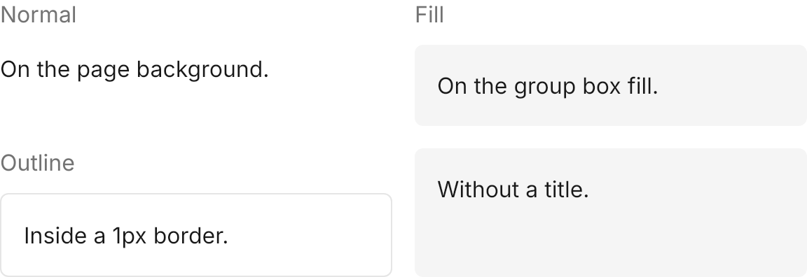
<WrapPanel ItemSpacing="16" LineSpacing="16">
  <GroupBox Header="Normal" Content="On the page background." Width="280" />
  <GroupBox Classes="fill" Header="Fill" Content="On the group box fill." Width="280" />
  <GroupBox Classes="outline" Header="Outline" Content="Inside a 1px border." Width="280" />
  <GroupBox Classes="fill" Content="Without a title." Width="280" />
</WrapPanel>Not covered
- The footer.