<StackPanel Spacing="8" HorizontalAlignment="Left">
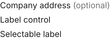
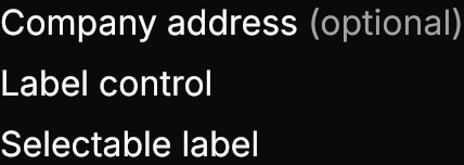
  <TextBlock Classes="label">Company address<Run Classes="secondary" Text=" (optional)" /></TextBlock>
  <Label Content="Label control" />
  <SelectableTextBlock Classes="label" Text="Selectable label" />
</StackPanel>Usage
TextBlock Classes="label" (and SelectableTextBlock) puts the text in the foreground color on GPUI Kit's fixed 20px line, whatever the font size, and wraps it when the width is constrained; a Run Classes="secondary" inside it is muted. Sizes and weights are the app's FontSize and FontWeight, as GPUI's text_* and font_* are. Avalonia's Label control gets the same look and keeps its Target. TextBlock has no default theme of its own, as one would retarget the text in every template.
Examples
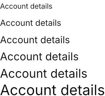
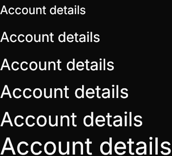
Font sizes from 12 to 24 on the same 20px line; text taller than the line overflows it, centered and unclipped, as in GPUI.
<StackPanel Spacing="8" HorizontalAlignment="Left">
  <TextBlock Classes="label" FontSize="12" Text="Account details" />
  <TextBlock Classes="label" FontSize="14" Text="Account details" />
  <TextBlock Classes="label" FontSize="16" Text="Account details" />
  <TextBlock Classes="label" FontSize="18" Text="Account details" />
  <TextBlock Classes="label" FontSize="20" Text="Account details" />
  <TextBlock Classes="label" FontSize="24" Text="Account details" />
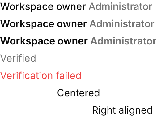
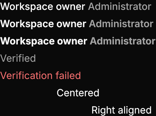
</StackPanel>Weights with a secondary run, colors with Foreground, and TextAlignment in a fixed width.
<StackPanel Spacing="8" HorizontalAlignment="Left">
  <TextBlock Classes="label" FontWeight="Medium">Workspace owner<Run Classes="secondary" Text=" Administrator" /></TextBlock>
  <TextBlock Classes="label" FontWeight="SemiBold">Workspace owner<Run Classes="secondary" Text=" Administrator" /></TextBlock>
  <TextBlock Classes="label" FontWeight="Bold">Workspace owner<Run Classes="secondary" Text=" Administrator" /></TextBlock>
  <TextBlock Classes="label" Foreground="{DynamicResource Gpui.MutedForeground}" Text="Verified" />
  <TextBlock Classes="label" Foreground="{DynamicResource Gpui.Danger}" Text="Verification failed" />
  <TextBlock Classes="label" Width="240" TextAlignment="Center" Text="Centered" />
  <TextBlock Classes="label" Width="240" TextAlignment="Right" Text="Right aligned" />
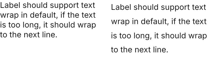
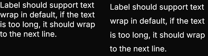
</StackPanel>A label wraps when its width is constrained; LineHeight replaces the 20px line.
<StackPanel Orientation="Horizontal" Spacing="24" HorizontalAlignment="Left">
  <TextBlock Classes="label" Width="200"
             Text="Label should support text wrap in default, if the text is too long, it should wrap to the next line." />
  <TextBlock Classes="label" Width="200" LineHeight="28.8"
             Text="Label should support text wrap in default, if the text is too long, it should wrap to the next line." />
</StackPanel>Not covered
- Highlighting search matches.
- Masks.