Buttons joined into one bar, with the shared edges and corners GPUI Kit draws.


<StackPanel Classes="button-group" Orientation="Horizontal" HorizontalAlignment="Left">
  <Button Classes="outline" Content="Day" />
  <Button Classes="outline selected" Content="Week" />
  <Button Classes="outline" Content="Month" />
</StackPanel>Usage
Put the buttons in a StackPanel Classes="button-group", horizontal or vertical, and leave its Spacing at 0. Each button stays a Button with its own classes: the colors, outline, selected, the sizes and the corner classes all work as usual, and Click or Command stay on each button.
Grouped, only the first and last buttons keep their outer corners, and every later button drops the edge it shares with the one before, so neighbours share one 1px divider (borderless variants have no edge to drop). The focus ring follows each button's corners.
Examples
Default, primary and ghost groups, plain and outlined; the group takes any of the Button's colors.


<WrapPanel ItemSpacing="16" LineSpacing="12">
  <StackPanel Classes="button-group" Orientation="Horizontal">
    <Button Content="One" />
    <Button Content="Two" />
    <Button Content="Three" />
  </StackPanel>
  <StackPanel Classes="button-group" Orientation="Horizontal">
    <Button Classes="primary" Content="One" />
    <Button Classes="primary" Content="Two" />
    <Button Classes="primary" Content="Three" />
  </StackPanel>
  <StackPanel Classes="button-group" Orientation="Horizontal">
    <Button Classes="ghost" Content="One" />
    <Button Classes="ghost" Content="Two" />
    <Button Classes="ghost" Content="Three" />
  </StackPanel>
  <StackPanel Classes="button-group" Orientation="Horizontal">
    <Button Classes="outline" Content="One" />
    <Button Classes="outline" Content="Two" />
    <Button Classes="outline" Content="Three" />
  </StackPanel>
  <StackPanel Classes="button-group" Orientation="Horizontal">
    <Button Classes="primary outline" Content="One" />
    <Button Classes="primary outline" Content="Two" />
    <Button Classes="primary outline" Content="Three" />
  </StackPanel>
  <StackPanel Classes="button-group" Orientation="Horizontal">
    <Button Classes="ghost outline" Content="One" />
    <Button Classes="ghost outline" Content="Two" />
    <Button Classes="ghost outline" Content="Three" />
  </StackPanel>
</WrapPanel>The buttons' size classes set the group's size; give every button the same one.


<WrapPanel ItemSpacing="16" LineSpacing="12">
  <StackPanel Classes="button-group" Orientation="Horizontal">
    <Button Classes="outline xsmall" Content="One" />
    <Button Classes="outline xsmall" Content="Two" />
    <Button Classes="outline xsmall" Content="Three" />
  </StackPanel>
  <StackPanel Classes="button-group" Orientation="Horizontal">
    <Button Classes="outline small" Content="One" />
    <Button Classes="outline small" Content="Two" />
    <Button Classes="outline small" Content="Three" />
  </StackPanel>
  <StackPanel Classes="button-group" Orientation="Horizontal">
    <Button Classes="outline" Content="One" />
    <Button Classes="outline" Content="Two" />
    <Button Classes="outline" Content="Three" />
  </StackPanel>
  <StackPanel Classes="button-group" Orientation="Horizontal">
    <Button Classes="outline large" Content="One" />
    <Button Classes="outline large" Content="Two" />
    <Button Classes="outline large" Content="Three" />
  </StackPanel>
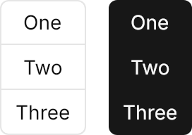
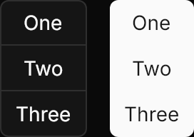
</WrapPanel>Orientation="Vertical" stacks the buttons and shares the horizontal edges instead.
<StackPanel Orientation="Horizontal" Spacing="16">
  <StackPanel Classes="button-group" Orientation="Vertical">
    <Button Classes="outline" Content="One" />
    <Button Classes="outline" Content="Two" />
    <Button Classes="outline" Content="Three" />
  </StackPanel>
  <StackPanel Classes="button-group" Orientation="Vertical">
    <Button Classes="primary" Content="One" />
    <Button Classes="primary" Content="Two" />
    <Button Classes="primary" Content="Three" />
  </StackPanel>
</StackPanel>Not covered
- A group-level API: the group is only the panel and its buttons, so selection and commands stay on each
Button.