Labels and values in GPUI Kit's description grid, with spans and separators.


<gpui:DescriptionList Width="600" HorizontalAlignment="Left">
  <gpui:DescriptionItem Label="Name" Value="GPUI Kit" />
  <gpui:DescriptionItem Label="Version" Value="0.1.0" />
  <gpui:DescriptionItem Label="License" Value="MIT" />
  <gpui:DescriptionItem Label="Platform" Value="macOS, Windows, Linux" Span="2" />
  <gpui:DescriptionItem Label="Status" Value="Stable" />
  <gpui:DescriptionSeparator />
  <gpui:DescriptionItem Label="Author" Value="Longbridge" />
</gpui:DescriptionList>Usage
gpui:DescriptionList lays out gpui:DescriptionItems, each a Label and a Value (the value is the content, so it can be a control), in rows of Columns. An item takes Span columns; a new row starts when the next span would pass the columns, and the items of a row that is not full grow to share it. A gpui:DescriptionSeparator is an 8px band across a whole row. The list is bordered by default: a 1px border with the theme radius, a rule between rows, and muted 14px labels on the label fill beside 16px values.
Examples
Orientation="Vertical" puts each label above its value.
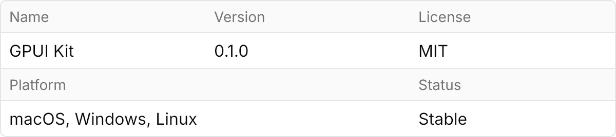
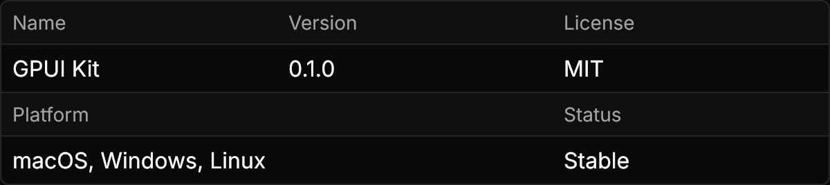
<gpui:DescriptionList Orientation="Vertical" Width="600" HorizontalAlignment="Left">
  <gpui:DescriptionItem Label="Name" Value="GPUI Kit" />
  <gpui:DescriptionItem Label="Version" Value="0.1.0" />
  <gpui:DescriptionItem Label="License" Value="MIT" />
  <gpui:DescriptionItem Label="Platform" Value="macOS, Windows, Linux" Span="2" />
  <gpui:DescriptionItem Label="Status" Value="Stable" />
</gpui:DescriptionList>IsBordered="False" for a plain grid without borders, fills or padding, in either orientation.
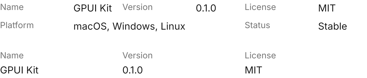
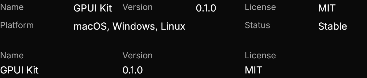
<StackPanel Spacing="24" HorizontalAlignment="Left">
  <gpui:DescriptionList IsBordered="False" Width="600">
    <gpui:DescriptionItem Label="Name" Value="GPUI Kit" />
    <gpui:DescriptionItem Label="Version" Value="0.1.0" />
    <gpui:DescriptionItem Label="License" Value="MIT" />
    <gpui:DescriptionItem Label="Platform" Value="macOS, Windows, Linux" Span="2" />
    <gpui:DescriptionItem Label="Status" Value="Stable" />
  </gpui:DescriptionList>
  <gpui:DescriptionList IsBordered="False" Orientation="Vertical" Width="600">
    <gpui:DescriptionItem Label="Name" Value="GPUI Kit" />
    <gpui:DescriptionItem Label="Version" Value="0.1.0" />
    <gpui:DescriptionItem Label="License" Value="MIT" />
  </gpui:DescriptionList>
</StackPanel>The size classes change the padding; the large list here has two columns and 100px labels.
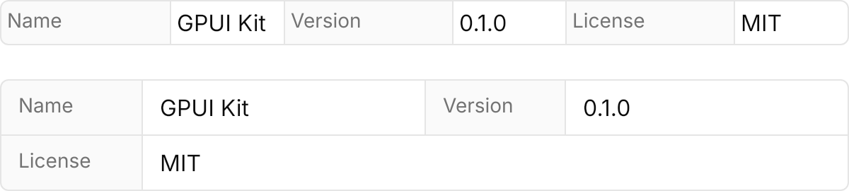
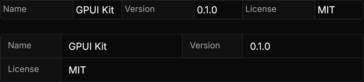
<StackPanel Spacing="24" HorizontalAlignment="Left">
  <gpui:DescriptionList Classes="small" Width="600">
    <gpui:DescriptionItem Label="Name" Value="GPUI Kit" />
    <gpui:DescriptionItem Label="Version" Value="0.1.0" />
    <gpui:DescriptionItem Label="License" Value="MIT" />
  </gpui:DescriptionList>
  <gpui:DescriptionList Classes="large" Columns="2" LabelWidth="100" Width="600">
    <gpui:DescriptionItem Label="Name" Value="GPUI Kit" />
    <gpui:DescriptionItem Label="Version" Value="0.1.0" />
    <gpui:DescriptionItem Label="License" Value="MIT" />
  </gpui:DescriptionList>
</StackPanel>Not covered
- Nothing: the control covers the component.