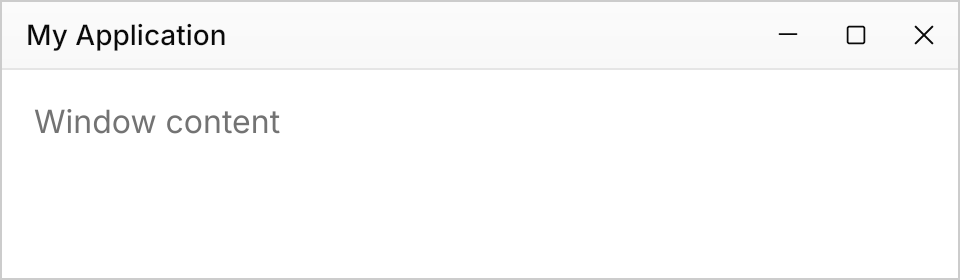
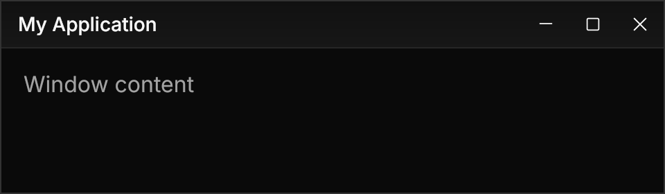
GPUI Kit's title bar and window border, as the decorations Avalonia draws itself.
<!--
  The theme draws the title bar as part of the window's decorations
  (WindowDrawnDecorations), which a page cannot host; this is the same bar
  built from the theme's resources: the gradient, the rule, the caption buttons.
-->
<Border Width="480" Height="140" HorizontalAlignment="Left" BorderThickness="1"
        BorderBrush="{DynamicResource Gpui.WindowFrame}" Background="{DynamicResource Gpui.Background}">
  <DockPanel>
    <Border DockPanel.Dock="Top" Height="34" BackgroundSizing="OuterBorderEdge" BorderThickness="0,0,0,1"
            BorderBrush="{DynamicResource Gpui.TitleBarBorder}">
      <Border.Background>
        <LinearGradientBrush StartPoint="0%,0%" EndPoint="0%,100%">
          <GradientStop Offset="0" Color="{DynamicResource Gpui.TitleBar.GradientTop.Color}" />
          <GradientStop Offset="1" Color="{DynamicResource Gpui.TitleBar.Color}" />
        </LinearGradientBrush>
      </Border.Background>
      <DockPanel>
        <StackPanel DockPanel.Dock="Right" Orientation="Horizontal">
          <Button Theme="{StaticResource GpuiCaptionButton}">
            <PathIcon Width="14" Height="14" Data="{StaticResource Gpui.Icon.WindowMinimize}" />
          </Button>
          <Button Theme="{StaticResource GpuiCaptionButton}">
            <PathIcon Width="14" Height="14" Data="{StaticResource Gpui.Icon.WindowMaximize}" />
          </Button>
          <Button Theme="{StaticResource GpuiCaptionButton}" Classes="close">
            <PathIcon Width="14" Height="14" Data="{StaticResource Gpui.Icon.WindowClose}" />
          </Button>
        </StackPanel>
        <TextBlock Text="My Application" Margin="{DynamicResource Gpui.TitleBar.Padding}" VerticalAlignment="Center"
                   FontSize="14" FontWeight="Medium" LineHeight="22.5" />
      </DockPanel>
    </Border>
    <TextBlock Text="Window content" Margin="16" Foreground="{DynamicResource Gpui.MutedForeground}" />
  </DockPanel>
</Border>Usage
The demo is a mock: WindowDrawnDecorations only renders inside a real window, so the page builds the same bar from the theme's pieces (the gradient, the rule, GpuiCaptionButton with its close class, and the Gpui.TitleBar.* resources). In an app nothing is composed by hand: the theme applies to the window chrome itself.
Set ExtendClientAreaToDecorationsHint="True" on the Window. The theme covers WindowDrawnDecorations, the decorations Avalonia draws itself: a 34px title bar with a 1px rule at its bottom, filled with GPUI Kit's gradient from the title bar color mixed with 45% of the background down to the title bar color; the window's Title at 14px medium, inset by the Gpui.TitleBar.Padding resource (12px by default); and the caption buttons, 34 by 33 with 14px icons, secondary on hover and press, danger for close, the maximize button showing restore while maximized. The frame is 1px of GPUI Kit's fixed gray inside a 20px shadow area with its two shadows. Avalonia draws these on Windows (with the extended client area), X11 and Wayland with client-side decorations, never on macOS.
Not covered
- Arbitrary content in the title bar.
- Decorations drawn by the OS.