Interactive

<CommandBar Content="Files" HorizontalAlignment="Left">
  <CommandBarButton>
    <CommandBarButton.Icon>
      <PathIcon Data="{StaticResource Gpui.Icon.Undo2}" />
    </CommandBarButton.Icon>
  </CommandBarButton>
  <CommandBarButton>
    <CommandBarButton.Icon>
      <PathIcon Data="{StaticResource Gpui.Icon.Redo2}" />
    </CommandBarButton.Icon>
  </CommandBarButton>
  <CommandBarSeparator />
  <CommandBarButton Label="New">
    <CommandBarButton.Icon>
      <PathIcon Data="{StaticResource Gpui.Icon.Plus}" />
    </CommandBarButton.Icon>
  </CommandBarButton>
  <CommandBarSeparator />
  <CommandBarToggleButton Label="B" IsChecked="True" />
</CommandBar>Usage
The theme covers CommandBar with CommandBarButton, CommandBarToggleButton and CommandBarSeparator: a transparent row with the bar's Content first, then the commands. A button is GPUI Kit's ghost compact button with an Icon and an optional Label to its right (DefaultLabelPosition stays Right), square without a label; a toggle button is GPUI Kit's Toggle, in the accent while checked or hovered; a separator is a 20px line taking no width. Sizes: xsmall, the default small (GPUI's toolbar size) and medium (large is the same). The arrow keys move between the commands. GPUI has no overflow menu; the overflow button shows only for SecondaryCommands.
Examples
xsmall, the default, and medium.
Interactive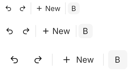
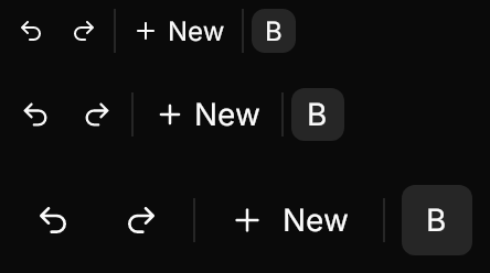
<StackPanel Spacing="8" HorizontalAlignment="Left">
  <CommandBar Classes="xsmall">
    <CommandBarButton>
      <CommandBarButton.Icon>
        <PathIcon Data="{StaticResource Gpui.Icon.Undo2}" />
      </CommandBarButton.Icon>
    </CommandBarButton>
    <CommandBarButton>
      <CommandBarButton.Icon>
        <PathIcon Data="{StaticResource Gpui.Icon.Redo2}" />
      </CommandBarButton.Icon>
    </CommandBarButton>
    <CommandBarSeparator />
    <CommandBarButton Label="New">
      <CommandBarButton.Icon>
        <PathIcon Data="{StaticResource Gpui.Icon.Plus}" />
      </CommandBarButton.Icon>
    </CommandBarButton>
    <CommandBarSeparator />
    <CommandBarToggleButton Label="B" IsChecked="True" />
  </CommandBar>
  <CommandBar>
    <CommandBarButton>
      <CommandBarButton.Icon>
        <PathIcon Data="{StaticResource Gpui.Icon.Undo2}" />
      </CommandBarButton.Icon>
    </CommandBarButton>
    <CommandBarButton>
      <CommandBarButton.Icon>
        <PathIcon Data="{StaticResource Gpui.Icon.Redo2}" />
      </CommandBarButton.Icon>
    </CommandBarButton>
    <CommandBarSeparator />
    <CommandBarButton Label="New">
      <CommandBarButton.Icon>
        <PathIcon Data="{StaticResource Gpui.Icon.Plus}" />
      </CommandBarButton.Icon>
    </CommandBarButton>
    <CommandBarSeparator />
    <CommandBarToggleButton Label="B" IsChecked="True" />
  </CommandBar>
  <CommandBar Classes="medium">
    <CommandBarButton>
      <CommandBarButton.Icon>
        <PathIcon Data="{StaticResource Gpui.Icon.Undo2}" />
      </CommandBarButton.Icon>
    </CommandBarButton>
    <CommandBarButton>
      <CommandBarButton.Icon>
        <PathIcon Data="{StaticResource Gpui.Icon.Redo2}" />
      </CommandBarButton.Icon>
    </CommandBarButton>
    <CommandBarSeparator />
    <CommandBarButton Label="New">
      <CommandBarButton.Icon>
        <PathIcon Data="{StaticResource Gpui.Icon.Plus}" />
      </CommandBarButton.Icon>
    </CommandBarButton>
    <CommandBarSeparator />
    <CommandBarToggleButton Label="B" IsChecked="True" />
  </CommandBar>
</StackPanel>IsEnabled="False" on the bar disables every command.
Interactive

<CommandBar IsEnabled="False" HorizontalAlignment="Left">
  <CommandBarButton>
    <CommandBarButton.Icon>
      <PathIcon Data="{StaticResource Gpui.Icon.Undo2}" />
    </CommandBarButton.Icon>
  </CommandBarButton>
  <CommandBarButton>
    <CommandBarButton.Icon>
      <PathIcon Data="{StaticResource Gpui.Icon.Redo2}" />
    </CommandBarButton.Icon>
  </CommandBarButton>
  <CommandBarSeparator />
  <CommandBarButton Label="New">
    <CommandBarButton.Icon>
      <PathIcon Data="{StaticResource Gpui.Icon.Plus}" />
    </CommandBarButton.Icon>
  </CommandBarButton>
  <CommandBarSeparator />
  <CommandBarToggleButton Label="B" IsChecked="True" />
</CommandBar>Not covered
- Arbitrary elements and flexible spacers among the commands.
ToolbarGroup.