A card that opens next to its content on hover, with GPUI Kit's delays and popover surface.
New control
Interactive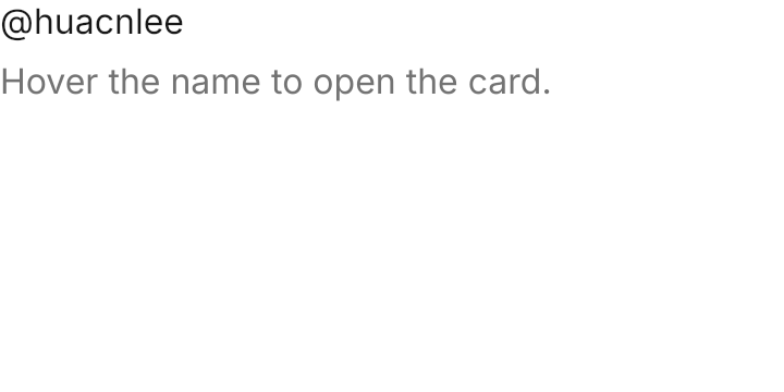
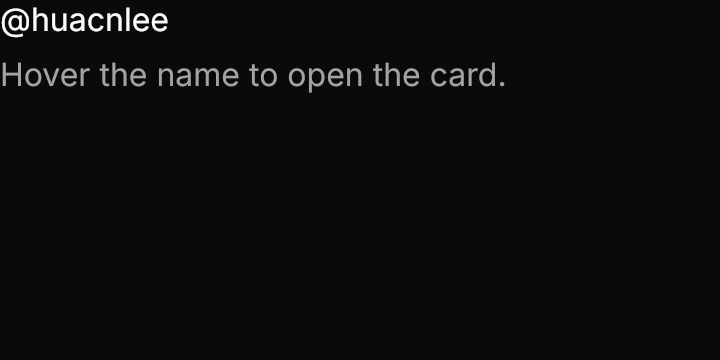
<Panel MinWidth="360" MinHeight="180">
  <StackPanel Spacing="8" HorizontalAlignment="Left" VerticalAlignment="Top">
    <gpui:HoverCard>
      <TextBlock Text="@huacnlee" Foreground="{DynamicResource Gpui.Primary}" />
      <gpui:HoverCard.Card>
        <StackPanel Spacing="8" Width="260">
          <StackPanel Orientation="Horizontal" Spacing="12">
            <gpui:Avatar UserName="Jason Lee" />
            <StackPanel VerticalAlignment="Center">
              <TextBlock Text="Jason Lee" FontWeight="SemiBold" />
              <TextBlock Text="@huacnlee" Foreground="{DynamicResource Gpui.MutedForeground}" />
            </StackPanel>
          </StackPanel>
          <TextBlock Text="Author of GPUI Component, a UI library for GPUI." TextWrapping="Wrap" />
        </StackPanel>
      </gpui:HoverCard.Card>
    </gpui:HoverCard>
    <TextBlock Text="Hover the name to open the card." Foreground="{DynamicResource Gpui.MutedForeground}" />
  </StackPanel>
</Panel>Usage
gpui:HoverCard wraps the trigger as its content; HoverCard.Card is what opens. The card has the popover surface (the background, ring and shadow, 12px of padding, 4px from the trigger) and, like the popover, slides to stay on screen instead of flipping. Entering the trigger schedules the open and leaving it schedules the close; the card keeps itself open while the pointer is on it.
Examples
Placement on each card: top, bottom, aligned to the trigger's left edge, and right.
Interactive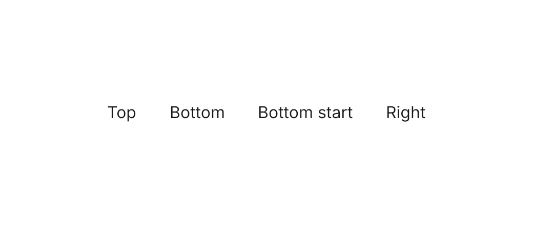
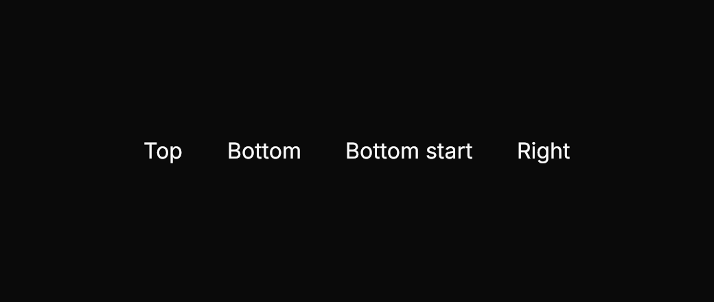
<Panel MinWidth="520" MinHeight="220">
  <StackPanel Orientation="Horizontal" Spacing="32" HorizontalAlignment="Center" VerticalAlignment="Center">
    <gpui:HoverCard Placement="Top">
      <TextBlock Text="Top" Foreground="{DynamicResource Gpui.Primary}" />
      <gpui:HoverCard.Card>
        <TextBlock Text="Opens above the trigger" />
      </gpui:HoverCard.Card>
    </gpui:HoverCard>
    <gpui:HoverCard Placement="Bottom">
      <TextBlock Text="Bottom" Foreground="{DynamicResource Gpui.Primary}" />
      <gpui:HoverCard.Card>
        <TextBlock Text="Opens below the trigger" />
      </gpui:HoverCard.Card>
    </gpui:HoverCard>
    <gpui:HoverCard Placement="BottomEdgeAlignedLeft">
      <TextBlock Text="Bottom start" Foreground="{DynamicResource Gpui.Primary}" />
      <gpui:HoverCard.Card>
        <TextBlock Text="Aligned to the trigger's left edge" />
      </gpui:HoverCard.Card>
    </gpui:HoverCard>
    <gpui:HoverCard Placement="Right">
      <TextBlock Text="Right" Foreground="{DynamicResource Gpui.Primary}" />
      <gpui:HoverCard.Card>
        <TextBlock Text="Opens to the right" />
      </gpui:HoverCard.Card>
    </gpui:HoverCard>
  </StackPanel>
</Panel>Not covered
- Opening on tap (
tap_to_open). - Turning the surface off (
appearance(false)).