A button with a caret half that opens a menu, as Avalonia's SplitButton.
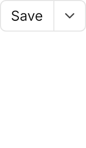

<Panel MinHeight="150">
  <SplitButton Content="Save" HorizontalAlignment="Left" VerticalAlignment="Top">
    <SplitButton.Flyout>
      <MenuFlyout Placement="BottomEdgeAlignedRight">
        <MenuItem Header="Save As..." />
        <MenuItem Header="Save All" />
        <Separator />
        <MenuItem Header="Export" />
      </MenuFlyout>
    </SplitButton.Flyout>
  </SplitButton>
</Panel>Usage
The theme covers SplitButton in full. The action half is the Content, run by Click or Command; the caret half opens the Flyout, normally a MenuFlyout. GPUI Kit opens the menu under the right edge, so give the flyout Placement="BottomEdgeAlignedRight"; the theme adds the 4px gap below the button.
The classes are the Button's: the colors primary, secondary, danger, warning, success, info, ghost, link and text, the modifiers outline and selected, and the sizes xsmall, small and large. While the menu is open the caret half keeps the pressed look. Avalonia focuses a SplitButton as one tab stop; its ring shows on the action half, where GPUI's first Tab lands.
Examples
The main colors, plain and outlined, and a disabled one. The demo keeps one MenuFlyout in the panel's resources and shares it through Flyout="{StaticResource SaveMenu}".
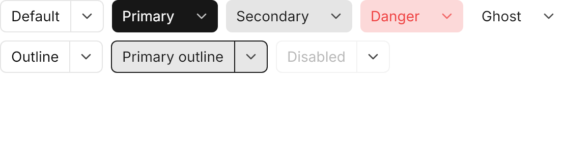
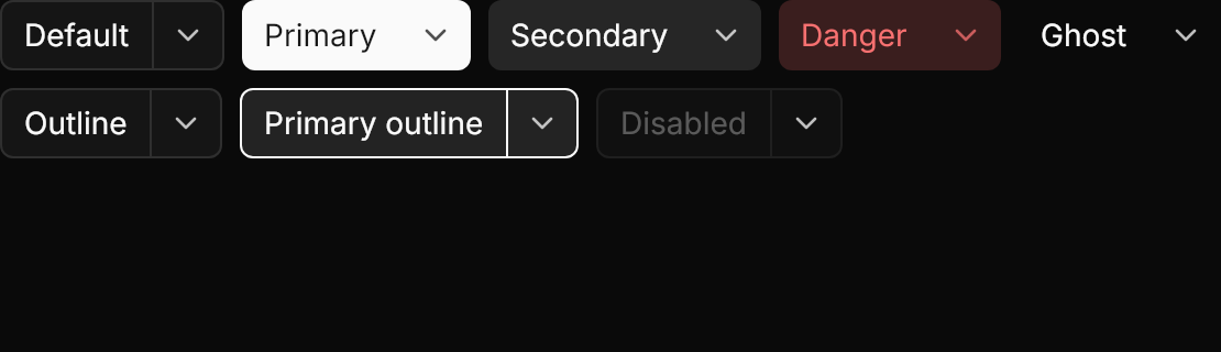
<Panel MinHeight="160">
  <Panel.Resources>
    <MenuFlyout x:Key="SaveMenu" Placement="BottomEdgeAlignedRight">
      <MenuItem Header="Save As..." />
      <MenuItem Header="Save All" />
    </MenuFlyout>
  </Panel.Resources>
  <WrapPanel ItemSpacing="8" LineSpacing="8" VerticalAlignment="Top">
    <SplitButton Content="Default" Flyout="{StaticResource SaveMenu}" />
    <SplitButton Classes="primary" Content="Primary" Flyout="{StaticResource SaveMenu}" />
    <SplitButton Classes="secondary" Content="Secondary" Flyout="{StaticResource SaveMenu}" />
    <SplitButton Classes="danger" Content="Danger" Flyout="{StaticResource SaveMenu}" />
    <SplitButton Classes="ghost" Content="Ghost" Flyout="{StaticResource SaveMenu}" />
    <SplitButton Classes="outline" Content="Outline" Flyout="{StaticResource SaveMenu}" />
    <SplitButton Classes="primary outline" Content="Primary outline" Flyout="{StaticResource SaveMenu}" />
    <SplitButton Content="Disabled" IsEnabled="False" Flyout="{StaticResource SaveMenu}" />
  </WrapPanel>
</Panel>The four sizes scale both halves and the caret.
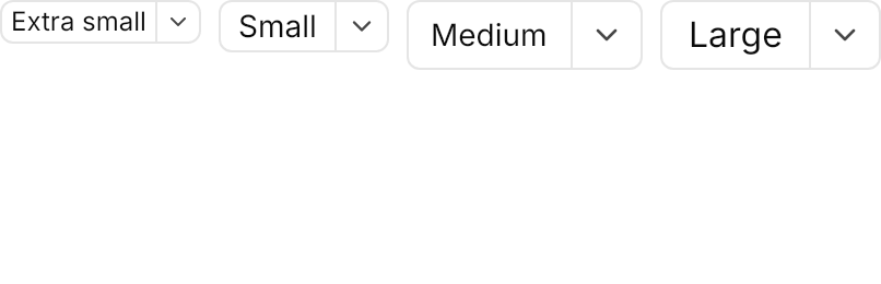
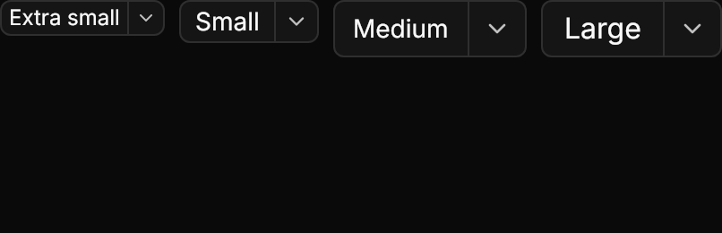
<Panel MinHeight="130">
  <Panel.Resources>
    <MenuFlyout x:Key="SaveMenu" Placement="BottomEdgeAlignedRight">
      <MenuItem Header="Save As..." />
      <MenuItem Header="Save All" />
    </MenuFlyout>
  </Panel.Resources>
  <WrapPanel ItemSpacing="8" LineSpacing="8" VerticalAlignment="Top">
    <SplitButton Classes="xsmall" Content="Extra small" Flyout="{StaticResource SaveMenu}" />
    <SplitButton Classes="small" Content="Small" Flyout="{StaticResource SaveMenu}" />
    <SplitButton Content="Medium" Flyout="{StaticResource SaveMenu}" />
    <SplitButton Classes="large" Content="Large" Flyout="{StaticResource SaveMenu}" />
  </WrapPanel>
</Panel>Not covered
- The loading state.
- The Custom variant (set
Background,ForegroundandBorderBrushdirectly instead). - A dropdown caret on a plain
Button; useSplitButton. - The toggled state (use
ToggleButton; see Toggle).