A header that reveals its content at its natural height, on GPUI Kit's spring.
Partial
Interactive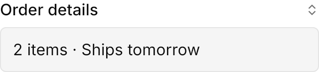
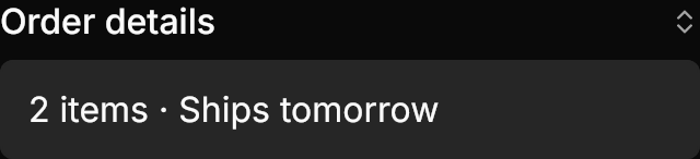
<!-- The class reveal animates the content's height; without it the content appears at once. -->
<Expander Theme="{StaticResource GpuiCollapsible}" Classes="reveal" IsExpanded="True" Width="320" HorizontalAlignment="Left">
  <Expander.Header>
    <DockPanel>
      <PathIcon DockPanel.Dock="Right" Data="{StaticResource Gpui.Icon.ChevronsUpDown}" Width="14" Height="14"
                Foreground="{DynamicResource Gpui.MutedForeground}" />
      <TextBlock Text="Order details" FontWeight="Medium" VerticalAlignment="Center" />
    </DockPanel>
  </Expander.Header>
  <Border Margin="0,8,0,0" Padding="12" CornerRadius="5.5" BorderThickness="1" BackgroundSizing="OuterBorderEdge"
          Background="{DynamicResource Gpui.Muted}" BorderBrush="{DynamicResource Gpui.Border}">
    <TextBlock Text="2 items · Ships tomorrow" />
  </Border>
</Expander>Usage
Give an Expander the named theme: Theme="{StaticResource GpuiCollapsible}". It has no chrome of its own: the header is the trigger and the content is whatever the app puts there. With the reveal class (GPUI Kit's motion_id) the content opens and closes at its natural height on Gpui.Spring.Control and reverses smoothly when toggled midway; without the class it appears and disappears at once, as GPUI Kit mounts it. ExpandDirection="Up" puts the content before the trigger.
Examples
ExpandDirection="Up" reveals the content above the trigger.
Interactive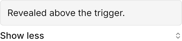
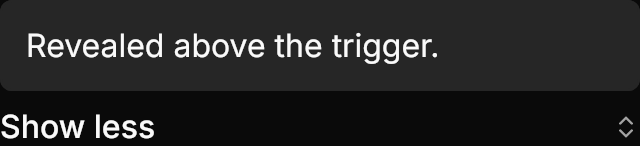
<!-- ExpandDirection Up puts the content before the trigger. -->
<Expander Theme="{StaticResource GpuiCollapsible}" Classes="reveal" ExpandDirection="Up" IsExpanded="True" Width="320" HorizontalAlignment="Left">
  <Expander.Header>
    <DockPanel>
      <PathIcon DockPanel.Dock="Right" Data="{StaticResource Gpui.Icon.ChevronsUpDown}" Width="14" Height="14"
                Foreground="{DynamicResource Gpui.MutedForeground}" />
      <TextBlock Text="Show less" FontWeight="Medium" VerticalAlignment="Center" />
    </DockPanel>
  </Expander.Header>
  <Border Margin="0,0,0,8" Padding="12" CornerRadius="5.5" BorderThickness="1" BackgroundSizing="OuterBorderEdge"
          Background="{DynamicResource Gpui.Muted}" BorderBrush="{DynamicResource Gpui.Border}">
    <TextBlock Text="Revealed above the trigger." />
  </Border>
</Expander>Not covered
- Nothing: the control's look and motion are covered in full.