GPUI Kit's empty state: media, a title, a description and actions, centered.
New control
Interactive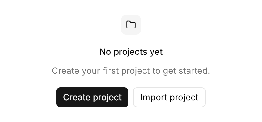
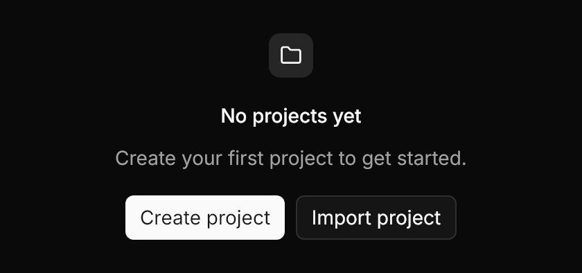
<gpui:EmptyState Classes="icon-media" Title="No projects yet" Description="Create your first project to get started."
                 Width="420" HorizontalAlignment="Left">
  <gpui:EmptyState.Media>
    <PathIcon Data="{StaticResource Gpui.Icon.Folder}" />
  </gpui:EmptyState.Media>
  <gpui:EmptyState.Actions>
    <StackPanel Orientation="Horizontal" Spacing="8">
      <Button Classes="primary" Content="Create project" />
      <Button Classes="outline" Content="Import project" />
    </StackPanel>
  </gpui:EmptyState.Actions>
</gpui:EmptyState>Usage
gpui:EmptyState centers a column with 24px padding and 16px gaps, on a radius of 12: the header (Media, then Title and Description 8px apart, at most 384px wide), the Actions, then its content. The title is text_sm medium and the description muted text_sm; both center and wrap. Media takes any control (an icon, an image, an avatar), and the icon-media class frames it in a 32px muted square. Every part is optional. The control is named EmptyState, as "Empty" says little in an Avalonia app.
Examples
A 40px icon as plain media, a bordered state with icon-media, a title alone, and content below the actions.
Interactive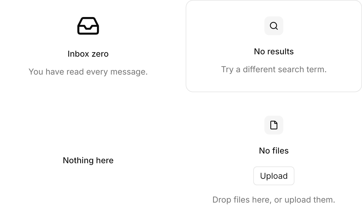
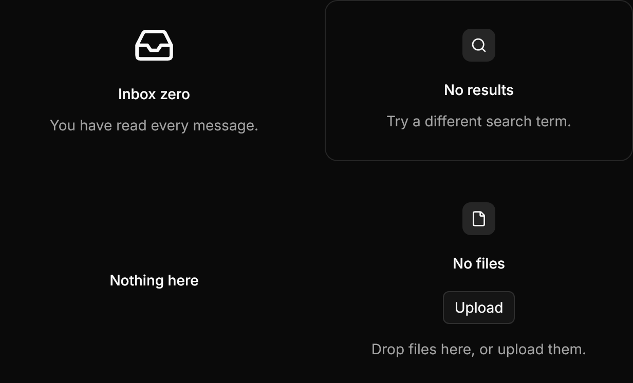
<WrapPanel ItemSpacing="16" LineSpacing="16">
  <!-- A plain media: any control, here a 40px icon. -->
  <gpui:EmptyState Title="Inbox zero" Description="You have read every message." Width="300">
    <gpui:EmptyState.Media>
      <PathIcon Data="{StaticResource Gpui.Icon.Inbox}" Width="40" Height="40" />
    </gpui:EmptyState.Media>
  </gpui:EmptyState>
  <!-- Bordered, with the icon in its muted square. -->
  <gpui:EmptyState Classes="icon-media" Title="No results" Description="Try a different search term." Width="300"
                   BorderBrush="{DynamicResource Gpui.Border}" BorderThickness="1">
    <gpui:EmptyState.Media>
      <PathIcon Data="{StaticResource Gpui.Icon.Search}" />
    </gpui:EmptyState.Media>
  </gpui:EmptyState>
  <!-- A title alone. -->
  <gpui:EmptyState Title="Nothing here" Width="300" />
  <!-- Content below the actions. -->
  <gpui:EmptyState Classes="icon-media" Title="No files" Width="300">
    <gpui:EmptyState.Media>
      <PathIcon Data="{StaticResource Gpui.Icon.File}" />
    </gpui:EmptyState.Media>
    <gpui:EmptyState.Actions>
      <Button Classes="outline" Content="Upload" />
    </gpui:EmptyState.Actions>
    <TextBlock Text="Drop files here, or upload them." Foreground="{DynamicResource Gpui.MutedForeground}" />
  </gpui:EmptyState>
</WrapPanel>Not covered
- The dashed frame around the empty state; Avalonia's
Borderdraws no dashes.