

<Panel MinHeight="360">
  <CalendarDatePicker Width="220" SelectedDate="2025-03-14" DisplayDate="2025-03-14"
                      SelectedDateFormat="Custom" CustomDateFormatString="yyyy/MM/dd" PlaceholderText="Select date"
                      HorizontalAlignment="Left" VerticalAlignment="Top" />
</Panel>Usage
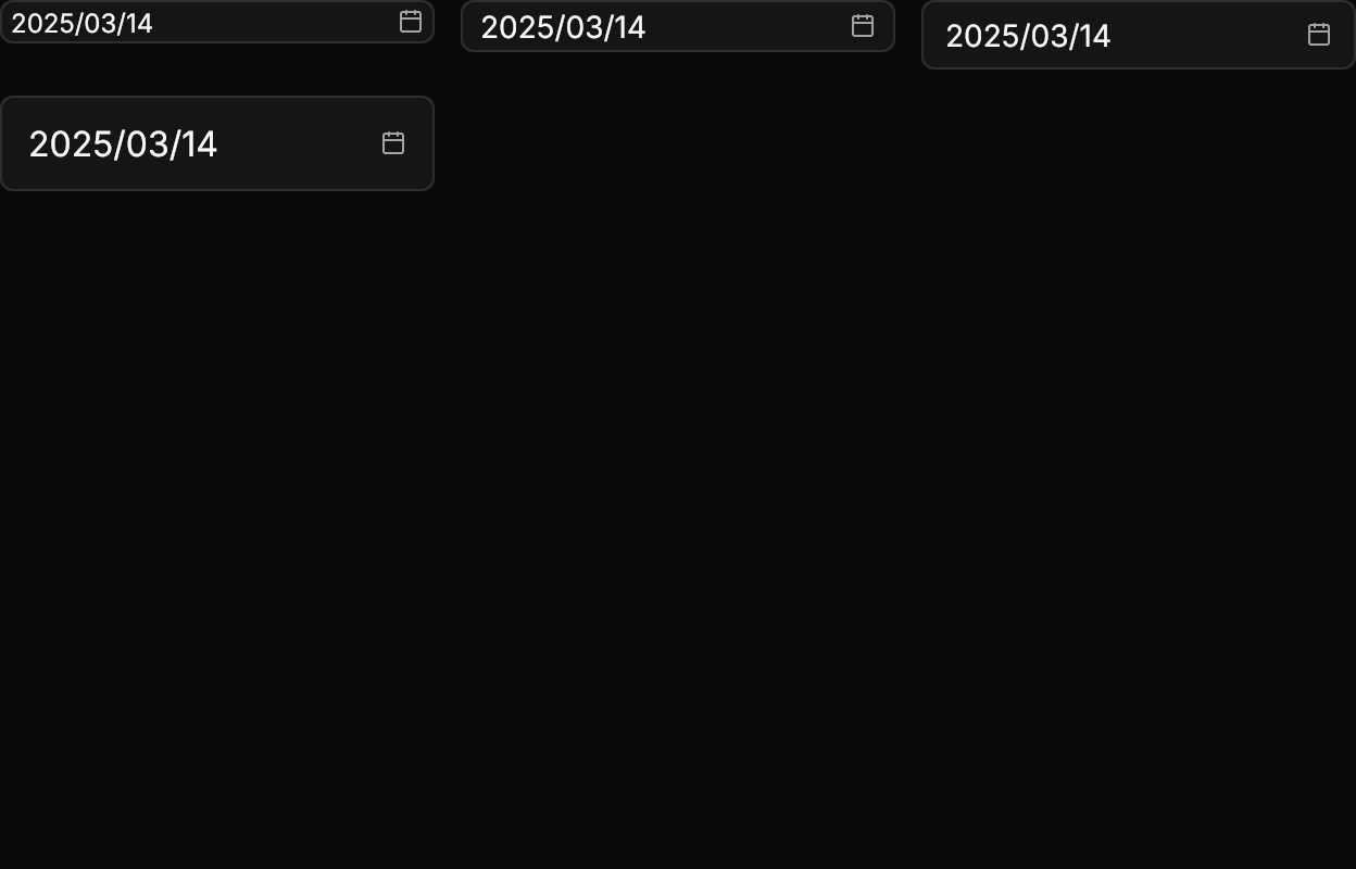
The theme covers CalendarDatePicker: an input-styled field with the date or the muted PlaceholderText and a muted calendar icon at its end; the border turns to the ring, with the focus band, while the field has focus or its calendar is open. The calendar opens 6px below on GPUI's popover surface (the Calendar theme without its card), sliding 8px down and fading in over 150ms. Today is always marked.
GPUI's text format and placeholder are the app's, and the format also governs parsing: set SelectedDateFormat="Custom", CustomDateFormatString="yyyy/MM/dd" and PlaceholderText="Select date" for GPUI Kit's defaults. Sizes: xsmall, small, large (medium is the default); the size class also sizes the popup calendar (small opens the small calendar, large the large one). Disabled, the field fades to half and drops the icon.
Examples
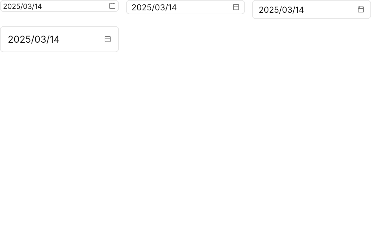
The four sizes.
<Panel MinHeight="400">
  <WrapPanel ItemSpacing="12" LineSpacing="12" VerticalAlignment="Top">
    <CalendarDatePicker Classes="xsmall" Width="200" SelectedDate="2025-03-14" DisplayDate="2025-03-14"
                        SelectedDateFormat="Custom" CustomDateFormatString="yyyy/MM/dd" />
    <CalendarDatePicker Classes="small" Width="200" SelectedDate="2025-03-14" DisplayDate="2025-03-14"
                        SelectedDateFormat="Custom" CustomDateFormatString="yyyy/MM/dd" />
    <CalendarDatePicker Width="200" SelectedDate="2025-03-14" DisplayDate="2025-03-14"
                        SelectedDateFormat="Custom" CustomDateFormatString="yyyy/MM/dd" />
    <CalendarDatePicker Classes="large" Width="200" SelectedDate="2025-03-14" DisplayDate="2025-03-14"
                        SelectedDateFormat="Custom" CustomDateFormatString="yyyy/MM/dd" />
  </WrapPanel>
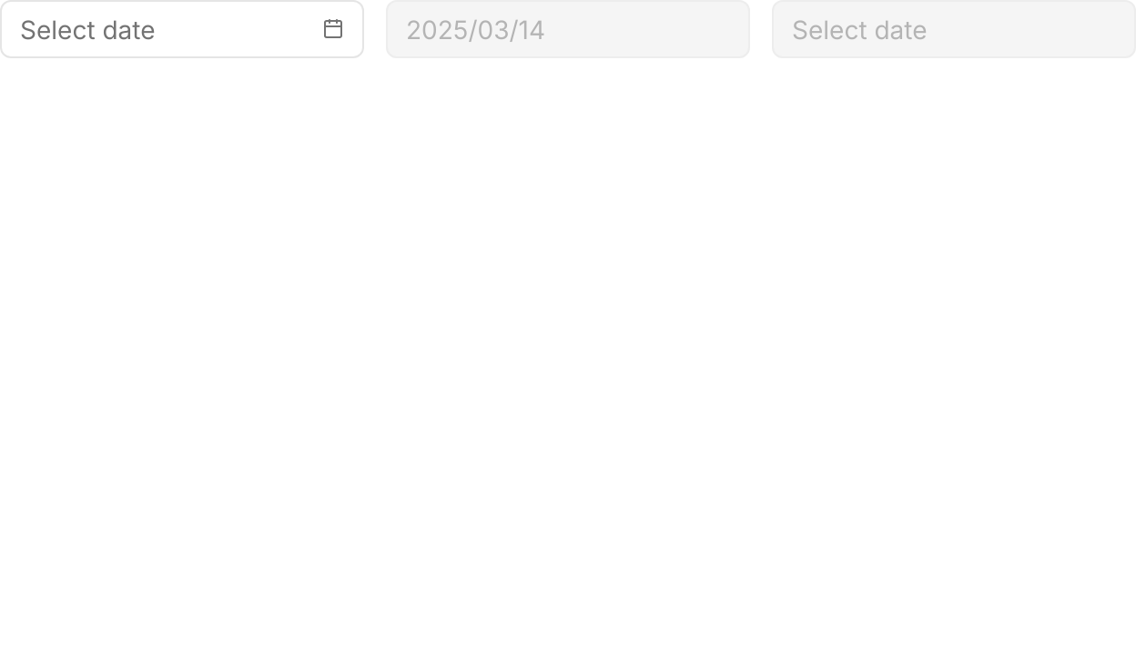
</Panel>An empty field with its placeholder, a disabled field with a date, and a disabled empty one.

<Panel MinHeight="360">
  <WrapPanel ItemSpacing="12" LineSpacing="12" VerticalAlignment="Top">
    <CalendarDatePicker Width="200" PlaceholderText="Select date"
                        SelectedDateFormat="Custom" CustomDateFormatString="yyyy/MM/dd" />
    <CalendarDatePicker Width="200" SelectedDate="2025-03-14" IsEnabled="False"
                        SelectedDateFormat="Custom" CustomDateFormatString="yyyy/MM/dd" />
    <CalendarDatePicker Width="200" PlaceholderText="Select date" IsEnabled="False"
                        SelectedDateFormat="Custom" CustomDateFormatString="yyyy/MM/dd" />
  </WrapPanel>
</Panel>Not covered
- Date ranges.
- Presets such as "Last 7 days".
- Editing the time in the same picker (use
TimePickeralongside; see Time Field).