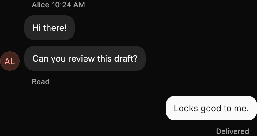
A chat message: bubbles with a header, a footer and an avatar, aligned to a side.
New control
Interactive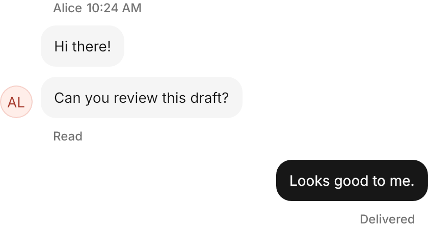
<StackPanel Width="420" Spacing="16" HorizontalAlignment="Left">
  <gpui:Message Footer="Read">
    <gpui:Message.Avatar>
      <gpui:Avatar UserName="Alice" Width="32" Height="32" />
    </gpui:Message.Avatar>
    <gpui:Message.Header>
      <StackPanel Orientation="Horizontal" Spacing="4">
        <TextBlock Text="Alice" />
        <TextBlock Text="10:24 AM" />
      </StackPanel>
    </gpui:Message.Header>
    <gpui:Bubble Classes="secondary" Content="Hi there!" />
    <gpui:Bubble Classes="secondary" Content="Can you review this draft?" />
  </gpui:Message>
  <gpui:Message Classes="end" Footer="Delivered">
    <gpui:Bubble Content="Looks good to me." />
  </gpui:Message>
</StackPanel>Usage
gpui:Message is one turn of a conversation. Its items are the bubbles (or any content: plain strings show in 16px text), 10px apart; Header sits above them and Footer below, in muted 12px text inset 12px unless a bubble is ghost; Avatar sits at the bottom beside them. Classes="end" mirrors the whole message to the end of the row. Stack messages in a StackPanel with Spacing="8" for GPUI Kit's message group.
Examples
Without bubbles: the items are strings, shown as plain text under the header.
Interactive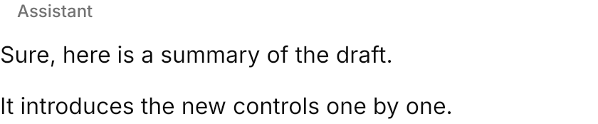

<gpui:Message Width="420" HorizontalAlignment="Left">
  <gpui:Message.Header>
    <TextBlock Text="Assistant" />
  </gpui:Message.Header>
  <x:String>Sure, here is a summary of the draft.</x:String>
  <x:String>It introduces the new controls one by one.</x:String>
</gpui:Message>Not covered
- MessageGroup as a control (a
StackPanelwithSpacing="8"is the same). - Setting the header's and footer's insets separately.