Numbered or icon steps joined by lines, with the current one highlighted.


<gpui:Stepper SelectedIndex="1" Width="480" HorizontalAlignment="Left">
  <gpui:StepperItem Content="Order Details" />
  <gpui:StepperItem Content="Shipping" />
  <gpui:StepperItem Content="Finish" />
</gpui:Stepper>Usage
gpui:Stepper lays out gpui:StepperItems: each is an indicator (a circle with the step's number, or its Icon) with the item's content as the label, and a line to the next step. Steps up to SelectedIndex are checked, in the primary color, and the lines after passed steps turn primary too. A click on a step's indicator or label selects it (SelectedIndex binds two-way), unless the stepper is disabled. Orientation="Vertical" runs the steps down, with the label beside the indicator; CentersSteps="True" gives every step an equal share of the width with its indicator and label centered.
Examples
Icon on an item replaces its number.


<gpui:Stepper SelectedIndex="1" Width="480" HorizontalAlignment="Left">
  <gpui:StepperItem Content="Order Details" Icon="{StaticResource Gpui.Icon.Calendar}" />
  <gpui:StepperItem Content="Shipping" Icon="{StaticResource Gpui.Icon.Inbox}" />
  <gpui:StepperItem Content="Finish" Icon="{StaticResource Gpui.Icon.Info}" />
</gpui:Stepper>The four sizes.
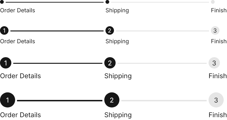
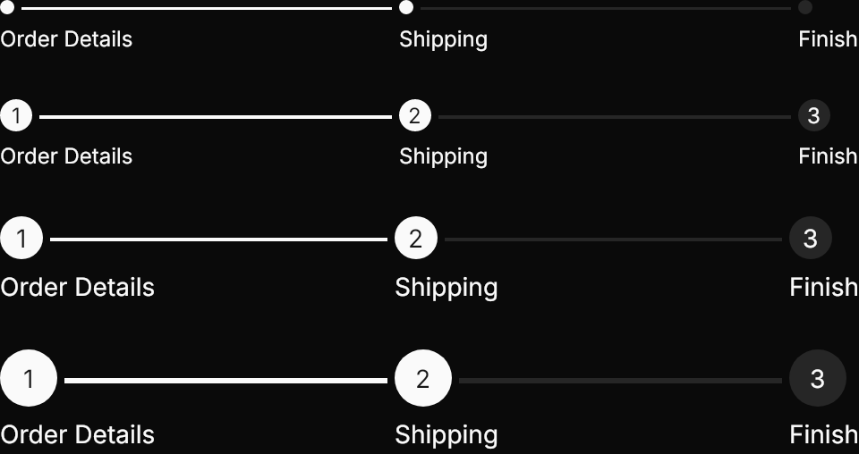
<StackPanel Spacing="24" HorizontalAlignment="Left">
  <gpui:Stepper Classes="xsmall" SelectedIndex="1" Width="480">
    <gpui:StepperItem Content="Order Details" />
    <gpui:StepperItem Content="Shipping" />
    <gpui:StepperItem Content="Finish" />
  </gpui:Stepper>
  <gpui:Stepper Classes="small" SelectedIndex="1" Width="480">
    <gpui:StepperItem Content="Order Details" />
    <gpui:StepperItem Content="Shipping" />
    <gpui:StepperItem Content="Finish" />
  </gpui:Stepper>
  <gpui:Stepper SelectedIndex="1" Width="480">
    <gpui:StepperItem Content="Order Details" />
    <gpui:StepperItem Content="Shipping" />
    <gpui:StepperItem Content="Finish" />
  </gpui:Stepper>
  <gpui:Stepper Classes="large" SelectedIndex="1" Width="480">
    <gpui:StepperItem Content="Order Details" />
    <gpui:StepperItem Content="Shipping" />
    <gpui:StepperItem Content="Finish" />
  </gpui:Stepper>
</StackPanel>CentersSteps="True", and Orientation="Vertical".
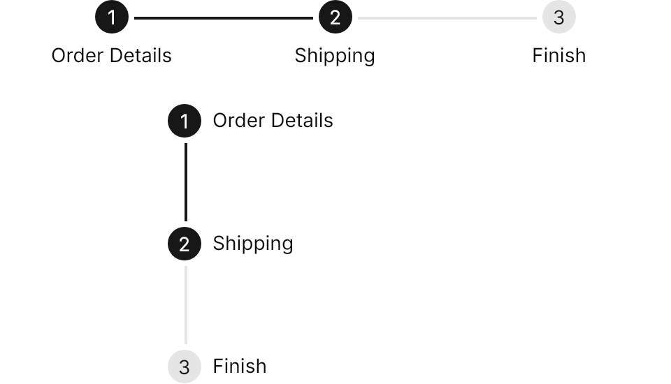
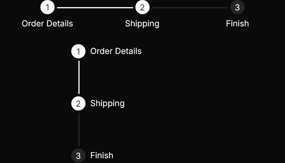
<StackPanel Spacing="24" HorizontalAlignment="Left">
  <gpui:Stepper SelectedIndex="1" CentersSteps="True" Width="480">
    <gpui:StepperItem Content="Order Details" />
    <gpui:StepperItem Content="Shipping" />
    <gpui:StepperItem Content="Finish" />
  </gpui:Stepper>
  <gpui:Stepper SelectedIndex="1" Orientation="Vertical" Width="240" Height="200">
    <gpui:StepperItem Content="Order Details" />
    <gpui:StepperItem Content="Shipping" />
    <gpui:StepperItem Content="Finish" />
  </gpui:Stepper>
</StackPanel>Not covered
- Nothing: the control covers the component.