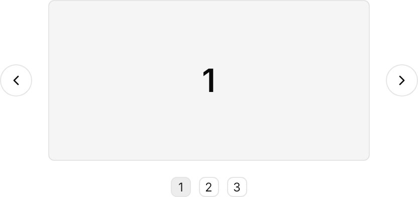
One page at a time, sliding on GPUI Kit's spring, with its dots as a PipsPager.

<StackPanel Spacing="16" Width="320" Margin="48,0" HorizontalAlignment="Left">
  <Panel>
    <Carousel Name="Slides" Focusable="True">
      <Border Height="160" CornerRadius="5.5" BorderThickness="1" BackgroundSizing="OuterBorderEdge"
              Background="{DynamicResource Gpui.Muted}" BorderBrush="{DynamicResource Gpui.Border}">
        <TextBlock Text="1" FontSize="32" FontWeight="SemiBold" HorizontalAlignment="Center" VerticalAlignment="Center" />
      </Border>
      <Border Height="160" CornerRadius="5.5" BorderThickness="1" BackgroundSizing="OuterBorderEdge"
              Background="{DynamicResource Gpui.Muted}" BorderBrush="{DynamicResource Gpui.Border}">
        <TextBlock Text="2" FontSize="32" FontWeight="SemiBold" HorizontalAlignment="Center" VerticalAlignment="Center" />
      </Border>
      <Border Height="160" CornerRadius="5.5" BorderThickness="1" BackgroundSizing="OuterBorderEdge"
              Background="{DynamicResource Gpui.Muted}" BorderBrush="{DynamicResource Gpui.Border}">
        <TextBlock Text="3" FontSize="32" FontWeight="SemiBold" HorizontalAlignment="Center" VerticalAlignment="Center" />
      </Border>
    </Carousel>
    <Button Classes="outline icon-only rounded-full" Margin="-48,0,0,0" HorizontalAlignment="Left" VerticalAlignment="Center" Click="OnPrevious">
      <PathIcon Data="{StaticResource Gpui.Icon.ChevronLeft}" />
    </Button>
    <Button Classes="outline icon-only rounded-full" Margin="0,0,-48,0" HorizontalAlignment="Right" VerticalAlignment="Center" Click="OnNext">
      <PathIcon Data="{StaticResource Gpui.Icon.ChevronRight}" />
    </Button>
  </Panel>
  <PipsPager Classes="carousel" NumberOfPages="3" HorizontalAlignment="Center"
             SelectedPageIndex="{Binding #Slides.SelectedIndex, Mode=TwoWay}" />
</StackPanel>Usage
The theme covers Carousel: it shows one page at a time, clipped to its bounds, and its PageTransition is gpui:SpringSlide, on which both pages ride one track 16px apart on GPUI Kit's spring_move. Set Focusable="True" so the carousel is a tab stop as GPUI Kit's is (Avalonia then handles the arrow keys); keyboard focus rings the pages.
The rest of GPUI Kit's carousel is the app's: Previous and Next are Button Classes="outline icon-only rounded-full" with a chevron, 16px outside the pages and centered on them, whose Click handlers call the carousel's Previous() and Next(); the dots are a PipsPager Classes="carousel" 16px below, with SelectedPageIndex bound two-way to the carousel's SelectedIndex.
Examples
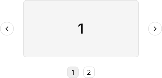
A smaller carousel with small buttons and two pages.

<StackPanel Spacing="16" Width="200" Margin="40,0" HorizontalAlignment="Left">
  <Panel>
    <Carousel Name="Slides" Focusable="True">
      <Border Height="100" CornerRadius="5.5" BorderThickness="1" BackgroundSizing="OuterBorderEdge"
              Background="{DynamicResource Gpui.Muted}" BorderBrush="{DynamicResource Gpui.Border}">
        <TextBlock Text="1" FontSize="24" FontWeight="SemiBold" HorizontalAlignment="Center" VerticalAlignment="Center" />
      </Border>
      <Border Height="100" CornerRadius="5.5" BorderThickness="1" BackgroundSizing="OuterBorderEdge"
              Background="{DynamicResource Gpui.Muted}" BorderBrush="{DynamicResource Gpui.Border}">
        <TextBlock Text="2" FontSize="24" FontWeight="SemiBold" HorizontalAlignment="Center" VerticalAlignment="Center" />
      </Border>
    </Carousel>
    <Button Classes="outline icon-only rounded-full small" Margin="-40,0,0,0" HorizontalAlignment="Left" VerticalAlignment="Center" Click="OnPrevious">
      <PathIcon Data="{StaticResource Gpui.Icon.ChevronLeft}" />
    </Button>
    <Button Classes="outline icon-only rounded-full small" Margin="0,0,-40,0" HorizontalAlignment="Right" VerticalAlignment="Center" Click="OnNext">
      <PathIcon Data="{StaticResource Gpui.Icon.ChevronRight}" />
    </Button>
  </Panel>
  <PipsPager Classes="carousel" NumberOfPages="2" HorizontalAlignment="Center"
             SelectedPageIndex="{Binding #Slides.SelectedIndex, Mode=TwoWay}" />
</StackPanel>Not covered
- Jumping several pages at once by number.
- Reversing a page change midway.
- Looping from the last page to the first.
- Dragging and wheel scrolling between pages.